| Image |
Comment |
| 10/22/2013 01:17:21 PM |
Fahrenheit 451 By Ray Bradburyby BrennanOBComment: OVerall the image is ok. The composition could have been changed up to show the tips of the flames. I think this would have made it a stronger image. Or maybe just a piece of the book showing with the flanes.
Gave it a 5 |
 Photographer found comment helpful. Photographer found comment helpful. |
| 10/22/2013 01:14:30 PM |
On Golden Pondby dtremainComment: I like the colors in the pond. Other than that, it looks like a snapshot of a pond at a park. Nothing much to it.
Gave it a 3 |
| Photographer found comment helpful. |
| 10/22/2013 01:13:25 PM |
"The Great Gatsby" Rememberedby beatabgComment: I like the detail in the image. A couple of things, I think, would have made this a better shot. I don't like the dress. It looks superimposed or something, which I am sure she was wearing a dres...looks doctored up or something. If this was an old lady, she could have been remembering "The Great Gatsby" times. That would have been great. The car unfortunately is not from that time period. I know you could take the translation of the picture and title a few different ways, but...
Gave it a 5 |
| Photographer found comment helpful. |
| 10/22/2013 01:10:00 PM |
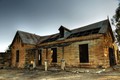
Wuthering Heights, a dark and ugly placeby AmmieComment: Never read the book, but I do understand that there was a dark and ugly place in the book. Maybe a human element would have made this have more appeal. Maybe some adjustments would have made some things stand out a little more. I know it is the angle, but on the right side of the image, the house looks to be leaning a lot. Maybe find a way to crop it out or recompose the image.
Gave it a 4 |
| Photographer found comment helpful. |
| 10/22/2013 01:07:47 PM |
Catch Her in the Ryeby IrvineJamesComment: Play on words...get it.
I like the golden look on the right side.
The one major detractor for me is the light spot on her neck. Everytime I look at the image, that is what always catches my attention. Also, her right shoulder is illuminated with her face, but there is not light on her front side. My brain tells me that this is not natural :) The sun is on the backside of her, so obviously you used fill light, but it only hit spots and that takes away from the image.
Gave it a 4 |
| Photographer found comment helpful. |
| 10/22/2013 01:03:29 PM |
Cold Comfort Farm - Stella Gibbons by StagoleeComment: I kind of get a cold feeling from the bottom left of the sky, but the sun shining through and the green don't give me that feeling. I have never read the book, so I don't know if you are just using the title to make "Cold Comfort Farm" or if there is a meaning behind any of the photo. So just going off of the title and the pic, I gave it a 4. |
| Photographer found comment helpful. |
| 10/22/2013 12:59:09 PM |
Hold back the waterby whiterookComment: There are a few changes that I think would have made this photo better.
1. The horizon line is askew. Straighten up the shot or rotate the canvas in photoshop.
2. There is no real detail in the rocks and foliage. That needs to be brought out some.
3. Color adjustment overall.
4. Longer shutter speed to make the water softer looking.
Gave it a 2 |
| 10/22/2013 12:56:14 PM |
|
| Photographer found comment helpful. |
| 10/22/2013 12:54:06 PM |
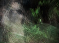
'Something Wicked This Way Comes' by Ray Bradburyby IAmEliKatzComment: The first few time I looked at this, I thought ummm...4 or 5.
I like the crosshatching look in the photo. The image makes it look like the "something wicked" is making a disturbance in the visual perception of the background.
Gave it a 7 |
| Photographer found comment helpful. |
| 10/22/2013 12:51:25 PM |
|
| Photographer found comment helpful. |
Home -
Challenges -
Community -
League -
Photos -
Cameras -
Lenses -
Learn -
Help -
Terms of Use -
Privacy -
Top ^
DPChallenge, and website content and design, Copyright © 2001-2025 Challenging Technologies, LLC.
All digital photo copyrights belong to the photographers and may not be used without permission.
Current Server Time: 07/31/2025 01:21:03 PM EDT.