| Image |
Comment |
| 05/26/2003 01:40:48 PM |
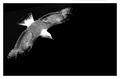
flightby deceptiveComment by Toddh: i think this is a bit too contrasty for my liking..... good composition though..... good luck, Todd. |
 Photographer found comment helpful. Photographer found comment helpful. |
| 05/26/2003 08:21:03 AM |
|
| Photographer found comment helpful. |
| 05/25/2003 07:12:47 AM |
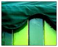
ice cream hutby deceptiveComment by e301: Have come back to this shot from just browsing around the site: really like it now, much more than I did at the time of voting. Two contrasts going on, betweeen the shades of green and the textures, and both excellently brought out. I'd guess it didn't score better because you only used one colour, but I'm not that much of an expert on the dpchallenge communal mindset. Now if those darker panels had been orange ... :)
Ed |
| Photographer found comment helpful. |
| 05/24/2003 11:48:31 PM |
|
| Photographer found comment helpful. |
| 05/24/2003 10:21:03 PM |
|
| Photographer found comment helpful. |
| 05/23/2003 11:14:03 PM |
primary loomby deceptiveComment by sylandrix: Greetings from the Critique Club!...
COMPOSITION... First off, I like the stark simplicity of this shot... Not everyone was a fan of the shadows but I think they make an interesting interplay with the actual wires/strings that are casting them. Their intersection creates a focal point in the image... Since the wires are mostly horizontal, you can emphasize this by creating a more panoramic crop - removing a bit from the bottom and top. A bit of subjective preference. -> I tend to like subjects more when they fill up the frame and when the frame aspect ratio fits with the subject of interest. Its by no means a hard-fast rule that must be followed but it does sometimes strengthen a composition...
TECHNIQUE... I really like the inclusion of the shadows and I would not have attempted to remove them. In fact, I would have tried to emphasize them more...The shadows are jet black on one side of the image but much lighter on the other. Could moving the position of the lights rendered all shadows a deep black? the wires/strings on the right side of the image are close to the background and therefore not casting a shadow...It would have been interesting to have raised them up a bit and played with their positioning until you had a consistent shadow effect going from one side of the string/wires to the other.... In the minor category, highlights do seem slightly harsh, and the absence of catch-lights on the red wire is noticeable...Either angle of the light is coming into play here or that red string/wire is made of a different material than the others...Either way you can reduce the harsh highlights by diffusing your light or maybe increasing the distance from subject to light source...
Overall, an interesting and visually appealing abstract image.... |
| Photographer found comment helpful. |
| 05/22/2003 11:17:07 PM |
|
| Photographer found comment helpful. |
| 05/22/2003 03:34:27 PM |
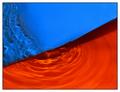
submerged blue and orangeby deceptiveComment by qachyk: Shots like this always amaze me, which, er, is partly because I'm very ignorant (not stupid, just ignorant). But still, nice, though I think I would have gone with a more yellow second colour to really get the contrast of the complementary colours -- this has a bit too much red in. |
| Photographer found comment helpful. |
| 05/21/2003 04:36:15 PM |
|
| Photographer found comment helpful. |
| 05/21/2003 06:46:43 AM |
|
| Photographer found comment helpful. |
Home -
Challenges -
Community -
League -
Photos -
Cameras -
Lenses -
Learn -
Help -
Terms of Use -
Privacy -
Top ^
DPChallenge, and website content and design, Copyright © 2001-2026 Challenging Technologies, LLC.
All digital photo copyrights belong to the photographers and may not be used without permission.
Current Server Time: 07/16/2026 05:56:51 AM EDT.