DPChallenge: A Digital Photography Contest You are not logged in. (log in or register
 
Browse Settings
Currently viewing:
Registered UserOneSweetSin

Show comments:

Per page:

Order:

Comments:


Comments Received by OneSweetSin
Pages:   ... [101] [102] [103] [104] [105] [106] [107] ... [161]
Showing 1031 - 1040 of ~1608
Image Comment
"W"
08/09/2003 11:34:49 AM
"W"
by OneSweetSin

Comment by neenee1999:
love it!!
Photographer found comment helpful.
Home Alone
08/09/2003 05:39:07 AM
Home Alone
by OneSweetSin

Comment by inspzil:
This isn't quite as sharp as it should be. I dont' really buy the expression either, its the same general idea, but doesn't quite have the same effect. Maybe a different kid would've yielded a more favorable result. Good luck anyway!
"W"
08/08/2003 02:39:34 PM
"W"
by OneSweetSin

Comment by WesF:
Nice shot, fits the challenge well.
Photographer found comment helpful.
"W"
08/08/2003 12:47:58 PM
"W"
by OneSweetSin

Comment by JBosie:
One of the few who got it
Photographer found comment helpful.
Done in the Garden
08/08/2003 05:16:44 AM
Done in the Garden
by OneSweetSin

Comment by e301:
hello from Critique Club Anna

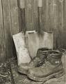
Now, before I go any further I'm going to say that I don't like this shot: I'll try not to be overly harsh in my thoughts.

Not only is the broad range of tones very low, there's also remarkably little contrast - to the extent that the metal shaft of the shovels almost blends in with the wood behind them, and also with such even lighting any real sense of texture has gone. This leaves very little visual interest for me: I would think that some side light on the whole set-up is needed, because I think there probably IS good texture there, and contrast between wod, metal and leather. There's no depth here, no sense of the real shape of these things, of what they'd be like to hold.

Compositionally, I find it strange too: that empty space to the left of frame - why did you keep it there? And why place to boots so far toward the bottom of the image? There's an absolutely classic composition just waiting to be released here: move the spades a little to the left and you have a triangle between their shafts, and toes and the ankles of the boots: a very strong shape, and it would also allow you to place the shovels on one of the strong lines, rather than almost-but-not-quite central as here. And why shoot such an orthodix study at an angle to the fence, which brings that odd diagonal and edge of the step into the picture, but not in such a way that they contribute anything? Don't get your reasoning ...

And I don't really 'get' the sepia toning either: feels like an attempt to age the shot, but somehow those boots just don't look old or weathreed or used enough to be appropriate to that treatment.

I'd certainly have waited for light, or added some myself, to this situation. Sorry to be so negative, but it's a honest reaction to this shot - it feels like a wasted opportunity, like a very rushed submission.

There's the focus issue too, on the nearer of the boots.

But it's lighting, it's all about lighting. Looking through all your challenge entries, I'd say that's the one area your work could really use some guidance, or research, or just help: I think you'd be amazed how your scores would improve (presuming that's what you're after!) A lot of your shots are taken with a very front-on light, which flattens out all the textures and shapes in images - try shooting things with the light to the side, or just slightly behind - just try a couple of experiments: I think you'll be surprised.

Good luck

ed
"W"
08/08/2003 12:57:13 AM
"W"
by OneSweetSin

Comment by dsidwell:
Such wonderful tones on the building. Very very nice.
Photographer found comment helpful.
Home Alone
08/07/2003 03:02:00 PM
Home Alone
by OneSweetSin

Comment by camelotnorth:
you caught the expression of McCulley very well..focus is good and using the whole frame adds to the composition.
Photographer found comment helpful.
Home Alone
08/07/2003 10:24:30 AM
Home Alone
by OneSweetSin

Comment by dsidwell:
Here's some drama! I like the expression The lighting is a bit harsh here, and colors nonsaturated, as I find in some of your other shots. I'm not sure what camera you have, but I would really experiment with light and slightly different colors and qualities and directions of light and rely less on your flash. It tends to wash things out and give a harsh feel to things. Your composition is really nice here, and the point of view is just right, but your lighting upstages most of this wonderful work.
Photographer found comment helpful.
"W"
08/07/2003 09:52:48 AM
"W"
by OneSweetSin

Comment by banmorn:
super
Photographer found comment helpful.
"W"
08/07/2003 09:38:57 AM
"W"
by OneSweetSin

Comment by paglia:
good title, medium shot 5
Photographer found comment helpful.
Pages:   ... [101] [102] [103] [104] [105] [106] [107] ... [161]
Showing 1031 - 1040 of ~1608


Home - Challenges - Community - League - Photos - Cameras - Lenses - Learn - Help - Terms of Use - Privacy - Top ^
DPChallenge, and website content and design, Copyright © 2001-2025 Challenging Technologies, LLC.
All digital photo copyrights belong to the photographers and may not be used without permission.
Current Server Time: 08/08/2025 01:42:47 PM EDT.