| Author | Thread |
|
|
08/08/2003 05:16:44 AM |
hello from Critique Club Anna
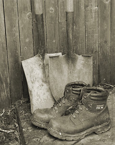
Now, before I go any further I'm going to say that I don't like this shot: I'll try not to be overly harsh in my thoughts.
Not only is the broad range of tones very low, there's also remarkably little contrast - to the extent that the metal shaft of the shovels almost blends in with the wood behind them, and also with such even lighting any real sense of texture has gone. This leaves very little visual interest for me: I would think that some side light on the whole set-up is needed, because I think there probably IS good texture there, and contrast between wod, metal and leather. There's no depth here, no sense of the real shape of these things, of what they'd be like to hold.
Compositionally, I find it strange too: that empty space to the left of frame - why did you keep it there? And why place to boots so far toward the bottom of the image? There's an absolutely classic composition just waiting to be released here: move the spades a little to the left and you have a triangle between their shafts, and toes and the ankles of the boots: a very strong shape, and it would also allow you to place the shovels on one of the strong lines, rather than almost-but-not-quite central as here. And why shoot such an orthodix study at an angle to the fence, which brings that odd diagonal and edge of the step into the picture, but not in such a way that they contribute anything? Don't get your reasoning ...
And I don't really 'get' the sepia toning either: feels like an attempt to age the shot, but somehow those boots just don't look old or weathreed or used enough to be appropriate to that treatment.
I'd certainly have waited for light, or added some myself, to this situation. Sorry to be so negative, but it's a honest reaction to this shot - it feels like a wasted opportunity, like a very rushed submission.
There's the focus issue too, on the nearer of the boots.
But it's lighting, it's all about lighting. Looking through all your challenge entries, I'd say that's the one area your work could really use some guidance, or research, or just help: I think you'd be amazed how your scores would improve (presuming that's what you're after!) A lot of your shots are taken with a very front-on light, which flattens out all the textures and shapes in images - try shooting things with the light to the side, or just slightly behind - just try a couple of experiments: I think you'll be surprised.
Good luck
ed |
|
Comments Made During the Challenge  |
|
|
08/04/2003 12:20:26 AM |
|
the focus seems to me to be a bit soft on the work bbots....may it's the dust and dirt, not sure....like the monotone, comp and texture contrasts. |
|
|
|
08/03/2003 04:22:12 PM |
|
A little sharper would have been nice, but I like it and like the overall tone. |
|
 Photographer found comment helpful. Photographer found comment helpful. |
|
|
08/03/2003 01:57:57 AM |
|
While exposure and tone are good, the eye is lead to the pair of softly focused boots at the bottom, which IMHO should be in better focus. Also, I would have liked to see this image in sepia and the shovels and boots not so centered. |
|
| Photographer found comment helpful. |
|
|
08/02/2003 02:54:06 PM |
|
all this needs is a sharpen and a little contrast enhancement to be a great photo worthy of a 9 or 10. as it is now, its a 7 i think. |
|
| Photographer found comment helpful. |
|
|
08/01/2003 11:40:41 AM |
|
sharper focus and higher contrast coudl improve the good composition |
|
| Photographer found comment helpful. |
|
|
08/01/2003 06:01:34 AM |
|
| Photographer found comment helpful. |
|
|
07/30/2003 12:14:51 PM |
|
Nice subject material. I can see how the vertical lines are true to the edge of the frame on the right but this means they are quite a lot out on the left. I wonder if it would be better to rotate a touch so that the central area of the fence and the spade handles are perfectly vertical. Great feeling of a day's work in the garden... not that you'd catch me doing it! :) |
|
| Photographer found comment helpful. |
|
|
07/30/2003 11:28:29 AM |
|
Good shot but would be better without the boots....maybe replace them with a flower pot or another garden utensil |
|
| Photographer found comment helpful. |
|
|
07/30/2003 08:51:00 AM |
|
The tone is great for the subject. Nicely done. Thinking outside the box is a plus ! |
|
| Photographer found comment helpful. |
Home -
Challenges -
Community -
League -
Photos -
Cameras -
Lenses -
Learn -
Help -
Terms of Use -
Privacy -
Top ^
DPChallenge, and website content and design, Copyright © 2001-2026 Challenging Technologies, LLC.
All digital photo copyrights belong to the photographers and may not be used without permission.
Current Server Time: 07/01/2026 07:38:17 PM EDT.