| Image |
Comment |
| 01/16/2006 06:06:50 PM |
|
 Photographer found comment helpful. Photographer found comment helpful. |
| 01/16/2006 05:04:07 PM |
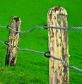
guard railsby ZenjohnComment by strangeghost: The colors, especially the grass, feels very overdone and unnatural. The shot had some potential but the composition is not very interesting. When you have lines like this, sometimes it helps if they're leading you to a corner of the photo rather than in one side and out the other. |
| Photographer found comment helpful. |
| 01/16/2006 11:38:26 AM |
|
| Photographer found comment helpful. |
| 01/16/2006 10:59:33 AM |
guard railsby ZenjohnComment by Konador: I think using the full 640px would have helped here. In my opinion the grass is too saturated - I'm not sure if that was done in post processing? There seem to be some artifacts created by that. Also looks like you clones something out at the top right? Repearing patterns there, which really draw attention to themselves. |
| Photographer found comment helpful. |
| 01/15/2006 07:08:35 PM |
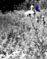
butterflyby ZenjohnComment by metoecus: I love the composition but the lighting and colors seem a little flat. Sharper focus and higher contrast would improve this image. |
| Photographer found comment helpful. |
| 01/15/2006 02:05:45 PM |
|
| Photographer found comment helpful. |
| 01/15/2006 08:26:37 AM |
butterflyby ZenjohnComment by Pug-H: I think this is a bit overdone. A butterfly's body wouldn't be the same colour as is wings... (and I think selective desaturation is a bit of a cop-out for this challenge). |
| Photographer found comment helpful. |
| 01/15/2006 01:15:06 AM |
butterflyby ZenjohnComment by C-town driver: Very nice use of selective desat. IMHO I would have liked to see the butterfly weighted heavier in the composition. Just my opinion, nice shot nonetheless |
| Photographer found comment helpful. |
| 01/14/2006 10:50:19 PM |
butterflyby ZenjohnComment by banmorn: The butterfly is a nice color but it is too small in the image to really make an impact for me. |
| Photographer found comment helpful. |
| 01/13/2006 11:52:55 PM |
butterflyby ZenjohnComment by ShotMD: Very nice selective desat... I also like the contrast provided by the b/w portion. |
| Photographer found comment helpful. |
Home -
Challenges -
Community -
League -
Photos -
Cameras -
Lenses -
Learn -
Help -
Terms of Use -
Privacy -
Top ^
DPChallenge, and website content and design, Copyright © 2001-2026 Challenging Technologies, LLC.
All digital photo copyrights belong to the photographers and may not be used without permission.
Current Server Time: 07/15/2026 03:30:48 PM EDT.