| Image |
Comment |
| 06/15/2006 06:19:45 AM |
|
 Photographer found comment helpful. Photographer found comment helpful. |
| 06/13/2006 10:59:40 PM |
|
| Photographer found comment helpful. |
| 06/13/2006 05:49:04 PM |
Box in the Sky [ reflections without mirrors II reshoot]by gocComment by ericwoo: Hey there from the Critique Club
Camera Work/Technical: Wonderful focus. The windows and corners are all very crisp and make for one of this image's major strengths.
Lighting: The lighting was a bit too harsh for this image. Looking at your settings, I think that it would have helped if you had cranked that aperture down a bit.
Composition/Content: The composition of this image is much stronger and better that the original submission. The lines and corners of the windows work very well to bring the viewer's eye up and into the frame, as well as hold interest.
My Opinion: While it is a far cry from the original, it is far better. Studying both images closely, I can't even make a relation between the two. However, this is a greatly improved image that scored pretty close to its potential.
Eric
|
| Photographer found comment helpful. |
| 06/13/2006 12:49:19 PM |
|
| Photographer found comment helpful. |
| 06/12/2006 04:28:32 PM |
|
| Photographer found comment helpful. |
| 06/12/2006 03:48:20 PM |
|
| Photographer found comment helpful. |
| 06/12/2006 02:30:44 PM |
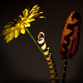
artificialby gocComment by ericwoo: Hey there from the Critique Club
First of all, congrats on your second highest scoring challenge entry to date.
Camera Work/Technical: Everything in the frame appears nicely focused, but I think that the post-processing is a little harsh. You finished with a very interestingly textured image, but I think some of your original shot info was lost.
Lighting: I think that your lighting here is near flawless and makes this image dramatic and powerful. You did a terrific hob with contrasting your highlights and shadows to project a warm, moody feeling.
Composition/Content: You also put together a very powerful composition. Both the flower and the lufa work very well as leading lines that draw the eye up and down both sides of the image. The lighting and the twirly thingie add very interesting texture that makes the eye want to see every little portion of the capture.
My Opinion: This one clearly meets the challenge very well. I think with a little less post-processing, you would have preserved some of the image detail, as well as pulled a little better score.
Eric
|
| Photographer found comment helpful. |
| 06/12/2006 09:26:28 AM |
|
| Photographer found comment helpful. |
| 06/12/2006 04:53:21 AM |
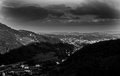
The Watcher 2by gocComment by Rankles: A good take on the challenge and a nice location. Maybe a little too much sky for the challenge. |
| Photographer found comment helpful. |
| 06/12/2006 02:43:36 AM |
|
| Photographer found comment helpful. |
Home -
Challenges -
Community -
League -
Photos -
Cameras -
Lenses -
Learn -
Help -
Terms of Use -
Privacy -
Top ^
DPChallenge, and website content and design, Copyright © 2001-2026 Challenging Technologies, LLC.
All digital photo copyrights belong to the photographers and may not be used without permission.
Current Server Time: 07/17/2026 10:28:43 PM EDT.


![Box in the Sky [ reflections without mirrors II reshoot]](https://images.dpchallenge.com/images_challenge/0-999/504/120/Copyrighted_Image_Reuse_Prohibited_341499.jpg)