| Image |
Comment |
| 12/23/2005 11:44:08 AM |
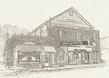
Buchanan Theatreby SJCarterComment by Makka: Did you go over the lettering at all in this shot. It maybe stands out a little too much for my liking. Would of been nice if it were broken up a little but still readable. |
 Photographer found comment helpful. Photographer found comment helpful. |
| 12/23/2005 11:43:14 AM |
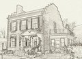
Harry's Houseby SJCarterComment by wavelength: I like this one very much, the placemnt of the house with the lamp appeals to me. I am usually a big fan of full color images, so the fact that I like this actually means something :o) |
| Photographer found comment helpful. |
| 12/23/2005 11:42:03 AM |
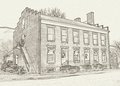
Wilson Warehouseby SJCarterComment by Makka: Wow! You've really achieved a great effect here. It does have a great old time appeal to it. I can understand the work on it would of taken a long time. Well done! |
| Photographer found comment helpful. |
| 12/23/2005 11:39:18 AM |
Wilson Warehouseby SJCarterComment by SDW: I think these are great. They remind me of the old postcards that was drawn in with no color. I think back in the early to mid 1800's. I think the effect has a great emotional and era feel but I would keep it old building that are in good condition. Doing that would give each photograph a great vintage look.
Great Work both on the taking the photographs and post processing. I really like picture one, two, and four because the effect seems to fit the subjects. I like picture three but the building looks to new for the processing used.
I hope this helped, and believe me you did a great job.
-SDW Message edited by author 2005-12-23 11:42:29. |
| Photographer found comment helpful. |
| 12/23/2005 11:37:59 AM |
|
| Photographer found comment helpful. |
| 12/23/2005 11:36:37 AM |
|
| Photographer found comment helpful. |
| 12/21/2005 09:18:57 AM |
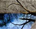
Divining Rodby SJCarterComment by CEJ: This is a beautiful shot! The colors in the reflection are incredible and the contrast between that and the far shore is exquisite! The 'divining rod' is excellent as well being the only true color tree. Very well done in my opinion. Shows a lot of creativity and thought. The composition is well done - ratio of subject to overall scene. Placement of the subject bothered me at first, but when you take in the whole shot and pair it with it's reflection, the impact is much stronger. Should have done much better, again my opinion. Well done! |
| Photographer found comment helpful. |
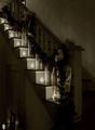
| 12/19/2005 10:52:35 AM |
Stairway to Heavenby SJCarterComment by SandyP: This is just beautiful. Unique in the browntones, which give it that nostalgic, old timey feel. I just love it. Not a 5.5 in my book for SURE! |
| Photographer found comment helpful. |
| 12/18/2005 09:29:18 PM |
Stairway to Heavenby SJCarterComment by backslash: I like the way the candles lead you up the stairs. Nice composition. The light at the lower left corner is a little distracting to me. Nice job. |
| Photographer found comment helpful. |
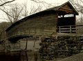
| 12/16/2005 02:04:01 PM |
Humpback Bridge IIby SJCarterComment by Ian-Andrew: I like this image but...
Love the curve of the planks and the rustic feel to it but somehow feel it's good but could have been great. I can see you have tried to keep the wall in the picture but feel an angle that brings out those wondeful curves would improve this image.
I like it though :o) |
| Photographer found comment helpful. |
Home -
Challenges -
Community -
League -
Photos -
Cameras -
Lenses -
Learn -
Help -
Terms of Use -
Privacy -
Top ^
DPChallenge, and website content and design, Copyright © 2001-2026 Challenging Technologies, LLC.
All digital photo copyrights belong to the photographers and may not be used without permission.
Current Server Time: 07/24/2026 10:29:21 PM EDT.