| Image |
Comment |
| 11/05/2006 12:16:31 AM |
|
 Photographer found comment helpful. Photographer found comment helpful. |
| 11/04/2006 08:01:34 PM |
|
| Photographer found comment helpful. |
| 11/04/2006 07:16:04 PM |
|
| Photographer found comment helpful. |
| 11/04/2006 07:13:46 PM |
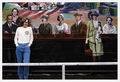
Dancersby MelethiaComment by sherpet: This is just excellent.....I really love this one such a lot, and now adding it to my favorites..... |
| Photographer found comment helpful. |
| 11/04/2006 06:59:54 PM |
|
| Photographer found comment helpful. |
| 11/04/2006 04:56:39 AM |
|
| Photographer found comment helpful. |
| 11/04/2006 04:53:06 AM |
|
| Photographer found comment helpful. |
| 11/03/2006 10:18:55 PM |
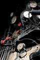
Stained Glassby MelethiaComment by SJCarter: WOW!!! This is terrific! Love the vivid color tones and crisp focus. Beautiful bokeh too. Well done! |
| Photographer found comment helpful. |
| 11/03/2006 08:20:01 PM |
Moon and starsby MelethiaComment by L1: Interesting capture...the stars were hidden and I didn't notice them at first glance. Good sharpness and exposure control. :) |
| Photographer found comment helpful. |
| 11/03/2006 02:20:18 AM |
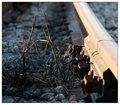
Days gone byby MelethiaComment by mist: I voted this up as a 6 in the challenge, quite liked the feel of it. The detail is great, and the red colours add a bit of punch to it. So why did it not score higher? If I had to guess, I'd say it's probably because you can't immediately see a train or railroad in the photo that some folk have looked at it and gone "Duh? does not compute" and voted it their mandatory 3/4 because they don't understand. I mean, for me, this is obviously a train. It's in a train challenge, and is full of dials and whizzamys. Clearly it's a train cab. Even if it's not, surely you'd give it the benefit of the doubt and vote as if it is? It's not really a large logical leap of faith is it? sigh.
Otherwise, who can say? |
| Photographer found comment helpful. |
Home -
Challenges -
Community -
League -
Photos -
Cameras -
Lenses -
Learn -
Help -
Terms of Use -
Privacy -
Top ^
DPChallenge, and website content and design, Copyright © 2001-2026 Challenging Technologies, LLC.
All digital photo copyrights belong to the photographers and may not be used without permission.
Current Server Time: 06/25/2026 12:48:34 PM EDT.