| Image |
Comment |
| 03/11/2008 01:29:35 PM |
|
 Photographer found comment helpful. Photographer found comment helpful. |
| 03/11/2008 03:40:52 AM |
Jailedby MelethiaComment by supernaught: What a beautiful way to capture an otherwise average subject! Colors and technicals are goog, but I would have liked to see the left cripped more. Nice photo! I give a 6. |
| Photographer found comment helpful. |
| 03/11/2008 03:38:58 AM |
Purple, complementedby MelethiaComment by supernaught: Fits the theme well, average subjects though. Great colors, but if all the flowers had been purple, this would have popped more. Focal is good, but overall an average shot. A 5. |
| Photographer found comment helpful. |
| 03/11/2008 03:36:44 AM |
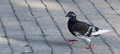
Struttin'by MelethiaComment by supernaught: I can really see the bird continuing it's journey just by looking at this. But bland colors and an average subject keep this a 5. |
| Photographer found comment helpful. |
| 03/11/2008 03:35:29 AM |
Cyclamen Leavesby MelethiaComment by supernaught: Hm. A bit over exposed, and unbalanced light on the leaf patterns hurts here. Fix those, and this is a fine entry into the challenge, but technicals send this below average to a 4 for me. |
| Photographer found comment helpful. |
| 03/11/2008 03:33:11 AM |
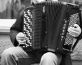
Classical with a twistby MelethiaComment by supernaught: What a nice B&W exposure! I can almost hear the accordion, and the technicals are spot on, save a little over exposure in some portions. The striking textures and detail on the accordion boost this up 2 points from mediocrity to a 7. I like looking at this capture! |
| Photographer found comment helpful. |
| 03/11/2008 03:30:23 AM |
Orbital neonby MelethiaComment by supernaught: A visually striking "arthouse" picture, but oversaturated to the point of noise in the gradient reds. I really like the embellished intensity of the light - but an otherwise average shot. I'd give this a 5. |
| Photographer found comment helpful. |
| 03/11/2008 03:16:58 AM |
The Bread Guyby MelethiaComment by supernaught: I'm only seeing "supermarket guy" here, and the bread seems like an afterthought, though it fits the theme well enough. The colors seem a t-i-n-y bit over saturated, as the hues in his face are a bit overdone. I wouldn't call this a candid, since he's way to happy to pose here. I'd give this a 5.
|
| Photographer found comment helpful. |
| 03/11/2008 03:13:26 AM |
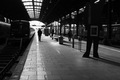
Outboundby MelethiaComment by supernaught: Nice depiction of a lazy subway station. Fits the theme very well, but way too dark, unless you were going for silouhettes? Alas, I can't apply that to my score If you were, because this is just too dark, and too bright in the background to the point that my eyes hurt looking at it! lol. More balancing would have made this a fine black and white photo. I'd give this a 5. |
| Photographer found comment helpful. |
| 03/11/2008 03:08:46 AM |
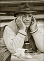
Tea for Oneby MelethiaComment by supernaught: An ordinary capture, with some technicals that are distracting - such as the noisy building in the background. Could have popped more if it were darker, and a bit sharper. Some over exposure on the teacup distracts me somewhat. Fits the challenge theme in mediocre fashion, but doesn't say "Led Zepplin" to me. I'd give this a 5. |
| Photographer found comment helpful. |
Home -
Challenges -
Community -
League -
Photos -
Cameras -
Lenses -
Learn -
Help -
Terms of Use -
Privacy -
Top ^
DPChallenge, and website content and design, Copyright © 2001-2026 Challenging Technologies, LLC.
All digital photo copyrights belong to the photographers and may not be used without permission.
Current Server Time: 08/18/2026 04:13:18 PM EDT.