| Image |
Comment |
| 07/11/2005 03:37:55 PM |
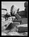
The Thinkerby KaveyComment by admart01: B/W Club!
Can't add much more than Rob's comments. The vacant, gray sky feels like a void with all the angular forms and frame-filling detail. Maybe it is the thick, black border that's highlight that for me?? I find the shadows and their play amongst the rocks to be very interesting -- b&w strengthens that element. |
 Photographer found comment helpful. Photographer found comment helpful. |
| 07/11/2005 03:32:34 PM |
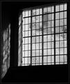
Old Panesby KaveyComment by admart01: B/W Club!
(ignoring all the great elements of this shot - compostion, artistic feel, etc. in favor of B&W focus) :)
This shot really works in B&W - it keeps it simple. The lack of color forces the attention on the light (isn't that one of the best things about windows) and shadows. The boost of contrast drops a bit of detail in favor of cleaner lines between the shapes further highlighting the geometric and architechtural quality in the shot. |
| Photographer found comment helpful. |
| 07/11/2005 02:57:55 PM |
The Thinkerby KaveyComment by muckpond: B/W Club!
great shot and great title. the composition is good, but i would like to see deeper tones throughout -- it looks a little gray. i think having the solid black border so near the photo makes it look plain as well. making the shadows a bit darker and the highlights an oh-so-little-bit lighter would make the formation itself "pop" more.
i took the liberty of doing a few contrast adjustments. i'm not saying that my version is "better," but i think it more accurately describes what i'm talking about more than words could:
 |
| Photographer found comment helpful. |
| 07/11/2005 02:48:48 PM |
Old Panesby KaveyComment by muckpond: B/W Club!
i really enjoy the lines in this shot. it DOES look like the reflection is cut off to the left, but i understand why. i think a bit of a wider shot showing the reflection tapering off might help "explain" that to the viewer.
i don't know what's under the window, but i keep finding myself wondering. and i like the texture on the glass but would like to make it a bit more prominent. at this point in time, i can't see if it's etched or if there's like a grassy hill back there or what. and it seems rather gray. i think you could bump up the contrast a bit in the window to make the whites "whiter."
overall i love a good window shot, which this is. |
| Photographer found comment helpful. |
| 07/11/2005 10:41:57 AM |
The Thinkerby KaveyComment by Truegsht: B/W Mentor Class
Great shot to me...can't say much more. If it were a little sharper right in the middle...would be really great. Message edited by author 2005-07-11 10:54:19. |
| Photographer found comment helpful. |
| 07/11/2005 10:41:19 AM |
Old Panesby KaveyComment by Truegsht: B/W Mentor Class
Everything looks great to me, except for not being able to see a little more detail under the window pane. A little more detail would have made this really stand out. It is a little blown out on the bottom left corner of the glass. Message edited by author 2005-07-11 10:54:35. |
| Photographer found comment helpful. |
| 07/11/2005 10:29:54 AM |
The Thinkerby KaveyComment by aboutimage: This is a great photo. Almost required a "triple take". The more I look at it, the more I see "the Thinker". I don't have anything terribly critical to say about it, as I think it looks good and presents no significant visual distractions. Great job. |
| Photographer found comment helpful. |
| 07/03/2005 03:44:31 PM |
The Thinkerby KaveyComment by L1: This is fascinating... I'd love to see this place in person some day! Really nice textures and shapes in this image...the one distraction is the shadow coming across the bottom right diagonal, but it doesn't detract from the image. I think the title is perfect. Well done! :) |
| Photographer found comment helpful. |
| 07/02/2005 09:23:55 AM |
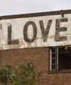
101_0158.jpgby KaveyComment by Jutilda: I "LOVE" this. Very abstract and simple. Did you try it in black and white? It might even have more punch that way. |
| Photographer found comment helpful. |
| 06/22/2005 06:41:58 PM |
Octoberby KaveyComment by kevrobertson: LOVE this shot.
I was one of your 3 tens.
I am really surprised that this didn't score higher in the challenge. The colours are great. The composition is good and the focus is spot on.
Love it.
Kev |
| Photographer found comment helpful. |
Home -
Challenges -
Community -
League -
Photos -
Cameras -
Lenses -
Learn -
Help -
Terms of Use -
Privacy -
Top ^
DPChallenge, and website content and design, Copyright © 2001-2026 Challenging Technologies, LLC.
All digital photo copyrights belong to the photographers and may not be used without permission.
Current Server Time: 07/15/2026 03:42:46 PM EDT.