| Author | Thread |
|
|
07/14/2005 11:11:53 AM |
|
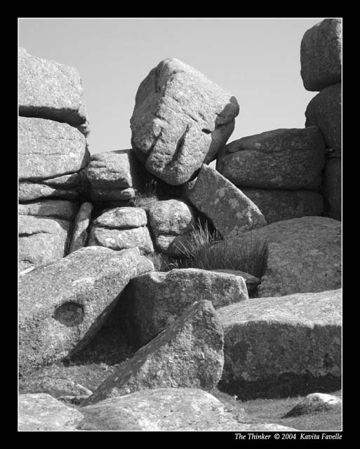
This one is "bland" for lack of a better work. Not enough real contrast as the tonal range seems too narrow. |
|
 Photographer found comment helpful. Photographer found comment helpful. |
|
|
07/11/2005 06:07:47 PM |
B/W Club
I'm going to agree with muckpond on this. Your image is great, but kind of... the same all over, if that makes sense. I looked at mp's version, and I do like that there is more a difference within the blacks, whites and greys. More definition. However, I'm not sure I like the starkness of the shadows.
I'll come back to this one, after I finish my exams tonight, see if I can show what I mean.
-Christine
|
|
| Photographer found comment helpful. |
|
|
07/11/2005 03:37:55 PM |
B/W Club!
Can't add much more than Rob's comments. The vacant, gray sky feels like a void with all the angular forms and frame-filling detail. Maybe it is the thick, black border that's highlight that for me?? I find the shadows and their play amongst the rocks to be very interesting -- b&w strengthens that element. |
|
| Photographer found comment helpful. |
|
|
07/11/2005 02:57:55 PM |
B/W Club!
great shot and great title. the composition is good, but i would like to see deeper tones throughout -- it looks a little gray. i think having the solid black border so near the photo makes it look plain as well. making the shadows a bit darker and the highlights an oh-so-little-bit lighter would make the formation itself "pop" more.
i took the liberty of doing a few contrast adjustments. i'm not saying that my version is "better," but i think it more accurately describes what i'm talking about more than words could:
 |
|
| Photographer found comment helpful. |
|
|
07/11/2005 10:41:57 AM |
B/W Mentor Class
Great shot to me...can't say much more. If it were a little sharper right in the middle...would be really great.
Message edited by author 2005-07-11 10:54:19. |
|
| Photographer found comment helpful. |
|
|
07/11/2005 10:29:54 AM |
|
This is a great photo. Almost required a "triple take". The more I look at it, the more I see "the Thinker". I don't have anything terribly critical to say about it, as I think it looks good and presents no significant visual distractions. Great job. |
|
| Photographer found comment helpful. |
|
|
07/03/2005 03:44:31 PM |
|
This is fascinating... I'd love to see this place in person some day! Really nice textures and shapes in this image...the one distraction is the shadow coming across the bottom right diagonal, but it doesn't detract from the image. I think the title is perfect. Well done! :) |
|
| Photographer found comment helpful. |
|
|
06/08/2005 07:34:58 PM |
|
Well spotted! Great title that really compliments the picture and makes you take a closer look :) |
|
| Photographer found comment helpful. |
Home -
Challenges -
Community -
League -
Photos -
Cameras -
Lenses -
Learn -
Help -
Terms of Use -
Privacy -
Top ^
DPChallenge, and website content and design, Copyright © 2001-2026 Challenging Technologies, LLC.
All digital photo copyrights belong to the photographers and may not be used without permission.
Current Server Time: 07/03/2026 10:45:24 PM EDT.