| Image |
Comment |
| 06/09/2006 04:53:21 AM |
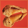
Naturally Textured - Take IIby DigiFotoBuddyComment by Arancha: Way better macro than the original, good light and reflection. I prefer the black background though. You did a good job with this second take, and if I gave you a 7 the first time, now you got a 9. Good job!!! :-) |
 Photographer found comment helpful. Photographer found comment helpful. |
| 06/07/2006 09:32:43 PM |
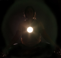
Enlighteningby DigiFotoBuddyComment by Rebecca: Hi Shailesh!
I definitely think you suffered from the problem that truth and perception are not one in the same. Without knowing how this was done, it does look like at least two light sources. Knowing after the fact how it was done, it's truly ingenious, but we don't know that during voting.
As a photograph in general, some things I would do are to let the model's hair down to spill over her shoulders, put her in a black shirt to match the background, and add a reflector in front to reflect light onto her face and hands. I'd love to see the serene meditative expression on her face, and her mudhras currently are lost in the dark. |
| Photographer found comment helpful. |
| 06/07/2006 09:29:50 PM |
|
| Photographer found comment helpful. |
| 06/07/2006 03:55:39 PM |
|
| Photographer found comment helpful. |
| 06/07/2006 10:44:23 AM |
Enlighteningby DigiFotoBuddyComment by emorgan49: I think this image also could have suffered from "voter-monitor-calibration-syndrome" Not all monitors are calibrated equally and dark images often suffer. I just looked at this on a work monitor and it is so dark I can hardly make out the person. The spot of light seems very bright. |
| Photographer found comment helpful. |
| 06/07/2006 09:33:52 AM |
Enlighteningby DigiFotoBuddyComment by front_element: Hi shaileshivyas
I think this was a well executed shot technically and shows that you have the technique 100% covered.
The low vote may have something more to do with the image itself rather than the DNMC element. The question that's worth asking is “would I have entered this image into a different challenge?” In other words, how strong do you feel the image is?
For me the subject is difficult to make out (I do have a calibrated monitor) and the 'meaning' is unclear. Some reflectors close to the lens would have thrown light back onto the model and given her more definition. A title something like 'The Inner Light' may have helped voters engage with the image more.
This is offered as constructive and I hope you don't take offence at my comments.
|
| Photographer found comment helpful. |
| 06/07/2006 08:33:29 AM |
|
| Photographer found comment helpful. |
| 06/06/2006 06:53:41 PM |
|
| Photographer found comment helpful. |
| 06/06/2006 05:44:21 PM |
Enlighteningby DigiFotoBuddyComment by jneria: This looks like their are multiple light sources. Also the sphere of light, i think would look better if it were more diffuse. |
| Photographer found comment helpful. |
| 06/06/2006 04:42:38 PM |
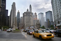
City Architectureby DigiFotoBuddyComment by fotomann_forever: ::: Greetings from Critique Club :::
Hi, as requested, here is an indepth critique of your submission.
First Impression - the most important one:
Overall, it seems to be more of a cityscape shot than an architecture shot to me. But, I do like it as a cityscape.
Composition:
A typical architecture shot should draw ones eye to the details of a building. This really has more of a composition that one would see in a subjectless landscape. Compositionally, the yellow cab in the foreground becomes more of a subject than the buildings.
Subject:
The way you have composed this shot puts more emphasis on the taxi in the foreground than the architecture of the city.
Technical (Color, focus, and light):
Focus looks sharp. Color and lighting are both nice. Nothing wrong with the technicals.
To grow its vote?:
Meet the challenge in the eyes of more voters. If the challenge had been cityscapes this shot would have done really well. But, just seems out of place in this challenge.
Summary:
This shot does show competence on the part of the photographer and overall is a good shot.
Hope to see more from you soon,
Leroy |
| Photographer found comment helpful. |
Home -
Challenges -
Community -
League -
Photos -
Cameras -
Lenses -
Learn -
Help -
Terms of Use -
Privacy -
Top ^
DPChallenge, and website content and design, Copyright © 2001-2026 Challenging Technologies, LLC.
All digital photo copyrights belong to the photographers and may not be used without permission.
Current Server Time: 07/19/2026 01:08:10 PM EDT.