| Author | Thread |
|
|
07/13/2006 10:53:26 PM |
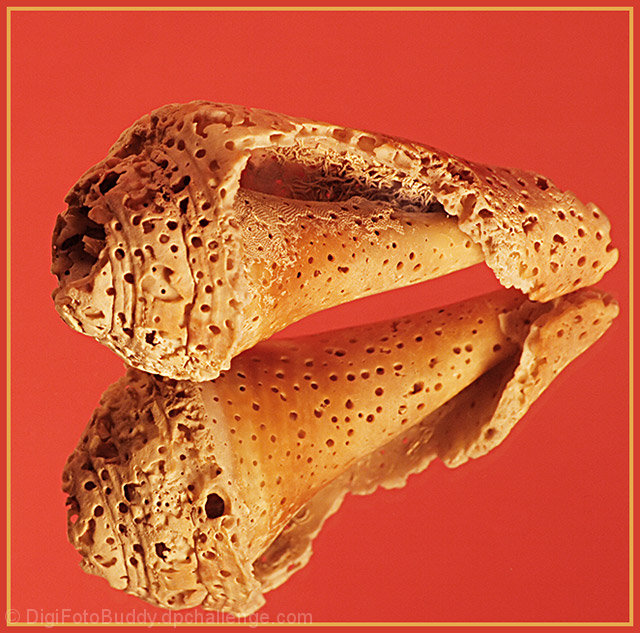
hey, shailesh. comparing this shot with your previous one, i must say this one's definitely an improvement. It's better compositionally.
However, for some strange reason, it looks a bit oversharpened yet oof. Also, the red bg's a bit painful to look at.
A bluey-greeney or blackey bg would've worked better, IMO.
Good job on this, though! |
|
 Photographer found comment helpful. Photographer found comment helpful. |
|
|
06/23/2006 04:07:27 AM |
Greetings from CTP2
I think you improved this shot in the wow factor category. It no longer looks like a snapshot compared to the other one. It's bold and in your face. However, there are some things I prefer in the original. For example, the sharpness. I think you got it right in the original but here it feels oversharpened. Maybe I'm wrong but this type of texture shouldn't look that sharp, IMO. The other thing is the background color. I liked the black background better than this bright red version, which just makes the image seem too bright in general. Still it commands your attention better than the original so good job improving that. |
|
| Photographer found comment helpful. |
|
|
06/21/2006 01:10:26 AM |
Hi Shailesh-
Don't hit me, but I like the original photo much better. I think that red is a very very difficult color to photograph, since it tends to oversaturate very easily, and it overwhelms the natural color variations of the shell. The original looks much cleaner and much sharper, where the retake lacks that nice sharp quality. |
|
| Photographer found comment helpful. |
|
|
06/19/2006 01:57:10 PM |
Hello from Álex, CTP MkII
First Impression: wonderful texture
Composition: very nice simmetry
Subject: quite interesting shell
Technical: good focus, nice lighting (maybe a little dark on the upper left of the shell.
Improvement: the BG in red is a bit too strong, I prefer the black one
Summary: very good shot. It seems clear you move very well on the studio environment
Álex
|
|
| Photographer found comment helpful. |
|
|
06/15/2006 10:24:44 AM |
CTP2 Gunnsi
First impression:
Good texture, good focus and frame. Placement of subject also good.
What can you do better?
Change the red colour to something more like the sea.
This is a major improvement on your previous entry. |
|
| Photographer found comment helpful. |
|
|
06/13/2006 07:59:09 AM |
Hi!
I really think this is a better image:)I don't mind the background colour, not to sure on the boder though... |
|
| Photographer found comment helpful. |
|
|
06/13/2006 03:42:22 AM |
From the Critique Club :
Hi Shailesh ,
Comparing with  , I think that Naturally Textured - Take II fits much better a Textures' challenge. , I think that Naturally Textured - Take II fits much better a Textures' challenge.
The focus is great on the shell and on its reflection , really much better ; the details are very sharp.
Personally I prefer the first background , it's more neutral , maybe even less appealling at a first sight but orange/redish and sand color don't work too well together (imho).
Noise is visible too in this version and about the border , I have noticed that many voters/viewers generally don't appreciate borders.
Lighting is good , better than in the first one (no strong shadows , more natural look).
I agree with Neuferland you truly have improved your shot !
Please feel free to email me about this critique.
Mambe |
|
| Photographer found comment helpful. |
Comments Made During the Challenge  |
|
|
06/12/2006 06:33:20 PM |
|
Shail!!!! Nice! Very nice! HUGE improvement over the original. Focused on one shell, not three, better color, nice pop to the shot. Only two little things bother me, the shell looks a tad oversharpened and the orange background. I would have stuck with black but that's me. I would have given the original a 5, but this one gets an 8 for overall improvement and effort! ;) |
|
| Photographer found comment helpful. |
|
|
06/10/2006 12:16:57 AM |
|
Very well photographed...good colours. |
|
| Photographer found comment helpful. |
|
|
06/09/2006 04:53:21 AM |
|
Way better macro than the original, good light and reflection. I prefer the black background though. You did a good job with this second take, and if I gave you a 7 the first time, now you got a 9. Good job!!! :-) |
|
| Photographer found comment helpful. |
|
|
06/07/2006 09:29:50 PM |
|
"WOW", this just "POPS"..... |
|
| Photographer found comment helpful. |
|
|
06/06/2006 07:48:59 AM |
|
the redish color is too distracting to me |
|
| Photographer found comment helpful. |
Home -
Challenges -
Community -
League -
Photos -
Cameras -
Lenses -
Learn -
Help -
Terms of Use -
Privacy -
Top ^
DPChallenge, and website content and design, Copyright © 2001-2026 Challenging Technologies, LLC.
All digital photo copyrights belong to the photographers and may not be used without permission.
Current Server Time: 06/28/2026 02:11:35 PM EDT.