| Image |
Comment |
| 06/09/2006 06:39:05 AM |
|
| 06/08/2006 10:31:54 PM |
|
| 06/08/2006 01:27:17 PM |
|
| 06/08/2006 09:28:03 AM |
|
| 06/08/2006 03:53:14 AM |
|
| 06/08/2006 12:19:05 AM |
|
| 06/07/2006 09:22:34 PM |
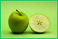
One and a half Apple's a Dayby djtj1980Comment by Jutilda: I like the idea of this image. It's clear and concise but I think the minty green of the border doesn't add to the overall quality of it. To me, I find it distracting and in a different color value than the more lime/yellow green of the granny smith apple and background. I would like to have it less centered with some more negative space. I prefer that the subject not be in the middle like a target's bullseye. It works sometimes, and it isn't the worst thing in the world, but I think it would be more artful if the apple and half were to the left with more area to the right and in the foreground. |
| 06/07/2006 08:27:23 PM |
|
| 06/07/2006 12:01:16 PM |
|
| 06/07/2006 10:22:36 AM |
One and a half Apple's a Dayby djtj1980Comment by SJCarter: This is such a nice shot - and that border is just awful. Normally a small border doesn't bother me, but the color of this one completely clashes with the rest of the composition IMHO. I'm sorry, but without it I would score this a solid 7 - it's a technically strong and appealing image. With it, I'm struggling to give it a 5. |
Home -
Challenges -
Community -
League -
Photos -
Cameras -
Lenses -
Learn -
Help -
Terms of Use -
Privacy -
Top ^
DPChallenge, and website content and design, Copyright © 2001-2026 Challenging Technologies, LLC.
All digital photo copyrights belong to the photographers and may not be used without permission.
Current Server Time: 07/17/2026 01:39:36 AM EDT.