| Author | Thread |
Comments Made During the Challenge  |
|
|
06/12/2006 12:31:35 AM |
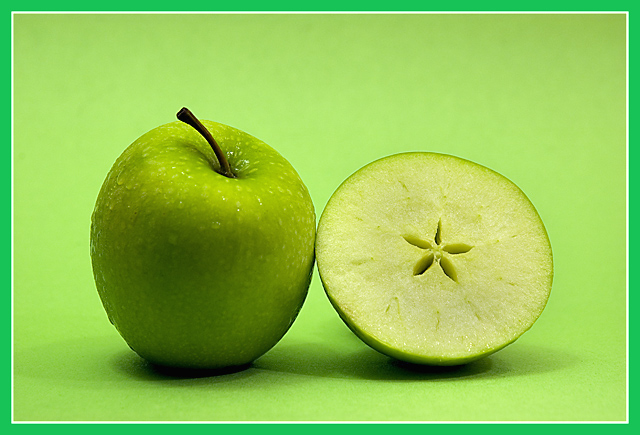
Nice tones of green
but i dont like the border -1 for that |
|
|
|
06/11/2006 10:23:09 PM |
|
|
|
06/11/2006 11:13:06 AM |
|
I really think the border is more of a distraction than an enhancement. |
|
|
|
06/11/2006 06:06:24 AM |
|
|
|
06/10/2006 04:20:40 PM |
|
Solid black border may have been a better choice, this color of green fights against the natural yellow/green of the fruit. I really like the design in the half and the background color works well. |
|
|
|
06/10/2006 01:26:37 AM |
|
I like the shot,the lighting, but on this one I definitely don't like the border. |
|
|
|
06/09/2006 12:42:26 PM |
|
great detail! makes me hungry. |
|
|
|
06/09/2006 06:39:05 AM |
|
I wouldn't want half a doctor visiting me either! |
|
|
|
06/08/2006 10:31:54 PM |
|
both image and apples appear very crisp-7- |
|
|
|
06/08/2006 01:27:17 PM |
|
Don't like the dark green border - Do like the unusual cut on the apple that shows the seed spaces. |
|
|
|
06/08/2006 09:28:03 AM |
|
there has been quite a few of these in this challenge, but you got what the others couldn't. Nice job. GL. |
|
|
|
06/08/2006 03:53:14 AM |
|
One of the better apple images, in this challenge... |
|
|
|
06/08/2006 12:19:05 AM |
|
almost perfect...ok it's just a great image! 9 |
|
|
|
06/07/2006 09:22:34 PM |
|
I like the idea of this image. It's clear and concise but I think the minty green of the border doesn't add to the overall quality of it. To me, I find it distracting and in a different color value than the more lime/yellow green of the granny smith apple and background. I would like to have it less centered with some more negative space. I prefer that the subject not be in the middle like a target's bullseye. It works sometimes, and it isn't the worst thing in the world, but I think it would be more artful if the apple and half were to the left with more area to the right and in the foreground. |
|
|
|
06/07/2006 08:27:23 PM |
|
Lose the border. It's a clashing shade and distracting from the image. |
|
|
|
06/07/2006 12:01:16 PM |
|
Nice clean and simple shot. |
|
|
|
06/07/2006 10:22:36 AM |
|
This is such a nice shot - and that border is just awful. Normally a small border doesn't bother me, but the color of this one completely clashes with the rest of the composition IMHO. I'm sorry, but without it I would score this a solid 7 - it's a technically strong and appealing image. With it, I'm struggling to give it a 5. |
|
Home -
Challenges -
Community -
League -
Photos -
Cameras -
Lenses -
Learn -
Help -
Terms of Use -
Privacy -
Top ^
DPChallenge, and website content and design, Copyright © 2001-2026 Challenging Technologies, LLC.
All digital photo copyrights belong to the photographers and may not be used without permission.
Current Server Time: 06/29/2026 01:21:09 PM EDT.