| Image |
Comment |
| 11/10/2004 04:33:24 PM |
|
 Photographer found comment helpful. Photographer found comment helpful. |
| 11/10/2004 08:51:49 AM |
Soap and Waterby TranquilComment by Konador: I think this would work better in B&W as there a lot of unpleasant mixtures of colours which distract from the photo. |
| Photographer found comment helpful. |
| 11/09/2004 04:50:01 AM |
|
| Photographer found comment helpful. |
| 11/08/2004 08:31:54 PM |
|
| Photographer found comment helpful. |
| 11/08/2004 01:01:37 PM |
|
| Photographer found comment helpful. |
| 11/08/2004 11:59:43 AM |
Subjectiveby TranquilComment by OneSweetSin: Critique Club
I really do like this...it has a very mysterious feeling to it. It grabs your attention and you find yourself searching it for details and yet they are very few and limited.
The lighting is extremely good and adds to the entire composition. It really is a very strong entry and I feel it should have done better. |
| Photographer found comment helpful. |
| 11/08/2004 11:40:39 AM |
The Moveby TranquilComment by myqyl: Soft focus from depth of field on the front pieces doesn't add much to me... I like the "hand out of the darkness"... The knight is being moved, it only has one square it can go to (kb3), so I'm not sure I see the "indecision" here...But that's just me, and what do I know? :) |
| Photographer found comment helpful. |
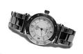
| 11/08/2004 07:24:43 AM |
Esquire Swiss - Decemberby TranquilComment by LalliSig: IMO this would look better in portrait mode, 90 degrees clockwise because I just cant help but strain my neck to look at it from that angle. Very well done though, nice lighting, no highlights on the watch itself and soft shadows and that´s not easy to pull off. |
| Photographer found comment helpful. |
| 11/07/2004 08:23:00 PM |
Kojo's Story of Hopeby TranquilComment by OneSweetSin: Critique Club
Excellent composition here good lighting and detail. Your problem as you have stated yourself is it is very weak in saying poverty. There just isn't enough here to know that it is a poverty stricken area or child.
I will though again say excellent composition...just stay closer to the theme of the challenge. |
| Photographer found comment helpful. |
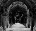
| 11/07/2004 08:20:14 PM |
Lines of Perceptionby TranquilComment by OneSweetSin:
Nice photo with a gothic feel to it. I think you could have made a much stronger image by showing more artifacts of the structure There is only a small area of it that is well lit and it grabs my attention to look for more details in the columns. Message edited by HBunch - Removed Critique Club status. |
| Photographer found comment helpful. |
Home -
Challenges -
Community -
League -
Photos -
Cameras -
Lenses -
Learn -
Help -
Terms of Use -
Privacy -
Top ^
DPChallenge, and website content and design, Copyright © 2001-2026 Challenging Technologies, LLC.
All digital photo copyrights belong to the photographers and may not be used without permission.
Current Server Time: 07/19/2026 02:27:22 AM EDT.