| Image |
Comment |
| 05/08/2004 08:49:15 AM |
FIRE!by kevrobertsonComment by banmorn: simple, like the orientation and but would definitely have the triangle to have been perfectly symmetrical. |
 Photographer found comment helpful. Photographer found comment helpful. |
| 05/07/2004 07:56:35 PM |
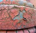
Rust (Closeup)by kevrobertsonComment by beckettboots: I love the texture of this, the depth of the flakes of old paint and the rust beneath. The framing is good with a nice sense of composition and dof. |
| Photographer found comment helpful. |
| 05/07/2004 11:30:28 AM |
|
| 05/06/2004 12:15:33 AM |
|
| Photographer found comment helpful. |
| 05/05/2004 11:55:13 PM |
|
| 05/05/2004 04:58:22 PM |
|
| Photographer found comment helpful. |
| 05/05/2004 04:04:30 PM |
Rust (Closeup)by kevrobertsonComment by melismatica: One of the better close-ups of rust I've seen in this challenge. Why? Lots of detail and texture. Harmonizing colors. No distracting background due to nice tight framing. |
| Photographer found comment helpful. |
| 05/05/2004 12:24:02 PM |
Rust (Closeup)by kevrobertsonComment by whagerbaumer: This appears to peeling paint with rust forming behind. I do not find it very appealing. Maybe If the shot were just of the center ninth of the photo. |
| Photographer found comment helpful. |
| 05/04/2004 05:05:28 PM |
FIRE!by kevrobertsonComment by redmoon: It looks too much like a flag to be an abstract! i know it's NOT a flag, but it looks too much like what it isn't to not be, from my point of view. It's a very modernist piece of art, which i'm sure galleries would love. But is it really photography? I mean, the only real slight flaw is loss of pure white in the top right. Paradoxically, for some thing so simple and comprising of only two colours, this is the hardest image one to vote on this week. Is it too abstract? For art, 8. For a photo - 2.5. That's an average of, oh, about 4.5. 5 it is. dang it, 6, coz i DO like it. |
| Photographer found comment helpful. |
| 05/04/2004 01:24:00 PM |
|
| Photographer found comment helpful. |
Home -
Challenges -
Community -
League -
Photos -
Cameras -
Lenses -
Learn -
Help -
Terms of Use -
Privacy -
Top ^
DPChallenge, and website content and design, Copyright © 2001-2026 Challenging Technologies, LLC.
All digital photo copyrights belong to the photographers and may not be used without permission.
Current Server Time: 07/17/2026 11:08:12 AM EDT.