| Image |
Comment |
| 05/13/2004 01:25:28 AM |
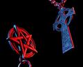
The Exorcistby labudsComment by jzoss: opposites: yes, compelling: not so much. Lacks a strong "focal point", and neither icon is strong enough to really catch the eye on its own. Like the lighting, though. Especially the red/blue highlights. |
| 05/12/2004 11:43:16 PM |
|
| 05/12/2004 10:47:41 PM |
The Exorcistby labudsComment by TabbyCat: This is great! I love how you picked the colors (red versus blue) and represented them accordingly. Very nice highlighting. The black background is pleasingly solid, though there's a bit too much of a black area above the pentagram (as compared to the area below the cross). If symmetry was your intention, probably would be better to move the pentagram up a bit. Then the negative space would be balanced. Just my two cents. Sharp and wonderfully done! :-) |
| 05/12/2004 05:37:37 PM |
|
| 05/12/2004 02:01:38 PM |
The Exorcistby labudsComment by ExoticChaos: The pentagram (pentacle) is not an evil symbol. Each point on the star represents something. Wicca uses the pentacle as their symbol and it's not evil. I do take offense because most people just assume its a symbol of the devil and satanic worship. A little reading up on the pentagram can tell you how treasured it is. Sighhh, movies have really desecrated it. Anyway, on to the technical aspects of the photo. I like the colors very much, the red and blue are saturated perfectly. I like how the cross reflects some red, and the pentacle reflects some blue. Not sure I like the crop too much. I'll have to come back to this one later in the challenge to comment more. *Ok* I'm back. After taking some time looking at the image again, I have decided I do like the crop. There is equal space between both symbols and the side of the image and also from top to bottom. I can't rate this low because I don't like how you used the pentacle. That is personal preference and not what the voting is about. So I will rate it just on the technical aspects. I've changed my vote and given you a 7. |
| 05/12/2004 01:42:02 PM |
|
| 05/12/2004 01:23:15 PM |
The Exorcistby labudsComment by L1: Nice shot. Fits challenge well; I like the lighting and the composition. It may be hard for some viewers to take, but it really does justice to the challenge instructions. Good job. |
| 05/12/2004 05:05:47 AM |
|
| 05/11/2004 11:13:48 PM |
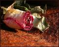
Dry Rusted Loveby labudsComment by banmorn: Now when you see this comment and who it is from you may be surprised to see that I am writing that the flower adds absolutely nothing to this shot....the rust and the composition of it are really great and you just did not need to add the flower. A frest floser of a less clashing color might have worked better, but not as well as the rust by itself IMHO. |
| 05/11/2004 01:22:45 PM |
|
Home -
Challenges -
Community -
League -
Photos -
Cameras -
Lenses -
Learn -
Help -
Terms of Use -
Privacy -
Top ^
DPChallenge, and website content and design, Copyright © 2001-2026 Challenging Technologies, LLC.
All digital photo copyrights belong to the photographers and may not be used without permission.
Current Server Time: 07/21/2026 05:05:47 PM EDT.