| Image |
Comment |
| 05/23/2010 11:29:49 PM |
|
 Photographer found comment helpful. Photographer found comment helpful. |
| 05/21/2010 01:19:08 AM |
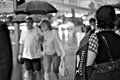
I "Heart" Londonby Covert_OddityComment by Ken: DOF and composition really work well here, I get feeling of viewing the people along with her. The lights makes for a great background. |
| Photographer found comment helpful. |
| 05/18/2010 10:11:29 PM |
|
| Photographer found comment helpful. |
| 05/17/2010 08:21:28 PM |
|
| Photographer found comment helpful. |
| 05/17/2010 11:42:44 AM |
|
| Photographer found comment helpful. |
| 05/15/2010 02:15:02 PM |
|
| Photographer found comment helpful. |
| 05/15/2010 08:26:12 AM |
|
| Photographer found comment helpful. |
| 05/15/2010 03:05:26 AM |
|
| Photographer found comment helpful. |
| 05/13/2010 03:44:29 AM |
Aligator Eyesby Covert_OddityComment by mrbig65: great idea,,,, cool one,,,,,,,, |
| Photographer found comment helpful. |
| 05/11/2010 06:47:05 AM |
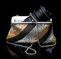
Vintage Chanelby Covert_OddityComment by spiritualspatula: Hello from the Critique Club-
I can’t decide what I think of your take on the challenge. I see the relation between your take (advertising) and the world of fashion. Anybody flipping through a fashion mag knows that 95% of the paper is advertising space, so the two are obviously inextricably linked. But is there a delineation? I’m not really sure, I guess that’s for the DNMC worriers to worry over.
You have very successfully created a nice advertising type image, regardless of which users find it to relate to the challenge. I enjoy your subdued approach, and your positioning is very nice and directed. It would have been nice to get the Paris to reflect fully as well, but raising the positioning a bit, but that’s a minor thing. Same thing with maintaining symmetry in the front of the right shoe and the background on the right as well. I’m not really sure what it is, but something about the look of the “antique tone” for lack of a better term makes the pure black portions of the background seem to have a violet tint. I don’t actually think its that color, but the contrast of the two colors fools the eye.
Nice entry, all nitpicks aside.
|
| Photographer found comment helpful. |
Home -
Challenges -
Community -
League -
Photos -
Cameras -
Lenses -
Learn -
Help -
Terms of Use -
Privacy -
Top ^
DPChallenge, and website content and design, Copyright © 2001-2026 Challenging Technologies, LLC.
All digital photo copyrights belong to the photographers and may not be used without permission.
Current Server Time: 06/22/2026 11:43:14 PM EDT.