| Author | Thread |
|
|
05/11/2010 06:47:05 AM |
Hello from the Critique Club-
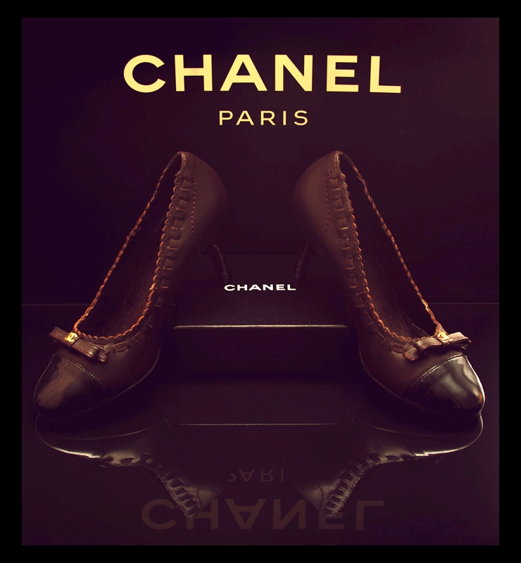
I can’t decide what I think of your take on the challenge. I see the relation between your take (advertising) and the world of fashion. Anybody flipping through a fashion mag knows that 95% of the paper is advertising space, so the two are obviously inextricably linked. But is there a delineation? I’m not really sure, I guess that’s for the DNMC worriers to worry over.
You have very successfully created a nice advertising type image, regardless of which users find it to relate to the challenge. I enjoy your subdued approach, and your positioning is very nice and directed. It would have been nice to get the Paris to reflect fully as well, but raising the positioning a bit, but that’s a minor thing. Same thing with maintaining symmetry in the front of the right shoe and the background on the right as well. I’m not really sure what it is, but something about the look of the “antique tone” for lack of a better term makes the pure black portions of the background seem to have a violet tint. I don’t actually think its that color, but the contrast of the two colors fools the eye.
Nice entry, all nitpicks aside.
|
|
 Photographer found comment helpful. Photographer found comment helpful. |
Comments Made During the Challenge  |
|
|
05/04/2010 09:25:43 PM |
|
Nice lighting - Just looks overall a little muddy though. |
|
| Photographer found comment helpful. |
|
|
05/04/2010 06:10:07 PM |
|
This is a strong image that I'd expect to see in a magazine. The only issue seems to be the side light on the right shoe (right side of the image) and how it's positioned slightly away from the camera, which make the image look less mirrored. I like the darkness and the textures of this image. |
|
| Photographer found comment helpful. |
|
|
04/30/2010 12:50:05 AM |
|
| Photographer found comment helpful. |
|
|
04/29/2010 09:10:39 PM |
|
I find the purple color cast to be displeasing to the eye - otherwise, nice shot! |
|
| Photographer found comment helpful. |
|
|
04/29/2010 11:40:14 AM |
|
The entire set-up is wonderful, and very professional-looking. I would have liked the shoes to have stood out more from the rest of all the brown. |
|
| Photographer found comment helpful. |
|
|
04/28/2010 09:16:23 PM |
|
Looks like an ad in a magazine. Good fashion shot. I like the reflection |
|
| Photographer found comment helpful. |
Home -
Challenges -
Community -
League -
Photos -
Cameras -
Lenses -
Learn -
Help -
Terms of Use -
Privacy -
Top ^
DPChallenge, and website content and design, Copyright © 2001-2026 Challenging Technologies, LLC.
All digital photo copyrights belong to the photographers and may not be used without permission.
Current Server Time: 06/28/2026 09:42:58 PM EDT.