|
|
|
Showing 1801 - 1810 of ~2067 |
| Image |
Comment |
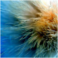
| 04/08/2009 12:48:56 AM | Another Proteaby banmornComment: Not voting because I'm in the challenge with you.
I really like this. The tiny filaments projecting from the bud are great, and the way the larger "bristles" are all curling away from the center is very neat. |  Photographer found comment helpful. Photographer found comment helpful. |
| 04/08/2009 12:45:07 AM | P R I C K L E by hotpastaComment: I'm not voting because I'm in the challenge with you, but if I wasn't, this would have received a high mark from me. The transition from warm to cool colors is excellent, and the way the points thrust into focus and fade off into nothingness is great. | | Photographer found comment helpful. |
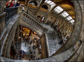
| 04/08/2009 12:30:27 AM | The Labyrinth by MAKComment: This is great. I second the escher nature of this. Great application of Photomatix too, neat but not overdone. | | Photographer found comment helpful. |
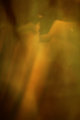
| 04/06/2009 01:41:25 AM | fallenby posthumousComment: Hello from the Critique Club-
In all senses, your entry meets the prompt from the challenge. There is obvious motion in the streaking of the “subject” if you will, and one would be hard-pressed to find a reason why this is not abstract. The hues are slightly warm, but also at the same time ominous. If colors were ever brooding, they would search for this as inspiration. I especially like how what I guess are the folds of the tissue seamlessly meld into the rest of the image, creating shadows that aren’t quite explainable since there’s seemingly nothing there. Very ephemeral, transitory. The wide variety of colors present is very nice. It isn’t quite an orange, or a green, or really a brown either, but alternately each in their own due place and time. In contrast to this smoothness and flowing is the one area where there is much of any definition. The angular lines of what I’m assuming to be the edge of the tissue stand out nicely, and although they appear to be the only “permanent” or definite thing present, they too streak off into nothingness. I like that there is this apparent existence of something, if there wasn’t anything at all “solid” this wouldn’t be as interesting visually, but having that transition… solid into ether or ether into solid… which way are things going. Very nice. I would assume this was ironically a bit TOO abstract for many voters in this challenge, unfortunately, but I find it quite nice.
-Derek
| | Photographer found comment helpful. |
| 04/06/2009 01:02:36 AM | No Discrimination Allowed( The Language of the Game)by aprudhommeComment: Hello, I’m from the Critique Club; just stopping by drop you a comment!
As a relatively new member, I hope you’re enjoying DPC, and I’m glad to see you’ve already entered a couple challenges.
At first glance, this image wouldn’t strike me as a language entry, for a couple reasons. After reading your comments, I understand where you were going with this and I like the idea of depicting commerce as a language, truly the only real international language, in fact. Unfortunately, viewers cannot see your comments during voting, so the fact that this is a fruit vendor would have been lost on me, as I didn’t realize that without the help of your details. I also don’t immediately associate flags with languages, but instead with nationality (though that is obviously similar to language). I agree that the cropping of the flagpole is distracting, and the buoys as well. In terms of composition, I would prefer to see some more space in front of the boat, and maybe have the boat be a bit lower in the frame as well, to more coincide with the rule of thirds as well as foregoing a centered subject. The midday lighting is very harsh and leads to extreme shadow and light. Going by your photo details, I would definitely suggest you lower your ISO for shots like this. Another tip in regards to settings would be to resist from stopping down your aperture completely. At a certain point, stopping down will actually start to decrease the sharpness of photos due to diffraction. Your colors are well saturated, and the flags have great pop to them.
As I said, I really like where you were going with business as a language, I just think it was a bit hard for viewers to grasp that intent without reading your comments.
-Derek
| | Photographer found comment helpful. |
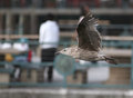
| 04/06/2009 12:43:11 AM | Passing throughby optixComment: Hello, I’m from the Critique Club;
In regards to the challenge, as other users have noted, IMHO this would not be considered abstract or motion. When I think of depicting motion, the first thing I think of is blur. There are other ways to depict motion, such as freezing action but still including reference points in the photo to give the viewer a sense of the motion. The background of this photo doesn’t give me a good reference point for any movement, because it is far off and there is no scale given. As far as the abstract part goes, I think that is one of the most difficult concepts to pin down when you’re considering what you’re going to photograph and how. Many people have hugely varying opinions on this, and if you ever feel the need to further confuse yourself on the topic, you can find numerous threads in the forum in regard to “what does abstract mean?” It seems to me that a good starting point is to make things a bit more difficult to identify. Some require it be unidentifiable, others enjoy photos that are simply difficult to discern, but I would say few if any think abstract refers to perfect focus and exposure on the subject. An alternative way to photograph this scene would be to increase the exposure time and pan with the subject to more effectively blur and streak the background. Also, if possible, some camera movements might be welcomed to help blur the gull itself.
If this photo were entered a challenge more fitting of it, I think it could have scored significantly higher. You did a great job on the focus. The definition on the feathers is very good. Colors seem well saturated. You left space in front of the gull to help give some sense of the motion. I might’ve considered stretching it out a bit more and giving some additional room in front of the gull, but that might just be me. Some additional isolation from the background might be nice, especially that fellow standing there. Being located right at the head of the bird and wearing strongly contrasting clothes makes him rather distracting for a background element.
Mostly, I think this was just a case of not quite meshing with what voters came into the challenge expecting.
-Derek
|
| 04/06/2009 12:22:13 AM | Branchingby orvaratliComment: Hello from the Critique Club-
Photos of Iceland are almost always beautiful, and this is no exception. I really like the piece of water you chose to photograph. It is one that is not quite as instantaneously identifiable as a body of water. I especially like the way the blue in the top left merges into the turbulent area of the water. The movement of the water gives a very soothing and dreamy feel to this image. In regard to the challenge, as many others noted, some aspects of this make it less abstract. I agree that the branches, and also the snowbank, detract from the “abstractness” of things, and also that they are somewhat distracting in the image. I would have preferred the scene without either of these elements. If getting rid of these elements and keeping this portion of the river in the composition wasn’t an option, I would have considered using some camera movement in addition to the movement of the water. Doing so would decrease how starkly the branches and snowbank contrast with the fluidity of the water.
-Derek | | Photographer found comment helpful. |
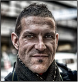
| 04/04/2009 08:21:25 AM | Highly Dangerous entRyby heavyjComment: Hey from the Critique Club:
The intensity of the stare is the first thing I notice. The eyes have lots of definition and are very keenly focused on the camera/viewer. Since this was for a Free-Study, you of course met the criteria for the challenge. To be honest, I’m not normally a big fan of portraits, feeling that they largely comprise the money making aspect of photography and not much else. They just sorta seem boring to me sometimes. Your photo, on the other hand, does not fall victim to this. Though the processing is pretty heavy, it works very well with the subject’s face. The sharp, angular lines of the chin, the slight stubble, the pensive expression… all work extremely well together. The extreme HDR you’ve done brings out every rugged aspect of his face, amplifying the expression and facial structure. I don’t mind the busy background, myself. The reason I don’t, is I have a hard time picturing this fellow in a nice studio for a nice portrait. It doesn’t mesh with where you’ve taken the processing, the pose, or the person, and I think having an outdoors environmental portrait is a much better choice.
In short, I very much enjoy this and think you did an excellent job using lots of processing without going over the top, and have created a portrait with added interest in the process.
-Derek
| | Photographer found comment helpful. |
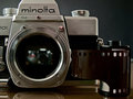
| 03/30/2009 03:07:27 PM | Forgottenby zackdezonComment: Hello from the Critique Club-
First things first: Your entry meets the challenge quite well. One thing I definitely like about this photo is that it is more than it initially appears. At first glance, one simply sees the Minolta, but a closer inspection reveals the Nikon peering out of its depths. As others have said, I like this contrast between the new and old, especially considering your title, which brings the transition from film to digital into the spotlight. I think your lighting is pretty good too. I’m not too sure of how you portrayed the film, however. If this wasn’t such a close crop, I would consider pulling the film out some and having it laid out. To me, the placement you went with sorta makes it fight with the camera as the focal point for the viewer. On the other hand, it does help the rest of your composition, and adds another element and depth (in more than one sense) to your photo, so I guess I’m on the fence about that.
Overall, I think you did a great job capturing this, and while multiple other users utilized the same subject matter, you did a good job separating yourself from the pack. One other minor comment: I would have cleaned the smudge on the Minolta letters, if at all possible (which might not be the case). If the body were more used and beaten up, I would leave it because it adds character, but since it is the only real blemish on the body, it’s a bit distracting to me.
-Derek | | Photographer found comment helpful. |
| 03/29/2009 09:01:07 AM | "I HOPE I score"by mbrutus2009Comment: Hello from the Critique Club:
I think an issue a lot of folks had with this challenge was DNMC and fit for challenge. Voters tend to vote down images that fit the challenge criteria only because of the title.
Having said that, I think this is a decent sports capture. I, too, like how the sun has illuminated your friend’s hair, and I think you did a good compromising the amount you froze the action yet still keeping some movement. The image also has good sharpness, contrast, and saturation throughout.
In terms of composition, I think framing your subject closer would benefit this particular pose. Generally, I would try to use a wider frame in order to show context (IE, other players, the goal ETC). Since the wider crop on this doesn’t do that, I would say that you can concentrate things down more and eliminate some of the surrounding negative space (which in this case is rather distracting because it is hardly blurred). You might consider opening your aperture to help blur the background a bit more. Also, getting a telephoto would help this, but for sports you need fast glass and that’s an expensive route.
Lastly, since this challenge was under Advanced editing, I would suggest you brighten the face a bit more and the shorts a bit too so they have a bit of definition to them.
-Derek
| | Photographer found comment helpful. |
|
Showing 1801 - 1810 of ~2067 |
Home -
Challenges -
Community -
League -
Photos -
Cameras -
Lenses -
Learn -
Help -
Terms of Use -
Privacy -
Top ^
DPChallenge, and website content and design, Copyright © 2001-2026 Challenging Technologies, LLC.
All digital photo copyrights belong to the photographers and may not be used without permission.
Current Server Time: 06/17/2026 06:11:35 PM EDT.
|