| Image |
Comment |
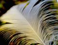
| 11/13/2004 08:55:16 PM |
Fallen Downby charmayneComment: nice DOF, but the lighting doesn't do this shot justice, IMO.. I'd have liked to have seen the white of the feather preserved more fully. |
 Photographer found comment helpful. Photographer found comment helpful. |
| 11/13/2004 08:54:24 PM |
|
| Photographer found comment helpful. |
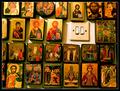
| 11/13/2004 08:53:34 PM |
The light of Faith...by gipomontesantoComment: Not only does this shot have nothing to do with being a macro.. (you've made everything *smaller* in your shot than it is in reality), but the subject matter is confusing, the lighting is harsh, your white balance is off (too much yellow), the crop is too tight at the top, and too loose on the left, and the border is unnecessary and distracting, all, of course, in my opinion. Keep trying, but in my view, this shot is about as off-challenge as one can get. |
| Photographer found comment helpful. |
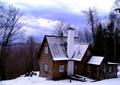
| 11/13/2004 08:41:41 PM |
Decemberby peeteComment: I find the ligthing to be a little harsh in this photo. The blue-ish is nice for the December tie in, but there isn't enough "white" to balance it. There's something about your composition that I'm not keen on either. Perhaps a lower perspective on the house, shot from nearer the ground? |
| Photographer found comment helpful. |
| 11/13/2004 08:39:40 PM |
11by zeuszenComment: This is a nicely done sillhoutte, but it just doesn't say anything to me. I can't even make anything out in the "Rorschach" effect.
Fortunately, these are my own failings. A good photo. Just not to my taste. |
| Photographer found comment helpful. |
| 11/13/2004 08:36:10 PM |
Julyby brandykComment: This image is a nice idea, but suffers from a couple of points for me.
1. Size. I'd have liked to have seen this larger.
2. Focus. This might be an issue with your camera and a lack of a good macro setting, but the crispness isn't there. (one reason why you may have chosen a smaller file size.
3. colors and contrast. The image seems faded, and the darks and lights just aren't dark and light enough for me. Added contrast would have given this image a much stronger feel. |
| 11/13/2004 08:33:50 PM |
November Gardenby flip89Comment: There's a general lack of a focal point here, and a lack of focus as well. I like the colors, but the scene is just a little too chaotic for me. The path there seems to be just an afterthough, but you may have been able to use it to give the photograph some strength, to lead the viewer into the scene. Instead, I just see it as a non-entity that helps to clutter. |
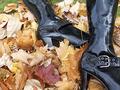
| 11/13/2004 08:31:40 PM |
Novemberby KaralewComment: I just don't get the connection with the boots. Sorry. |
| 11/13/2004 08:31:12 PM |
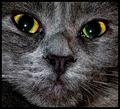
Novemberby stupidcatComment: Your color balance could use some tweaking, as I see a lot of reds in the skin tones. The focus isn't on your subject quite enough, and could have benefitted from a tighter crop.. (not much, but getting rid of that W in the corner would have helped a lot.
Not being American, I could also question the tie-in to the month, but luckily I know that November is the usual election month, so I wonder if you might be suffering there as well. |
| Photographer found comment helpful. |
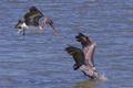
| 11/13/2004 08:28:41 PM |
November Fishing in Texasby newtune3Comment: A nice stop-motion capture, but the crop seems to be a little too loose, with too much free space at the edges. Especially the right edge, at least to me. A tighter crop would have given the focal point on the pelicans a much more dynamic center. |
| Photographer found comment helpful. |
Home -
Challenges -
Community -
League -
Photos -
Cameras -
Lenses -
Learn -
Help -
Terms of Use -
Privacy -
Top ^
DPChallenge, and website content and design, Copyright © 2001-2026 Challenging Technologies, LLC.
All digital photo copyrights belong to the photographers and may not be used without permission.
Current Server Time: 06/02/2026 07:39:57 PM EDT.