| Image |
Comment |
| 08/09/2003 11:21:08 AM |
|
 Photographer found comment helpful. Photographer found comment helpful. |
| 08/09/2003 11:20:44 AM |
|
| 08/09/2003 11:20:00 AM |
|
| Photographer found comment helpful. |
| 08/09/2003 11:02:32 AM |
|
| Photographer found comment helpful. |
| 08/09/2003 10:52:52 AM |
The Wizard of Ozby vjozComment: Nice panoramic shot. What lens did you use to capture this shot? How did you get the rainbow to show so effectively. Personally I would love to read a "How'd They Do That" article on how you got this picture with such vivid color. Score 8 |
| 08/09/2003 10:51:15 AM |
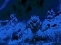
Vampire Hunter D(Animated Movie)by johnnykillchristComment: Hmm. Loved the movie but I don't remember this part.
Regardless, I like the perspective you've taken on this shot; the angle commends this composition. The blue layer and whatever filter you applied to the image make it seem surreal. For me, the aspect you've given the foremost subject (especially noticible on its arms as they stand out from their background) draw me into the story of the picture to spend more time engaging the elements of this photo. The lighting on the subject at the top right corner could be changed so that it didn't contain such black space within its outlines. Overall - 8 |
| Photographer found comment helpful. |
| 08/09/2003 10:46:55 AM |
Mavrickby StevePaxComment: Something about this looks . . . odd or displeasing to my eye. I think its the lines in the A at the top of the card and the line of the top of the card. They seem serated. I think the idea is good and the composition is good. But with just the black and white, these non-crisp lines drew me to look into the lines of the picture more than the actual shot. Hopefully that's just me. - 6 |
| Photographer found comment helpful. |
| 08/04/2003 11:10:27 PM |
My Garden Friendby JonatanComment: I little more green in the background would have gotten a better score from my perspective - 6 |
| Photographer found comment helpful. |
| 08/04/2003 11:08:35 PM |
|
| Photographer found comment helpful. |
| 08/04/2003 11:03:07 PM |
|
| Photographer found comment helpful. |
Home -
Challenges -
Community -
League -
Photos -
Cameras -
Lenses -
Learn -
Help -
Terms of Use -
Privacy -
Top ^
DPChallenge, and website content and design, Copyright © 2001-2026 Challenging Technologies, LLC.
All digital photo copyrights belong to the photographers and may not be used without permission.
Current Server Time: 05/31/2026 09:59:57 AM EDT.