| Author | Thread |
Comments Made During the Challenge  |
|
|
08/04/2003 11:03:07 PM |
|
 Photographer found comment helpful. Photographer found comment helpful. |
|
|
08/04/2003 12:44:47 PM |
|
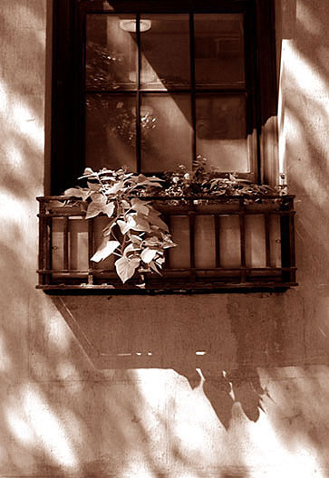
I love this. The angle of light and the play of shadows across the wall, the reflection in the window, and the use of sepia tone are all wonderful details. I often don't care for duotone pictures, but in this case it seems completely natural. |
|
| Photographer found comment helpful. |
|
|
08/03/2003 08:31:05 PM |
|
Very nice monochrome. good use of light and shadow, and good framing. |
|
| Photographer found comment helpful. |
|
|
08/02/2003 09:47:15 AM |
|
Very nice photo, i like the sepia and the composition is great, 9 |
|
| Photographer found comment helpful. |
|
|
08/01/2003 12:34:58 AM |
|
I focus more on the wall then the basket that holds plants. 4 |
|
|
|
07/31/2003 04:13:40 PM |
|
| Photographer found comment helpful. |
|
|
07/30/2003 08:53:24 PM |
|
I realize the subject is the flowerbed, but why crop the window and put in all that wall space below the flowerbed? I think you should have aimed just a bit higher. |
|
|
|
07/30/2003 11:29:53 AM |
|
This is nice....like the angular shadows...a little more clarity on the window box would have made it better, but it is still a very nice shot.... |
|
| Photographer found comment helpful. |
|
|
07/30/2003 10:12:46 AM |
|
i think it would make a greater impression in color |
|
| Photographer found comment helpful. |
|
|
07/30/2003 12:57:10 AM |
|
I don't like how the window is cut off at the top. I think this could have been more effective using the square of the window with the rectangle.. or even square.. shape of the crop/framing of the shot. The lighting and tones are very nice. |
|
| Photographer found comment helpful. |
Home -
Challenges -
Community -
League -
Photos -
Cameras -
Lenses -
Learn -
Help -
Terms of Use -
Privacy -
Top ^
DPChallenge, and website content and design, Copyright © 2001-2026 Challenging Technologies, LLC.
All digital photo copyrights belong to the photographers and may not be used without permission.
Current Server Time: 06/29/2026 02:53:34 AM EDT.