| Image |
Comment |
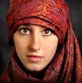
| 03/15/2004 08:09:54 PM |
portre ressami by kiwinessComment: Great capture. One of the best from the challenge. I like the composition and see very little technically that I would consider doing anything to change but the subject's left cheek (photo right) is slightly overexposed; not blown out. It might be worth it to select the area from under the eye across to the nose, down to the top of the lip and back up at a diagonal towards the outside edge of the eye and then apply a slightly darkening curve adjustment layer just to try and even out the skin tone. I don't like the crop with so much cloth at the top as the cloth almost becomes a competitor with the subject's face and eyes for being the more prominent in the photo. Having said that, I like the shot and score it well above average. Good job just as it is. |
 Photographer found comment helpful. Photographer found comment helpful. |
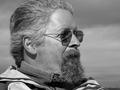
| 03/15/2004 08:05:02 PM |
Captainby timj351Comment: Very good capture. I normally look for either eye contact to convey a sense of intimacy to the viewer or a pose/look that demonstrates some emotion with which the viewer can identify. Here you lose a little for me just because you've lost 2 of the more expressive areas of the face: the mouth is shrouded by the beard and the eyes are covered by the darkened glasses. It's a great pose and you exposed it very well. I like the skin tone and even given that it appears to be taken with direct sunlight you managed to keep from having anything really blown out. I could also take the lack of any major expression better if the eyes were simply a little more open so that the viewer could at least perceive the gaze of the subject. All-in-all, I could see anyone choosing to frame this and put it up on the wall or keep it in the album. Good shot and a great example of how to shoot "outside the box" as it just slightly missed on the major areas I look for and yet I scored it well above average.
I do find the horizon at the bottom right corner slightly distracting but rather than cropping the photo closer, I'd suggest just Cloning/Healing Brush it out. |
| Photographer found comment helpful. |
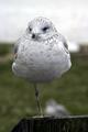
| 03/15/2004 08:00:16 PM |
One-legged Wait for ?by paradiverComment: I have a problem with this shot but its not that it is an animal. I've found several animal shots quite good portraiture but in this selection you have a very static subject in that the bird is centered and nothing seems to set it apart. The viewer cannot make contact with the eyes because they are too deep set. I can understand not wanting to flash the resting animal but with a portraiture subject that is not too captivating with composition or emotive expression, then I really need to see the eyes to make some connection. A little selective Levels or Curves work might have brought out something of the eyes to demonstrate some "personality". You got a good capture of a bird but it lacks in the portraiture genre. This falls into the same "Candid" section as some of the photos of people where you can't make personal contact with them either through watching them with an expressive look or by looking directly into their eyes. The subject doesn't have to always make eye contact with the viewer but here the stance/posture just don't convey anything compelling and you've lost the intimacy in the darkness around the eyes. Heck of a bird shot, tho. You do lose a little definition on top of the head with the light colored background and the feathers. Good tones throughout the subject. |
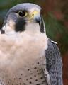
| 03/15/2004 06:53:25 PM |
Eyes Wide Openby TerryGeeComment: Great shot. Love the DOF and the catchlights in the eyes. Heck, most of the time I can't get this clear a shot of a human model. Congrats on this capture. If I was going to touch this up at all it'd be the eye. I think a selective edit by using either the Oval selection tool or the Polygon selection and then adding a Curves Adjustment Layer or Levels Adjustment Layer to just the eye selection might bring out the golden-brown to highlight the personality even more. I like it as it is but I think that edit might be worth the time just to see if you can pull that out without popping a red cast on the eye. One thing I especially like are the little feathers poking out on the wings; we have a couple of cockatiels and its fun to see some of the more characteristic little idiosyncracies that birds exhibit sometimes.
One of the better examples in this challenge. |
| 03/15/2004 06:48:24 PM |
Ok, Who Took My Shoes?by OneSweetSinComment: Cute shot. Definitely meaningful to anyone that knows the subject and a good capture regardless. While you can't slow kids down for photos (don't I know that) I'll simply point out that the subject's left foot is a little hot and while his right foot seems to have a suggestion of motion because it appears blurry. This is a solid capture and I'm sure any relative would love to have it in an album or stuck to the refrigerator but from a technical standpoint a reflector or a little fill flash would do wonders by just brightening up the shadows on the subject's face. After the fact, though, you can still make some decent changes in Photoshop if you have it by creating a duplicate layer, using the polygon tool (2nd down on the right column) and selecting the darker areas around the eyes and blending down onto the bridge of the nose. Next feather the selection by 5-10 pixels (Select | Feather) and then in the Layers menu create a new Curves Adjustment Layer (its the little circle button at the bottom with a diagonal line through it, when you click it a new menu appears and you select "Curves". Now you can click in either the upper right or lower left corner (based on how your Curves is setup) and then use the arrow keys to move up and down until you actually lighten the shadows to blend them into the subject's brighter cheeks. This won't completely remove the shadows and you don't want to overdo it but I think its a useful tip to know and I think it would help this shot a little. |
| Photographer found comment helpful. |
| 03/15/2004 06:42:00 PM |
Ericby MousieComment: Good capture. Nice shallow DOF. Even skin tones and direct, intimate contact with the subject. The catchlights in his eyes are fragmented and that's a little distracting but it looks like from the light that it was natural lighting. The light seems just a little flat (which could easily not be the case in the full sized version) so I'd only suggest a little more flash or probably a reflector. I don't know that a gold reflector would work well in this instance since the subject already has strong red tones to his skin but perhaps a white or, believe it or not, a black surface could put some nice, even light back up onto his face from below or from his right side. One tooth has a minor "hot" spot on it that with prolonged perusal can be a distraction but for the contest this is not a nit I'm counting off for and it'd be easily "fixed" before you printed to hang it. Maybe a little less green space at the top if you decide to print it and hang it but otherwise its a great shot. Technically sound and very pleasant to view. 8 |
| Photographer found comment helpful. |
| 03/15/2004 12:53:28 AM |
Adorableby CheerzComment: Perfect title. This little one is adorable. The lighting, however, seems a little flat on the image. |
| Photographer found comment helpful. |
| 03/15/2004 12:51:57 AM |
Basic Portrait of a Coupleby JB707Comment: The DOF on this seems to be fairly narrow. The male subject's eyes and t-shirt collar seem to be in focus but both the tree bark behind and the female subject's sunglasses seem to be OOF. You got a good set of subjects here with some texture to both of them (he with the facial hair; she with the glasses and hair moving around) but I think a smaller aperture would have helped this composition by widening the DOF. In my experience this is just something that you have to either get right from the first portrait you shoot or you have to take several like this where you want to bop yourself on the forehead when you review the shots and realize that you had the lens wide open until it finally sinks in to check EVERYTHING before taking that shot. Then again, there is another way. You can do what I do and just take hundreds of photos at each photo shoot so that hopefully somewhere in the first hundred or so you'll notice everything from the ISO to the aperture to the crap in the background. :)
I really think you have something here and I think this couple would be well worth shooting again. |
| Photographer found comment helpful. |
| 03/15/2004 12:43:45 AM |
|
| Photographer found comment helpful. |
| 03/15/2004 12:43:13 AM |
Selfportraitby willemComment: Poor subject. Naww, just kidding. Good shot. What were you using for the catchlights? Octagonal softbox (the skin tones look pretty even) or a regular lamp of some kind? |
Home -
Challenges -
Community -
League -
Photos -
Cameras -
Lenses -
Learn -
Help -
Terms of Use -
Privacy -
Top ^
DPChallenge, and website content and design, Copyright © 2001-2026 Challenging Technologies, LLC.
All digital photo copyrights belong to the photographers and may not be used without permission.
Current Server Time: 06/01/2026 01:55:36 PM EDT.