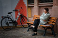
DPChallenge: A Digital Photography Contest You are not logged in. (log in or register
 
Browse Settings
Currently viewing:
Registered Useroscarthepig

Show comments:

Per page:

Order:

Comments:


Comments Made by oscarthepig
Pages:   ... ... [53]
Showing 131 - 140 of ~525
Image Comment
Short nap
10/03/2009 11:03:26 AM
Short nap
by Melethia

Comment:
I think the vignette hurts more than helps. It just seems to wash out the colors--especially since they are trying to be bright and saturated otherwise.

I tried a B/W conversion to test that theory. I still think it might be a little too much, but without colors for it to wash out, it wasn't so noticeable.

Next, I tried dodging it to remove the vignette altogether. I think I prefer it without.

The bit of plywood on the wall is unattractive and doesn't really fit with the rest of the building materials.

The subject looks to be in pain more so than sleeping. lol

I like how the bench and the suffering sleeper form an "X." I also like the way the umbrella (?) fits into the frame. I'm not so sure about the placement of the bicycle--it and the grimacing napper seem to draw a straight line across the picture.

Did I mention that the subject looks to be in pain?

Should you resubmit to 1x? It doesn't really strike me as something they would publish. Maybe add an overlay and/or use that anguished expression to your advantage. But then again, what do I know?

Well, anyway, that's my $0.02.
Photographer found comment helpful.
in the magic garden
10/02/2009 11:59:56 PM
in the magic garden
by cutout

Comment:
Originally posted by Melethia:

I don't actually see a nude form here - I simply feel a nude form - it has that sense to it, even without knowing it was in a "nude" challenge. More of an elemental thing, really. Works for me. Keep doing whatever it is you do - works more often than not.

p.s. Love the magic flowers bit from Steve. :-)


That's the best kind of abstract, IMO. The shapes look like what they are supposed to be, but at the same time they aren't what they appear to be.

I would love to see a shot of this shot from a different angle that revealed what you were shooting (the same applies to most all of your work). You have a great eye for shape, texture, and color.

I second the "magic flowers" love. Too funny.

Message edited by author 2009-10-03 00:00:46.
Photographer found comment helpful.
Anniversary Flowers
09/27/2009 12:51:22 AM
Anniversary Flowers
by dtremain

Comment:
Originally posted by skewsme:

somehow it's a relief that it's only flowers yelling at me this time. actually i like this. try a black vignette, they're in vogue :P


lol...not gunna try another vignette for a while, I'd guess.

eta: I meant to say how much I liked all the textures you captured in this.

Message edited by author 2009-09-27 00:52:26.
She's a Duesy!
09/27/2009 12:49:59 AM
She's a Duesy!
by dtremain

Comment:
Yeah, that's rough, man. Softer edge wouldn't have been DQed. She's an interesting character nonetheless. Definitely something that needed to be captured.
Emergency Detour
09/27/2009 12:46:59 AM
Emergency Detour
by dtremain

Comment:
Hehe. I looked around for a 69 to shoot (well, one that I could enter anyway). I almost titled my shot "Longing for Six" or some such. I agree with andreyua; you should have stopped to get the shot and the PP could use a little work contrast-wise.
Rudbeckia Row
09/27/2009 12:06:06 AM
Rudbeckia Row
by banmorn

Comment:
Really does not meet the challenge. Nice shot of the flowers, though.
Photographer found comment helpful.
Shoreline
09/27/2009 12:05:29 AM
Shoreline
by pinetree3

Comment:
Those blues and greens look almost unnatural and they contrast well with the oranges of the sky.
The Depth of Music
09/27/2009 12:04:20 AM
The Depth of Music
by ThePhotoTypo

Comment:
I like the low perspective of this shot (lower than typical for a piano picture) and the drums in the background. I could use a bit more DOF for this challenge, but it's good otherwise. I think a better background would have helped, too (i.e. lose the wallpaper and mini blinds).
Photographer found comment helpful.
Juxtaposed
09/27/2009 12:01:59 AM
Juxtaposed
by ttreit

Comment:
My first impression was that the foreground was not in focus, but I see that is a result of the soft edges from the spray paint. I don't think there is anything all that interesting in this shot, but viewed as a whole, it makes one wonder why it was taken. Provoking thought can't be a bad thing.
Photographer found comment helpful.
The Watershed
09/26/2009 11:59:36 PM
The Watershed
by hahn23

Comment:
Another Bob Ross painting....
Photographer found comment helpful.
Pages:   ... ... [53]
Showing 131 - 140 of ~525


Home - Challenges - Community - League - Photos - Cameras - Lenses - Learn - Help - Terms of Use - Privacy - Top ^
DPChallenge, and website content and design, Copyright © 2001-2025 Challenging Technologies, LLC.
All digital photo copyrights belong to the photographers and may not be used without permission.
Current Server Time: 09/18/2025 05:30:58 PM EDT.