| Image |
Comment |
| 05/02/2005 11:59:04 AM |
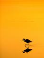
Sunset Feeding by StagoleeComment: Nicely done 10 (i konw you would have cloned a little if there was advanced editing) |
 Photographer found comment helpful. Photographer found comment helpful. |
| 04/29/2005 01:35:13 PM |
|
| Photographer found comment helpful. |
| 04/29/2005 12:37:17 PM |
|
| Photographer found comment helpful. |
| 04/29/2005 12:21:19 PM |
|
| Photographer found comment helpful. |
| 04/29/2005 11:54:49 AM |
|
| Photographer found comment helpful. |
| 04/29/2005 11:37:01 AM |
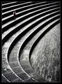
Repetition with variations for small childby e301Comment: Wow! Great. One of the best. I like the composition, the way the curves of the auditorium fill the frame. Good placement of the minimal subject wich do dominate the image. Good colour on the b&w background. Well done! 10 |
| Photographer found comment helpful. |
| 04/28/2005 01:05:59 PM |
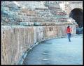
Treeby ColeyComment: Very good entry. Congrats. If it was advanced editing I am sure you would have cloned the disstracting elements on the left. 8 |
| Photographer found comment helpful. |
| 04/28/2005 01:02:21 PM |
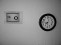
7:32:26 PMby codauberComment: I don't get the idea thoigh it looks interesting. The fram on the wall is far from my tastes and spoils the pic. The b&w convestion is washed out and there are too much greys. The angle on the clock is not very good. I would have tried to avoid it. The title does not influence my vote but I cannot get it either. I appreciate that you took some time for the set up and tried smth diff. Hope it helps and Good luck! |
| 04/28/2005 12:55:59 PM |
Lonely Daisyby MudHutComment: A tighter crop IMO would improve this image. Maybe cut off a fifth from the left. |
| Photographer found comment helpful. |
| 04/28/2005 12:54:30 PM |
Togetherby SnapperLComment: Nice idea. You captured a very romantic moment. The image gets me there. Technically the colours could have been better. It's a little ovexposed and I don't like the purple casts in the water and sky. Good luck! |
| Photographer found comment helpful. |
Home -
Challenges -
Community -
League -
Photos -
Cameras -
Lenses -
Learn -
Help -
Terms of Use -
Privacy -
Top ^
DPChallenge, and website content and design, Copyright © 2001-2026 Challenging Technologies, LLC.
All digital photo copyrights belong to the photographers and may not be used without permission.
Current Server Time: 04/30/2026 02:04:06 AM EDT.