| Author | Thread |
Comments Made During the Challenge  |
|
|
05/03/2005 11:33:37 PM |
|
Interesting shot, nice composition..I would bump up the contrast levels. |
|
|
|
05/03/2005 08:08:57 PM |
|
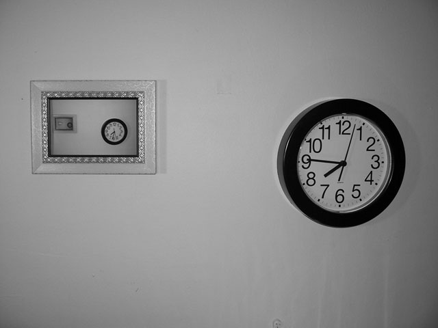
Why the discrepancy between the time on the clock and the time in the title? The recursion adds interest. |
|
|
|
05/02/2005 09:30:59 AM |
|
Webster: "Minimalism - a style or technique (as in music, literature, or design) that is characterized by extreme spareness and simplicity." Someone has actually made a minimalistic image without breaking the other photographic rules. Stayed with the rule of thirds, good framing, love the clock in the smaller frame that tells the time. Those that see will get it, those that don't get it should train their eyes to see, not to look. My only nit and it's minor, needs a little contrast, but it's minor. Good job! |
|
 Photographer found comment helpful. Photographer found comment helpful. |
|
|
04/30/2005 08:04:32 PM |
|
Strange photo and strange subject. Not working for me. |
|
|
|
04/30/2005 03:41:17 PM |
|
Cute idea. The problem is I can't tell what the subject is in order to comply with the challenge. |
|
|
|
04/30/2005 01:02:51 AM |
|
Creepy! I'm getting a total flashback from The Ring off of this picture. :-) Actually, the image itself is an excellent example of either type of minimalism and works nicely for this challenge. |
|
| Photographer found comment helpful. |
|
|
04/29/2005 11:15:37 PM |
|
Well, it certainly is minimal... But not very intriguing. |
|
|
|
04/29/2005 06:28:02 PM |
|
great composition, very original! |
|
| Photographer found comment helpful. |
|
|
04/29/2005 02:19:26 PM |
|
Cool concept and well executed. Not sure b&w was necessary thought. |
|
| Photographer found comment helpful. |
|
|
04/29/2005 11:16:59 AM |
|
interesting use of theme, whites need work, nice dof, nice movement, blacks good |
|
| Photographer found comment helpful. |
|
|
04/29/2005 08:18:00 AM |
|
Would of liked just to see one object. |
|
|
|
04/29/2005 05:53:03 AM |
|
Great idea let down by poor lighting. ...7... |
|
| Photographer found comment helpful. |
|
|
04/28/2005 10:07:52 PM |
|
This is very interesting. I like the concept, although i am still figuring that out. .I don't know how you did it...but very cool. |
|
| Photographer found comment helpful. |
|
|
04/28/2005 07:24:02 PM |
|
The lighting in the image is very flat, and as a result the entire image has suffered from it. It was clever how you used a mirror on the wall to reflect off a mirror you are holding to reflect the clock on the wall. Based on technicalities, I would only give this a 4, though you're cleverness has bumped it to a 5. Good luck. |
|
| Photographer found comment helpful. |
|
|
04/28/2005 05:15:22 PM |
|
I love the concept and I think you pulled it off very well. I do not like the reflections on the wall in the lower right or the cord. But I still gave it a 7. |
|
| Photographer found comment helpful. |
|
|
04/28/2005 01:31:37 PM |
|
|
|
04/28/2005 01:02:21 PM |
|
I don't get the idea thoigh it looks interesting. The fram on the wall is far from my tastes and spoils the pic. The b&w convestion is washed out and there are too much greys. The angle on the clock is not very good. I would have tried to avoid it. The title does not influence my vote but I cannot get it either. I appreciate that you took some time for the set up and tried smth diff. Hope it helps and Good luck! |
|
|
|
04/28/2005 12:44:21 PM |
|
Interesting! took some thought and effort to do this one... good job. |
|
| Photographer found comment helpful. |
|
|
04/28/2005 12:42:07 PM |
|
Interesting picture. I don't really know what to think of it. |
|
|
|
04/28/2005 12:16:49 AM |
|
Amazing concept. Wonderful creativity. Only thing for me that subtracts from the photo is the artifacts at the bottom of the image that keep the wall from being perfectly flat. |
|
| Photographer found comment helpful. |
|
|
04/27/2005 05:44:17 PM |
|
not so much a comment on the pic, but..... what time is it? |
|
|
|
04/27/2005 01:59:49 PM |
|
I feel this image had a central subject that occupied a small portion of the image. |
|
|
|
04/27/2005 01:03:46 PM |
|
Nicely done. Could use higher contrast. Love the reflection! |
|
|
|
04/27/2005 12:11:25 PM |
|
very cool. I love this alot. 9 |
|
|
|
04/27/2005 11:58:21 AM |
|
Just the clock would have been enough here. |
|
|
|
04/27/2005 09:37:54 AM |
|
I like it, very simple and effective |
|
|
|
04/27/2005 09:21:18 AM |
|
|
|
04/27/2005 01:08:24 AM |
|
I was confused as to which subject was the main focus and then I looked closer at the picture on the left. Very cool effect! Nice work. |
|
| Photographer found comment helpful. |
Home -
Challenges -
Community -
League -
Photos -
Cameras -
Lenses -
Learn -
Help -
Terms of Use -
Privacy -
Top ^
DPChallenge, and website content and design, Copyright © 2001-2026 Challenging Technologies, LLC.
All digital photo copyrights belong to the photographers and may not be used without permission.
Current Server Time: 06/28/2026 06:07:52 AM EDT.