| Image |
Comment |
| 11/11/2003 08:49:44 AM |
ROSE & BUDSby pookey83Comment: Wonderful subtle colours and tones captured here. I feel that the composition lets it down though... the ratio of negative space to subject seems haphazard and not thought out. Perhaps a tighter crop? 8 |
 Photographer found comment helpful. Photographer found comment helpful. |
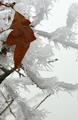
| 11/11/2003 08:45:09 AM |
Changing Seasonsby rll07Comment: A wonderful and beautiful photo, but I don't see this as a still life. Sorry. 1 |
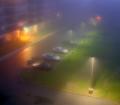
| 11/08/2003 11:48:39 AM |
by timmiComment: Amazing!! What is interesting is that if you follow the colours from the bottom-left to the top-right, you get the colours in the right order of a rainbow. I would have liked this photo if it was a Photoshopped effect, to me it doesn't matter if it was 'real' or not, it's the end result that matters. However, this is quite a find in the 'real' world, with no Photoshoppery! |
| Photographer found comment helpful. |
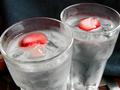
| 11/07/2003 06:56:09 AM |
Strawberry Waterby kevintehComment: The glasses are lit really well, it's very impressive that there are no nasty reflections or glare. However, the composition lets it down. It doesn't seem deliberate that the edges of the glasses have been chopped off, and the point of view doesn't work IMO. 6 |
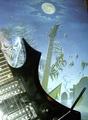
| 11/07/2003 06:53:51 AM |
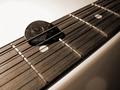
Tidbit!by tolovemoonComment: The existing artwork in the background is great, the foreground guitar with nasty reflections is not so great. Try lighting the guitar so that all the shadow detail can be made out, without burning out any of the highlights. And make sure that the light source is not reflected in the paintwork. 4 |
| Photographer found comment helpful. |
| 11/07/2003 06:51:46 AM |
|
| Photographer found comment helpful. |
| 11/07/2003 06:45:17 AM |
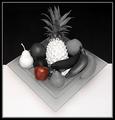
Poisoned Appleby NatatorComment: Wonderful composition... this picture could almost be a blue ribbon winner, but the burnt out highlights (on the pear and pineapple) spoil it. There's a bit too much glare on the apple. I love your black and white background, very imaginative and striking. 8 |
| Photographer found comment helpful. |
| 11/07/2003 06:40:28 AM |
rested noiseby skybelowComment: Nice macro... I prefer the top-left to bottom-right diagonal though. I think most people find it more pleasing to follow that line, as it is the way we are accustomed to read. Bit too much noise in the bottom-right corner... did you try NeatImage? Other than that I like your lighting. 6 |
| 11/07/2003 06:38:26 AM |
tricky oneby dizaComment: Woah, this almost caught me out! Great picture, very inventive, but how on earth is this a still life? 1 |
| 11/07/2003 06:34:52 AM |
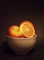
Peachesby richsamsComment: Lovely photo, wrong challenge. 1
(could do with perhaps some more contrast... try a curves adjustment) |
| Photographer found comment helpful. |
Home -
Challenges -
Community -
League -
Photos -
Cameras -
Lenses -
Learn -
Help -
Terms of Use -
Privacy -
Top ^
DPChallenge, and website content and design, Copyright © 2001-2026 Challenging Technologies, LLC.
All digital photo copyrights belong to the photographers and may not be used without permission.
Current Server Time: 07/26/2026 01:47:56 PM EDT.