| Image |
Comment |
| 11/15/2004 11:02:56 AM |
Leda and Zeusby magnetic9999Comment: Great piece of graphic design, but not sure this really says impressionist to me. It's more like a cartoon depiction of a Pre-Raphaelite subject. It's very nice but just doesn't look enough like a photo for my taste. 5 |
| 11/15/2004 11:02:47 AM |
Serenityby connieComment: Doesn't really say impressionist to me, and obviously Photoshopped, but it is absolutely gorgeous. Have to take points off for 1st two issues, but will still put into favourites. 5 |
| 11/15/2004 11:02:43 AM |
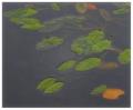
Fallen Leavesby agwrightComment: A little overfiltered for my taste... looks like selective use of the plastic wrap filter. I'll bet this could have been gorgeous with more subtle use of PS. 5 |
 Photographer found comment helpful. Photographer found comment helpful. |
| 11/15/2004 11:02:36 AM |
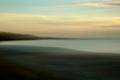
Mauve Reflectionsby kosmikkreeperComment: Beautiful colours, but let down by weak composition. I'd also have liked to see a little more clarity... it's too blurred for my taste. 5 |
| Photographer found comment helpful. |
| 11/15/2004 11:02:26 AM |
The Purist Peacockby mrorange002Comment: There are some nice colours and textures here, but I'm not quite sure about the overall effect. I'm not taken by the quality of the blurring effect, however it was achieved, and the composition comes across as haphazard. The burnt out highlights detract from the shot, and I wish there was a tad more detail in the shot. 6 |
| Photographer found comment helpful. |
| 11/15/2004 11:02:18 AM |
Winter strollby geewhyComment: The upside-down reflection gives some nice textures to this photo, but I'm not wholly convinced by the composition. The colours and autumn leaves give a great mood. 6 |
| Photographer found comment helpful. |
| 11/15/2004 11:02:12 AM |
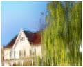
Suburban Impressionismby smokeditorComment: The inverted water reflection is a good idea for this challenge, but the subject matter doesn't really wow me here. 6 |
| Photographer found comment helpful. |
| 11/15/2004 11:02:02 AM |
foggy mornby ellamayComment: Not a fan of the pigeons, which takes away from the composition IMO. I wonder if it would look better with some of the top negative space cropped out. Nice muted colours. 6 |
| Photographer found comment helpful. |
| 11/15/2004 11:01:56 AM |
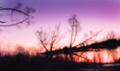
Claude Monet: Duskby hopperComment: Some nice colours, but the composition of the silhouettes isn't strong enough, and rather than impressionist textures, I see noise. 6 |
| Photographer found comment helpful. |
| 11/15/2004 11:01:50 AM |
Floral Studyby EddyGComment: An interesting flower shot, which I'm assuming was taken through textured glass, or is a water reflection. I think the white background stops this from being really exceptional... the composition is just a little plain as it stands. Nice painted effect though. 6 |
| Photographer found comment helpful. |
Home -
Challenges -
Community -
League -
Photos -
Cameras -
Lenses -
Learn -
Help -
Terms of Use -
Privacy -
Top ^
DPChallenge, and website content and design, Copyright © 2001-2026 Challenging Technologies, LLC.
All digital photo copyrights belong to the photographers and may not be used without permission.
Current Server Time: 06/10/2026 05:23:44 PM EDT.