| Image |
Comment |
| 02/08/2008 09:27:13 PM |
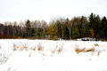
Road side peaceby QuigleyComment: What I like:
--parallel lines formed by the grass in the foreground and the trees in the background
--your description of what this place is like other times of the year
Things I am less fond of:
--both sky and snow are mightly bright. looks like the sky has some blue sky and clouds, so making that darker should bring out some nice shapes. polarizing filter may have helped for the sky(depending where the sun was).
--lack of a point to which my eyes are drawn. the whitish tree to the right of center has some interesting branching; perhaps walking up closer to it would have made this a good point of interest for the photo. |
 Photographer found comment helpful. Photographer found comment helpful. |
| 02/06/2008 12:18:16 PM |
|
| Photographer found comment helpful. |
| 02/05/2008 07:46:11 PM |
stormy sunrise dpc.jpgby saltwatershotsComment: Overall very nice, like the way you got the wave blury, nice scenery.
This is too centered for my taste (sun, horizon, rock with water washing over it and to some extent even the best part of the wave are all centered). Thus only advice I have would have been to take this horizontally, removing a chunk of sky and adding more of a view to the left. If you can't go back to redo this, then would crop top of sky to shift horizon further away from the middle.
Minor additional thought: consider selectively lightening up the rocks in the foreground.
Hope this helps. |
| Photographer found comment helpful. |
| 02/05/2008 07:35:55 PM |
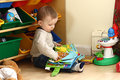
IMG_9855.jpgby twilson944Comment: Nice/cute shot, like the way the little one is posed, lighting is good.
Agree with other comments that it is too busy. The subject is the child (and not the toys) and you have too many distractions. Thus would
a) definitely crop the left to get rid of the bear and the lower green storage container (the bear should go in any case, because it is being rude by mooning us)
b) maybe crop the right (by an amount approximately equal to the left crop)
If you were to redo this, then would move closer, or move the little one a little further away from the shelving/containers, so the background becomes partially out of focus.
Based on the original, you definitely want to get closer (or use a longer lens if you have one) so that the child fills up the picture better.
Hope this helps. |
| Photographer found comment helpful. |
| 02/05/2008 06:54:52 PM |
|
| Photographer found comment helpful. |
| 02/05/2008 06:52:43 PM |
aloneby UrfaKComment: Nice series of rectangles, great perspective, very stark. |
| Photographer found comment helpful. |
| 02/05/2008 06:44:56 PM |
by MephistoComment: Like the photo with its empty space, like the drummer and his stuff, lighting is good. Agree about cloning out bright light, trying to decide whether cropping a bit off right would be good, maybe also clone out one of the items on floor in middle (the one closest to the bottom). Not sure I understand the relationship of the title to the photo, but then again I was neither an art nor an english major in college. |
| Photographer found comment helpful. |
| 02/05/2008 11:46:51 AM |
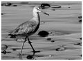
Wk. 5_B&W_Sea Birdby twmaxComment: Nice light and details on the bird. Love the patterns produced by the stones in the sand. IMHO I wonder whether this should have been your bird main challenge entry. |
| Photographer found comment helpful. |
| 02/05/2008 11:42:11 AM |
Genevieveby trevytrevComment: Congrats on the new baby. Impressed you took on the LOD tournament (and now the Hotpasta tournament) with a newborn at home. But I digress. Very adorable baby photo, nice composition and lighting. Light must have been bright -- the pupils are very constricted. |
| Photographer found comment helpful. |
| 02/05/2008 11:36:30 AM |
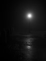
Week 02 - Fog.jpgby KenComment: Very nice darkness depicted here. I would have preferred it if the columns on the left were just a tiny bit lighter. Great pavement texture. |
| Photographer found comment helpful. |
Home -
Challenges -
Community -
League -
Photos -
Cameras -
Lenses -
Learn -
Help -
Terms of Use -
Privacy -
Top ^
DPChallenge, and website content and design, Copyright © 2001-2026 Challenging Technologies, LLC.
All digital photo copyrights belong to the photographers and may not be used without permission.
Current Server Time: 07/17/2026 02:14:22 AM EDT.