| Image |
Comment |
| 02/13/2008 06:50:59 AM |
|
 Photographer found comment helpful. Photographer found comment helpful. |
| 02/10/2008 05:36:23 PM |
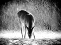
#3 - Graze and Glowby colorcarnivalComment: Love the way you used the lighting to really make the deer pop out. Neat the way the shape of the brush in the background seems to parallel the deer's body. Very cool. |
| Photographer found comment helpful. |
| 02/10/2008 05:32:15 PM |
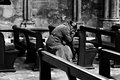
Prayer (Week 3)by booboo_goonComment: Nice the way this looks like it could be a photo from the 1930's. Would straighten it out just a bit. |
| Photographer found comment helpful. |
| 02/10/2008 05:27:43 PM |
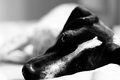
Dennis (Week 6)by booboo_goonComment: Cool how the white stripe on his forehead runs down the left side of his nose. Great contrast between mainly black head and very light tones of the rest of his body and the background. Nice expression of his eyes. |
| Photographer found comment helpful. |
| 02/10/2008 05:22:54 PM |
|
| Photographer found comment helpful. |
| 02/10/2008 05:19:44 PM |
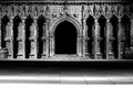
Three Miceby pawdrixComment: Great title and subject matter, nice composition, nice textures of brick, like the graffiti. Upper left corner is a bit out of focus for my taste, wonder whether mild cropping along top and left would be useful. |
| Photographer found comment helpful. |
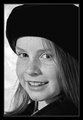
| 02/10/2008 05:14:04 PM |
Week 3 - Hannahby CapeSailComment: Like the way her dark hat and dark coat frame her face. Nice pose. Eyes are nice and sharp, wonder if selectively sharpening up nose/cheek freckles just a tiny bit would be useful. |
| Photographer found comment helpful. |
| 02/10/2008 05:05:52 PM |
03 Caitlinby SandyPComment: Great lighting, wonderful composition, bricks/stones add nice interest. Like the expression on her face. |
| Photographer found comment helpful. |
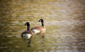
| 02/10/2008 10:07:26 AM |
Golden Pondby BudyaComment: Things I like:
--The way the birds have their heads positioned identically
--Composition
--Ripples
Things I might change:
--Border line is just a tad too subtle, would choose a color that makes it stand out just a bit more
--Like what NI did to the water, but the birds seem a bit too soft. Never used NI, can it work on selective areas? If not, PS will allow selective noise reduction.
--Some people would argue that the birds should be in the lower right corner, that way they are looking into rather than out of the picture.
BTW, these are Canadian geese, not ducks. :-)
Hope this helps. |
| Photographer found comment helpful. |
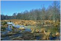
| 02/08/2008 09:40:46 PM |
Winter Wetlandsby MaryOComment: I am late to the commenting party, so much has already been said. Diagonal is nice as are the geese, the blues of the sky and water are good, like the color of the grass that is in the sun. Lower left corner is my least favorite part, seems a bit too dark, would like to see a bit lighter -- or, as mpeters suggested, getting up closer (or using a longer lens) might have eliminated this area from the image altogether. |
| Photographer found comment helpful. |
Home -
Challenges -
Community -
League -
Photos -
Cameras -
Lenses -
Learn -
Help -
Terms of Use -
Privacy -
Top ^
DPChallenge, and website content and design, Copyright © 2001-2026 Challenging Technologies, LLC.
All digital photo copyrights belong to the photographers and may not be used without permission.
Current Server Time: 07/17/2026 02:16:10 AM EDT.