|
|
|
Showing 2781 - 2790 of ~4876 |
| Image |
Comment |
| 12/24/2008 11:22:36 PM | Happy Holidaysby DigiFotoBuddyComment: Greetings from the Critique Club...
I was not able to vote on this challenge, but if I had, I probably would have given you a 6 or 7.
The Bokeh in the photograph is absolutely stunning. The fact there is bokeh in the background and foreground and that you have managed to balance it all is no small feat. I think the positioning of the star could use some improvement. I don't mind it being centered, but at it shows, it is not parallel to the camera plane. It would be stronger if it were not pointing to the left. Other than that, I do not have much to add.
Overall it is a very nice image. Congrats on your top 20 finish.
If you need any clarification on any of my comments, please feel free to pm me. It might take some time for me to get back to you. |  Photographer found comment helpful. Photographer found comment helpful. |
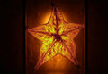
| 12/24/2008 11:12:31 PM | First Star I See Tonightby StangComment: Greetings from the Critique Club...
I was not able to vote on this challenge, but if I had, I probably would have given you a 6 or 7.
Wow, what a georgeous photograph. I'm dissapointed it didn't score higher. Just stunning. I love all the busy-ness in the sky and in the water. The colours are wonderful, and the bright white star does stand out well against the blue sky. I'm guessing the reason it didn't finish higher was because either the star was missed by many, or they felt it was not a strong enough element in an otherwise beautiful photo.
Great shot and keep up the good work.
If you need any clarification on any of my comments, please feel free to pm me. It might take some time for me to get back to you. |
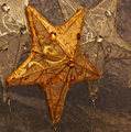
| 12/24/2008 11:07:34 PM | Golden star (and hangers-on)by snafflesComment: Greetings from the Critique Club...
I was not able to vote on this challenge, but if I had, I probably would have given you a 6.
My first impression is that this is a nicely executed photograph that fits the theme very well. I like the variation in colours of the stars, and all the intricate details. The background has details, but is neutral enough to not be distracting. The unbalanced framing was a good choice as it lets the viewer wander around the image. I find myself coming back to the gold star, probably because it is near the center, and the colour is brighter than the rest. I don't have any constructive criticism that I feel would add to the photo. I said I would have voted the image a 6 because it is a lovely photograph, but it doesn't "speak to me" as well as some of the entries.
After reading the comments below, it does look like a cat!
If you need any clarification on any of my comments, please feel free to pm me. It might take some time for me to get back to you. | | Photographer found comment helpful. |
| 12/24/2008 11:02:10 PM | Carambola a.k.a. Starfruitby MsAmbrosiaComment: Greetings from the Critique Club...
I was not able to vote on this challenge, but if I had, I probably would have given you a 7.
Overall I think this is a great image. I love the backlighting and all the details that come through the fruit. I also like how the light creates a halo around the star. The darkness in the background also creates a nice mood. The crop you have chosen reminds me of a country flag because of the shape, as well as the 2 vertical lines. I'd love to see a version of this with a square crop. I think it would help keep my eyes from wandering away from the star. Great shot.
If you need any clarification on any of my comments, please feel free to pm me. It might take some time for me to get back to you. |
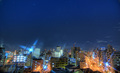
| 12/24/2008 10:58:15 PM | Urban Starsby heavyjComment: Greetings from the Critique Club...
I was not able to vote on this challenge, but if I had, I probably would have given you a 6 or 7.
My first impression is that this a wonderfully different photograph and I am surprised it finished with a sub 6 score. The city is incredibly sharp, and the way you have compared the lights in the city to the stars in the sky is a lovely comparison. The framing is great (rule of thirds used), and the exposure seems just right. I really don't have any constructive criticism to give. This photo is a gem in the rough. Great work.
If you need any clarification on any of my comments, please feel free to pm me. It might take some time for me to get back to you. | | Photographer found comment helpful. |
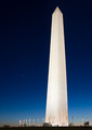
| 12/24/2008 10:53:23 PM | 2 stars and the Washington Monumentby jbirkmanComment: Greetings from the Critique Club...
I was not able to vote on this challenge, but if I had, I probably would have given you a 5 or 6.
My first impression is that this is an awesome photograph. I love the gradation in the sky, and the monument is nice and bright, but still holds the details very well. The cement horizon line is a little left heavy, and I would have prefered to see a little more negative space between the flags on the right and the edge of the photograph.
The score does not reflect the quality of the photograph, so it seems to me, the reason it didn't score higher was because the stars are not a significant part of the photograph. They become secondary to the other elements in the photo.
If you need any clarification on any of my comments, please feel free to pm me. It might take some time for me to get back to you. | | Photographer found comment helpful. |
| 12/23/2008 09:35:16 PM | Tower of Temptationby tpbremerComment: Greetings from the Critique Club...
I was not able to vote on this challenge, but if I had, I probably would have given you a 6 or 7.
My first thought was that I liked your outtake a lot better, but after comparison, I think they are both well done. The one element I prefer about the outtake is that there is a progression that is easy to follow, where as in this version, the Reeses almost become a sculpture on their own. The square crop was a good choice, and I like how you chose to almost completely fill the frame. If I weren't allergic to chocolate, I'd be running to the store to buy some now.
Keep up the good work.
If you need any clarification on any of my comments, please feel free to pm me. It might take some time for me to get back to you. | | Photographer found comment helpful. |
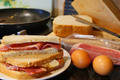
| 12/23/2008 09:30:13 PM | The Great British Traditionby didlessComment: Greetings from the Critique Club...
I was not able to vote on this challenge, but if I had, I probably would have given you a 6.
My first thought is that I would prefer to see the unopened egg and unfried bacon on the left hand side, as opposed to the right. In western society, we read from left to right, and therefore, if your objects were flipped, it would better follow the "before & after". I like the idea of using depth of field to separate the main subjects from the rest of the scene. Opening up a little wider, if possible, would really help separate the background and the foreground even further. Nice image overall. It makes me want to go get some food.
If you need any clarification on any of my comments, please feel free to pm me. It might take some time for me to get back to you. | | Photographer found comment helpful. |
| 12/23/2008 09:25:50 PM | To be or not to be!!by AmeedEl-GhoulComment: Greetings from the Critique Club...
I was not able to vote on this challenge, but if I had, I probably would have given you a 5 or 6.
My first impression is that I like the balanced composition, and overall dark colours. I'm not sure the hair style adds to the photograph, but it doesn't take away from it either. You finished with a decent score, but I think that there were other photographs in the challenge that better demonstrated "fill flash". So while you did have a fill flash shooting up at the model, the overall feel of the photograph is that of fairly balanced lighting. To increase your score, I think a more dramatic light source might be needed. Keep up the good work.
If you need any clarification on any of my comments, please feel free to pm me. It might take some time for me to get back to you. | | Photographer found comment helpful. |
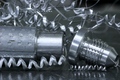
| 12/23/2008 09:20:06 PM | "Turned" into something...by bcenuComment: Greetings from the Critique Club...
I was not able to vote on this challenge, but if I had, I probably would have given you a 5 or 6.
While I think it is relatively clear on the before and after, I think that simplifying the scene a bit would help with the comparison. I find the aluminum swirls in the background to be distracting as they are fighting for my attention. If you had left a little more negative space on the bottom of the photograph, instead of the top, there would have been lots of beautiful reflectsions in the metal. The aluminum rod and threaded fitting with just the two metal swirls in the foreground would have been nice and simple, and easier to understand.
I hope you find these comments helpful. If you need any clarification on any of my comments, please feel free to pm me. It might take some time for me to get back to you. | | Photographer found comment helpful. |
|
Showing 2781 - 2790 of ~4876 |
Home -
Challenges -
Community -
League -
Photos -
Cameras -
Lenses -
Learn -
Help -
Terms of Use -
Privacy -
Top ^
DPChallenge, and website content and design, Copyright © 2001-2026 Challenging Technologies, LLC.
All digital photo copyrights belong to the photographers and may not be used without permission.
Current Server Time: 07/25/2026 10:08:48 AM EDT.
|