| Image |
Comment |
| 07/20/2002 10:58:00 PM |
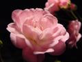
Practicing with Lightby RWTaylorComment: So soft and beautiful. I like the contrast of the pink and black, and the blurred roses in the background. Excellent work. |
| 07/20/2002 10:19:00 PM |
|
 Photographer found comment helpful. Photographer found comment helpful. |
| 07/17/2002 02:16:00 PM |
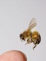
Bzzzby RemieComment: Excellent capture, and closer than I would want to get. I like the simplicity of this shot. karmat |
| 07/20/2002 12:39:00 PM |
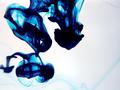
Blue in Motionby C3DComment: I like the blue and the flowing-ness of this picture. To me, though, it looks kinda fuzzy in some places on the left, and it may be cropped just a hair to close on the left as well. |
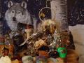
| 07/19/2002 05:54:00 PM |
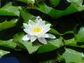
Indian Dreamsby uncleboComment: The lighting and focus on this picture is great. the viewer can really make out hte detials on each object. However, it is just a little too busy. My suggestion would be to take one or two items and photograph them so that the viewer can really absorb it. Also, it has kinda an odd crop. Crowded on the left, open on the right; feels a little off-balance to me. |
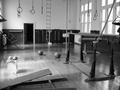
| 07/17/2002 02:14:00 PM |
Workoutby NitenComment: To have so much stuff in it, I find this to be a really simple, clean picture. I like that. I think the black and white works very well, too. Though I really like the "stillness" of it, it would have told a neat story to show a lone athlete resting on a piece of equipment. But that would be a different picture. Don't change this one! karmat |
| Photographer found comment helpful. |
| 07/17/2002 02:51:00 PM |
Nicholasby basia03Comment: Great expression! This looks a little grainy. Is it cut from a larger picture? |
| Photographer found comment helpful. |
| 07/17/2002 01:55:00 PM |
Kipling Was Wrong!by GeneralEComment: Nice crisp colors and framing, though maybe tilted a little. My only suggestion would be to crop the bottom of the interstate signs at the top out leaving just East West and arrow. karmat |
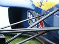
| 07/17/2002 03:00:00 PM |
Williams F1by doogbullComment: Good colors and focus. It seems a little weighted to the right to me, though, and i don't know why. Maybe it is the white area on the left. Really can't offer a way to correct it. Sorry. |
| 07/21/2002 07:40:00 PM |
ghosts...by gesellComment: Nice effect and colors. I like the brightness of it. |
Home -
Challenges -
Community -
League -
Photos -
Cameras -
Lenses -
Learn -
Help -
Terms of Use -
Privacy -
Top ^
DPChallenge, and website content and design, Copyright © 2001-2026 Challenging Technologies, LLC.
All digital photo copyrights belong to the photographers and may not be used without permission.
Current Server Time: 06/21/2026 07:47:33 PM EDT.