| Image |
Comment |
| 07/17/2002 01:46:00 PM |
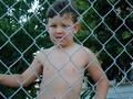
Tyler!by IsaacComment: I like the expression on his face and the fact that you took it from his eye level (or just below). It may be cropped a little too closely at the top, and it seems kinda flat to me. |
| 07/17/2002 02:48:00 PM |
A Face Only A Mother Could Loveby kristie380Comment: Good focus. I think cropping just above the nostrils and including the ears may have helped because then you wouldn't have the other little critter in the lower left. karmat |
| 07/18/2002 10:52:00 PM |
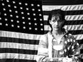
Indivisibleby connieComment: Hmmm, shall I say your model doesn't look to be too happy. Other than that, I like how you have this composed with the flag's stars on her right, and the shirt's stars on her left. I know you probably have a reason for having this in BW, it does have a certain mood to it, but how did it look in color? |
| 07/17/2002 01:43:00 PM |
Get in Your Corner!by CreativeFlyPhotoComment: Good focus and lighting for this kind of situation. There is alot going on in this picture. Maybe choosing one element and focusing on it would improve effectiveness. Or if you had changed the angle just a little so that the people across the ring didn't have a rope across their eyes. karmat |
 Photographer found comment helpful. Photographer found comment helpful. |
| 07/21/2002 07:16:00 PM |
Capitol Domeby ClubJuggleComment: Nice shot. Since you do not have a vivid blue sky, did you try it in bw? OR, try to focus on the flag since that is the most obvious color in the picture (except for the orange triangles at the bottom, which could be cropped or framed out.) |
| Photographer found comment helpful. |
| 07/17/2002 01:48:00 PM |
flies in the house (moscas en la casa)by brent matsuoComment: Was the yellowish cast intentional? If not, adjusting the white balance on your camera, if possible, or in post-processing, if accessible, may eliminate it for you. There may simply be too much "stuff" in this picture, especially with the empty space behind it. If the entire countertop (?) had been full of stuff, it would look more intentional. |
| 07/21/2002 06:58:00 PM |
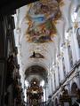
Higher Callingby welcherComment: Excellent capture of the colors of the ceiling. This is a very nice piece. To me, though, the darkness on the left makes it feel unbalanced |
| 07/18/2002 02:04:00 PM |
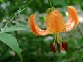
Canada Liliby tjuneau13Comment: This is a very nice picture, I like the colors and the focus (though it may be a touch soft for some). The only thing that bothers me is the stem goes up and out of the picture and then back in. I'm not really sure how to fix this other than just finding another angle, or something. karmat |
| 07/20/2002 10:33:00 PM |
|
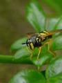
| 07/20/2002 03:40:00 PM |
waspby tomlewis1980Comment: Good contrast between the bee and leaves. I almost think a horizontal framing would work better. That way, you would still have space around the bug, but wouldn't clip his wing in the crop. |
| Photographer found comment helpful. |
Home -
Challenges -
Community -
League -
Photos -
Cameras -
Lenses -
Learn -
Help -
Terms of Use -
Privacy -
Top ^
DPChallenge, and website content and design, Copyright © 2001-2026 Challenging Technologies, LLC.
All digital photo copyrights belong to the photographers and may not be used without permission.
Current Server Time: 06/21/2026 10:46:35 PM EDT.