| Image |
Comment |
| 07/24/2002 02:31:00 PM |
Komodo Dragonby pjangelComment: Hmmmmm, I think someone is looking at me. Great framing and composition. The focus works very well here, and you have filled the frame nicely. karmat |
 Photographer found comment helpful. Photographer found comment helpful. |
| 07/25/2002 06:29:00 PM |
Nature's Textureby spillerComment: Nice idea. I think it needs to be a little better in focus to be completely effective. karmat |
| Photographer found comment helpful. |
| 07/24/2002 02:25:00 PM |
Delectable Dropletsby jaidComment: I think a tighter crop on just the face and glass, if possible, would have worked well too. This is hilarious. karmat |
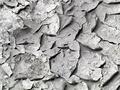
| 07/22/2002 09:29:00 PM |
Dry Earthby ttruthComment: Nice capture of texture. I think you've also used what shadows were available well; it gives it more depth. karmat |
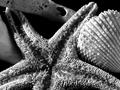
| 07/28/2002 11:16:00 PM |
She Sells Sea Shellsby KarenBComment: I like this shot in black and white. I think if the really smooth shell on the far left (or it looks smooth) was between the starfish and the shell on the right, it would show the contrast of the textures even better. |
| Photographer found comment helpful. |
| 07/23/2002 09:58:00 PM |
Cement, of coarseby ScottEmmonsComment: It does have texture, and you have done well by having the "grain" move diagonally instead of vertically or horizontally, I think. It just seems a little monotonous. Maybe if you had added something that would contrast with both texture and color it would have more "grab appeal." karmat |
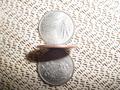
| 07/26/2002 02:40:00 PM |
quartersby g04tComment: Reflective surfaces are soooooo hard to do well. You have an awesome idea here, and the background, though busy, adds another layer of texture. I think if you were to redo this shot, you should try it so that the light doesn't cast a shadow over the lower quarter. Maybe use two or three lights at different points so that shadows are eliminated. Secondly, and this is just a thought, use Ohio and NC's quarter because there have been "debates" over which is really the "First in Flight" state. karmat |
| 07/25/2002 06:33:00 PM |
barbsby jgibsonComment: I like the repetitious patterns here, though the colors don't do a lot for me. After looking at it again, I am bumping your score up some. karmat |
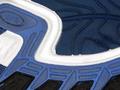
| 07/25/2002 06:37:00 PM |
Adidas Soleby vonnie1956Comment: Good color and focus. The white line gives some movement to the picture as well. It just seems a little flat to me. Maybe a different perspective would do something. karmat |
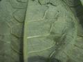
| 07/22/2002 09:29:00 PM |
Leaf it aloneby freetimeComment: Nice texture, but it seems a bit out of focus ot me. I think a sharper focus would show the veins even better. karmat |
Home -
Challenges -
Community -
League -
Photos -
Cameras -
Lenses -
Learn -
Help -
Terms of Use -
Privacy -
Top ^
DPChallenge, and website content and design, Copyright © 2001-2026 Challenging Technologies, LLC.
All digital photo copyrights belong to the photographers and may not be used without permission.
Current Server Time: 06/22/2026 05:02:35 AM EDT.