| Author | Thread |
|
|
07/29/2002 02:46:00 AM |
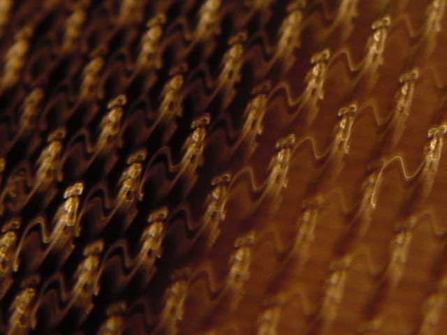
haha i can't believe how many people rated this poorly. maybe i should have used the full version. people complaining about it being out of focus? give me a break. there's nothing for it to be in focus on in the first place. the image (since it's a time lapse) isn't based on anything real to start with. obviously you didn't know what it was, but still, i think people's idea of what 'texture' is is skewed. :P
here's a scaled down version of the original. //anomalo.us/temp/DSC16366sa.jpg
|
|
Comments Made During the Challenge  |
|
|
07/27/2002 01:56:00 AM |
|
Maybe i'd like it more if i knew what it was, but w/o knowing, I see more blur than I'd like. 4 sjgleah |
|
|
|
07/26/2002 11:55:00 PM |
|
This looks like one of those shots that is probably great art, but over my head. It was interesting certainly. But definitely over my head. |
|
|
|
07/26/2002 07:46:00 PM |
|
If it wasn't for the title I couldn't have guessed what this was, maybe it has a lot to do with the "soft focus" (being generous there) |
|
|
|
07/25/2002 08:01:00 PM |
|
I see it, but I still don't understand it. This is a really nifty Macro! Soooo close!!! What is it? Why is the right side lighter than the left? (-1 point) I need to make a note to look at this after the Challenge week, gotta know what this is! The odd lighting is the only thing about this I don't like, so you stay at 9. (what IS it!) Swash |
|
|
|
07/25/2002 06:33:00 PM |
|
I like the repetitious patterns here, though the colors don't do a lot for me. After looking at it again, I am bumping your score up some. karmat |
|
|
|
07/24/2002 03:41:00 PM |
Composition7
Originality8
Technical Aspects6
Meets Challenge5
Total Score7
For those that are just learning, like me.
Composition: Scoring in this area is based on basic composition of a picture and includes the rule of thirds, balance, cropping, and curved and diagonal lines. Subject matter that does not lend itself to the picture or otherwise unwanted is also considered here.
Originality: Scoring in this area is based on pictures or concepts that I have seen, as well as how much effort you have invested in the picture. Usually a little something that sets it aside from a snapshot. Does it make me want to come back for another look? You know things like that.
Technical Aspects: Focus, exposure, lighting, and other special effects (done by the camera), and post processing are all considered in this category.
Meets Challenge: This is based on my interpretation of if you, have/have not, met the challenge. This is fairly simple but quite important for this site.
There are many sites that can give you assistance in achieving better skills in photography, but I think the best way to learn is to take pictures and show them to other people. Believe me when it is a good one you will know it.
Good luck!
Autool
|
|
|
|
07/24/2002 03:20:00 PM |
|
This would make a great texture :) ** sorry background texture for pc, is what I meant** |
|
|
|
07/24/2002 01:27:00 PM |
|
Great abstract. I love the repetitive pattern and the color. |
|
|
|
07/24/2002 01:18:00 PM |
|
This picture needs to be a bit lighter (5) AquaGoddess12880 |
|
|
|
07/24/2002 10:34:00 AM |
|
Interesting shot, nice repetition and color fade. |
|
|
|
07/24/2002 04:49:00 AM |
|
|
|
07/23/2002 10:33:00 PM |
|
As an abstract, this is a really interesting shot. As a texture, it's a little less appealing. Very interesting tones, though. Overall good entry. |
|
|
|
07/23/2002 10:06:00 PM |
|
interesting abstract, but the lack of focus doesn't interest me in this particular image... = 5 - jmsetzler |
|
|
|
07/23/2002 09:23:00 PM |
|
extremely abstract. something about the color of this is sort of uninteresting .. |
|
|
|
07/23/2002 11:37:00 AM |
|
|
|
07/23/2002 04:29:00 AM |
|
|
|
07/22/2002 03:29:00 PM |
I really like this, but maybe just a little more focus.
Ruthann |
|
|
|
07/22/2002 02:45:00 PM |
.
Message edited by author 2003-09-19 03:08:29. |
|
|
|
07/22/2002 01:06:00 PM |
|
i'm not quite sure what i'm looking at here. overall, too blurry. i think if this was in focus, i'd like it even if i wasn't sure what it is. -- gr8photos (2) |
|
|
|
07/22/2002 12:01:00 PM |
|
tough one for the focus, I guess. it looks very organic and makes me wonder what kind of barbs they actually are - will find out next week. 5 beegee |
|
|
|
07/22/2002 11:21:00 AM |
|
kinda nice but can't tell what it is. |
|
|
|
07/22/2002 10:01:00 AM |
|
|
|
07/22/2002 09:23:00 AM |
|
Using out of focus elements to show texture is kind of disorienting and adds confusion,textures should be in focus. |
|
Home -
Challenges -
Community -
League -
Photos -
Cameras -
Lenses -
Learn -
Help -
Terms of Use -
Privacy -
Top ^
DPChallenge, and website content and design, Copyright © 2001-2026 Challenging Technologies, LLC.
All digital photo copyrights belong to the photographers and may not be used without permission.
Current Server Time: 06/29/2026 03:36:55 AM EDT.