|
|
|
Showing 7301 - 7310 of ~9205 |
| Image |
Comment |
| 12/12/2002 01:23:12 PM | Leading the Choirby crabappl3Comment: The color, tone, and clarity of this shot is simply amazing. Very well done. Also, the expression on her face is hilarious. My only nit is that I think it would feel more balanced if she were further to the right in the frame, even if you had to crop part of her elbow off. |  Photographer found comment helpful. Photographer found comment helpful. |
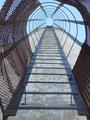
| 12/12/2002 01:13:46 PM | Stairway to Heavenby goodtempoComment: I really like the symmetry of this and how it "pulls" you to the top of the frame. Something is lacking, though, but for the life of me, I can not figure out what it is. I will think on it! | | Photographer found comment helpful. |
| 12/12/2002 01:05:31 PM | Birds Eye Viewby spidermanComment: Ooops, I completely missed the bird the first time around! The structure itself is interesting I think, but it is really grainy to me. Did you use digital zoom or crop it from a larger pic? Or did you intend it to be that way? I'm not sure, but converting it to black and white might help some since the sky is so white and the colors are almost monotone anyway. |
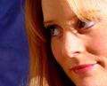
| 12/12/2002 01:02:29 PM | Portrait of a Beautyby byetkoComment: I like the composition of this picture in that by eliminating much of her head, the viewer is forced to focus on her face. Also the background color sets up a nice contrast. To me, there is a bit too much light on the face, especially the right side. If it is sunlight, maybe a thin or sheer material over the window would help diffuse it. If it is artificial, bouncing it off of a reflector (or wall or ceiling) might be nice. This is also an example I think would work well with a soft focus or gaussian blur, BUT I can understand why someone would do that because they don't traditionally score well on dpc. | | Photographer found comment helpful. |
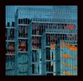
| 12/12/2002 12:59:53 PM | City Abstractby JakComment: The abstract part of this is awesome. I like the different "layers," for lack of a better word, of each of the sections. And the orange/red gives the appearance of fire. It is just real grainy to me, and I think a crisper picture would have been more effective.
Also, and this is just my opinion, the black in the border works well, but I think a wee bit more narrow would be better. |
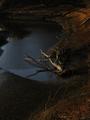
| 12/12/2002 12:56:09 PM | light's ebbby aelithComment: I think the curves in this picture do well to give movement to the picture. Also, the dead tree adds some interest as well. I am gathering from the title that this is a picture that is supposed to be dark, but on my monitor, it is a touch too much so. I think a touch more exposure, or a bit of adjusting of the lightness and contrast might make the interesting details more obvious. |
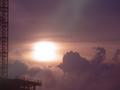
| 12/12/2002 12:51:42 PM | Up in the Cloudsby jab119Comment: I love the colors and texture of the sky and cloud. My only comment is regarding the structure on the left. In my opinion, you need more of it, or it needs to be eliminated all together. Right now, it seems to me that being in the frame was an accident! Also, if it is going to be included, maybe have it in a little sharper focus so that it really stands out. |
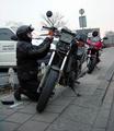
| 12/12/2002 12:49:50 PM | Roadside Repairs (Portrait of a friend)by AzrifelComment: Ah, nothing like a little roadside maintenance on a ride! The composition in this, and the strong leading diagonals work really well to take the eyes from the bottom of the picture to the top. Did you try it in black and white? Since the red bike is the only real color, I was wondering if it might have a little more interest that way. | | Photographer found comment helpful. |
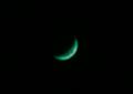
| 12/12/2002 12:43:17 PM | Green Cheeseby ChaszmyrComment: the negative space works well here as it does focus the eyes on the subject. However, I think if the green slice were in the lower right it would feel more balanced. Being in the center like that makes it feel static to me. |
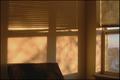
| 12/12/2002 12:08:28 AM | Morning Shadowby tjuneau13Comment: I like the simplicity of this and how the shadows become the focus of the picture. The warm colors also give it an ambient feel I think. Overall, though, the picture seems a little flat to me, for some reason; I can't really put my finger on it right now. I will think about it though. |
|
Showing 7301 - 7310 of ~9205 |
Home -
Challenges -
Community -
League -
Photos -
Cameras -
Lenses -
Learn -
Help -
Terms of Use -
Privacy -
Top ^
DPChallenge, and website content and design, Copyright © 2001-2026 Challenging Technologies, LLC.
All digital photo copyrights belong to the photographers and may not be used without permission.
Current Server Time: 07/16/2026 07:50:13 PM EDT.
|