|
|
|
Showing 7081 - 7090 of ~9205 |
| Image |
Comment |
| 02/01/2003 10:29:29 PM | |  Photographer found comment helpful. Photographer found comment helpful. |
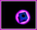
| 02/01/2003 04:24:55 PM | Meet Spot, my pet square.by SonifoComment: Hi Spot! I like how the negative space draws the attention to the subject, and the effect that is kinda a circle in a circle. | | Photographer found comment helpful. |
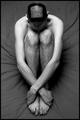
| 02/01/2003 04:23:30 PM | Square competition gone to my head.by SharQComment: That's dedication to the cause, brother. Hope you waited a while and you could have gotten a good before/after shot! I like the symmetry of the shot, and how his arms bring the focus of hte eyes down to the feet. |
| 02/01/2003 04:21:30 PM | Too square for a houseboatby johnmkComment: I think the boats adn the thing they are pushing/pulling need to be a little more to the right, it looks like they are getting ready to run out of the frame. The blue structure at the top really grabs attention, but it also becomes a focal point for the eyes, distracting from the lower part of the frame. Don't know if that was intentional or not. |
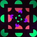
| 02/01/2003 04:19:21 PM | No Squaresby SeekerComment: Cool set up. I am assuming this is neon paper with a black light?? If so, you have some noise in the colored parts. I have found that a longer exposure sometimes helps with blacklights, but it is definitely difficult. Did you try neatimage, or some other noise elimination filter? That may help as well. |
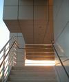
| 02/01/2003 04:17:38 PM | Squarewayby r_sandlerComment: I like the perspective of this shot, though I'm not sure if I like the openness on the left. I guess if I don't have a definite opinion, it must be okay! :-) The light adds some drama to the shot, but it is almost blown-out, I think. Maybe a faster shutter speed? Overall, good work. | | Photographer found comment helpful. |
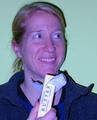
| 01/31/2003 10:33:36 PM | Trying to butter me up?by catpixelComment: CRITIQUE CLUB CRITIQUE
by karmat
COMPOSITION
I think the composition works well in this shot. It is cropped so that her face fills the frame and the stick of butter helps to lead from the bottom of the frame up to her face. I think if anything were to be changed, it may be to allow more of her hand to show, instead of chopping it off.
TECHNIQUE
I will not mention the color except to say maybe the white balance was off? However, it seems that the butter is accurately colored. And the rest of the picture is a little off, leading me to believe it may be intentional.
I really like the color of the background, as it is a pleasant switch from the typical white or black. Also the shadow up the right side of her is a little harsh, making me think you used a flash. Since she is the only subject, and the background is empty, could you have used a smaller aperture number, and not have used the flash? OR sit a light behind her to block some of that. I really like the animated look you have captured; she looks completely natural, as if she is enjoying her typical afternoon snack!
OVERALL EFFECT
Umm, as for a picture, it looks a little contrived, BUT "got milk" shots aren't typically what you would shot for a portfolio anyway, so that factor doesn't bother me. Just mentioned because sometimes it may be better to get a little more natural. (I promise, this is just a thought and not a complaint, etc). Again, the look on her face spreads joy, I think, and I find it interesting that you have her eating butter. At least I hope you staged that and she doesn't do that regularly. A stick of butter at a time couldn't be healthy. | | Photographer found comment helpful. |
| 01/31/2003 03:52:37 PM | My preciousssby RefractedComment: I like the composition, but I almost missed the square, there. Maybe a slightly tighter composition? | | Photographer found comment helpful. |
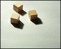
| 01/31/2003 03:51:57 PM | Three Squareby DougPazComment: I like the use of negative space and shadows here. It looks like they are marching forward to me. I can almost see a little sphere/circle being "attacked" by the cubes here. :-) | | Photographer found comment helpful. |
| 01/31/2003 03:51:10 PM | |
|
Showing 7081 - 7090 of ~9205 |
Home -
Challenges -
Community -
League -
Photos -
Cameras -
Lenses -
Learn -
Help -
Terms of Use -
Privacy -
Top ^
DPChallenge, and website content and design, Copyright © 2001-2026 Challenging Technologies, LLC.
All digital photo copyrights belong to the photographers and may not be used without permission.
Current Server Time: 07/17/2026 01:37:35 PM EDT.
|