|
|
|
Showing 6971 - 6980 of ~9205 |
| Image |
Comment |
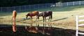
| 03/06/2003 05:19:23 PM | Three Horsesby timj351Comment: I think it is interesting that the lines in this shot lead the eyes one way (right to left with back fence) then the other (to the right with the edge of the water and horses) back to the left with the different color of water, and then they rest, somehow on the white part of the fence in the lower right. In my opinion, maybe cropping that little piece of fence out would let more attention to to the horses. |
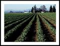
| 03/06/2003 05:17:09 PM | Rowsby robbiehComment: The lines really draw the eyes up and to the farm. Nice colors and details, as well. |
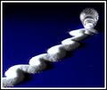
| 03/06/2003 05:16:35 PM | Archesby GordonComment: I love the blue and the repeating pattern. Very strong feeling, yet mysterious. |
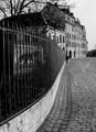
| 03/06/2003 05:16:01 PM | Walking along the fence. by jjbeguinComment: I like how the wall and bricks meet together to draw the eye into the picture. I don't know if it was intentional or not, but about halfway up, the bricks' pattern changes adn the eye is taken further to the right (at least mine is) on to the "back" of the picture. Very effective at moving the eyes around. Good use of bw. |
| 03/06/2003 05:12:35 PM | |  Photographer found comment helpful. Photographer found comment helpful. |
| 03/06/2003 05:11:22 PM | Salt Shakerby JackoComment: I love the simple colors, and how the texture is shown. Great use of shadows. | | Photographer found comment helpful. |
| 03/05/2003 02:02:17 PM | |
| 03/03/2003 12:27:17 AM | NO! I'm not ready to let him go!by SonifoComment: Wow, awesome shot, Sonifo. God is good. Before Travis was conceived, I prayed that if he would not glorify God, may he not even exist. As hard as it was to lose one, you can rest knowing he is with God, and you will meet him some day. | | Photographer found comment helpful. |
| 03/02/2003 11:12:07 PM | Smiling Through the Painby BigSmilesComment: CRITIQUE CLUB CRITIQUE
by karmat
COMPOSITION
Though the hands frame the face well, the overall composition seems a bit static. Perhaps if some of the mouth were covered, or if it were turned at just a bit of an angle, it would give it more dynamics.
TECHNIQUE
The focus and lighting is good, though some parts of the hand do seem a bit bright. I am not sure if this is a lighting issue, or tension from squeezing this little guy! I think it might have been interesting if the skin tones could have been desaturated, even a little.
OVERALL EFFECT
You ahve met the challenge well, adn I like the use of humor. |
| 03/02/2003 09:33:57 PM | Drifterby PaigeComment: CRITIQUE CLUB CRITIQUE
by karmat
COMPOSITION
I really like how you have included only part of the fruit and in the upper right hand corner. Also, the sea of blue works as sortof a negative space context to draw attention to the fruit.
TECHNIQUE
The colors you have used here are fantastic. I love the silky smooth look of the blue. Also, the capture of the bubbles on the fruit are a nice touch. My only criticism would be that the shadow under the fruit is a little noisy. I'm not sure how you could fix that without distorting the rest of the picture, but for non-dpc stuff, I would try to smooth that out. The yellow may be just a touch too light. Though I can see it fairly plainly on my screen, others may not, especially if it is not calibrated correctly or something.
OVERALL EFFECT
The satiny look of the blue gives this an elegant dreamy look. For some reason, it makes me think of a giant lemon relaxing in a swimming pool on a hot summer day.
Nice work, and good luck in future challenges. | | Photographer found comment helpful. |
|
Showing 6971 - 6980 of ~9205 |
Home -
Challenges -
Community -
League -
Photos -
Cameras -
Lenses -
Learn -
Help -
Terms of Use -
Privacy -
Top ^
DPChallenge, and website content and design, Copyright © 2001-2026 Challenging Technologies, LLC.
All digital photo copyrights belong to the photographers and may not be used without permission.
Current Server Time: 07/18/2026 09:27:37 AM EDT.
|