|
|
|
Showing 5721 - 5730 of ~9205 |
| Image |
Comment |
| 07/03/2006 06:50:27 PM | |
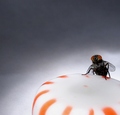
| 06/26/2006 10:19:08 AM | It's Mine. ALL Mine. by karmatComment: Originally posted by DrAchoo:
Great one karmat! If the bug patrol comes knocking at your door, you can always hide out with me... |
:) |
| 06/21/2006 01:22:42 PM | It's Mine. ALL Mine.by karmatComment: Yea, I'm stoked. oh yea. oh yea.
The funniest part -- I wondered if it really met the challenge. hehehe. I mean, I could see it, but so many times what is obvious to me is completely lost on 99% of the rest of the voters.
:) |
| 06/19/2006 01:00:29 AM | |  Photographer found comment helpful. Photographer found comment helpful. |
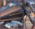
| 06/19/2006 12:59:22 AM | XS Riderby coolharComment: Very nice. The tight crop works exceptionally well, I think. | | Photographer found comment helpful. |
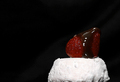
| 06/19/2006 12:57:38 AM | American V8by CVetteComment: I love the angle you chose to shoot this with. Very nice . .. | | Photographer found comment helpful. |
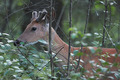
| 06/13/2006 03:38:14 PM | Young Deerby TommyMoe21Comment: CRITIQUE CLUB CRITIQUE
by karmat
Excellent capture. I like how the deer is in its natural habitat.
Compositionally, the placement within the frame makes the head a strong focal point. It does seem a bit "straight on" though, and while I understand deer are not the most obliging models, if you could have grabbed one where he was looking at you, or was angled more towards you, it may have given the composition a bit more "dynamicism" and interest.
Technically, you did well at capturing this near sundown. Even with the higher ISO, you do not seem to hvae a lot of visible noise in the picture. I like how some of the branches and limbs are blurry/out of focus. This helps give the picture some depth and dimension. Desaturating the green was a wise move, I think, otherwise, it had the potential to totally overwhelm the reds of the deer. It could possibly stand a bit more brightness or contrast, but I am on my work monitor and would hesitate to make that a "gospel statement," because sometimes this monitor can be a bit dark.
Good work.
karma | | Photographer found comment helpful. |
| 06/12/2006 12:29:18 AM | | | Photographer found comment helpful. |
| 06/11/2006 12:56:25 AM | Neon Lightby kaidaehnkeComment: CRITIQUE CLUB CRITIQUE
by karmat
My first impression is that the green in this is awesome. Very much an attention grabber.
Compositionally, because it is an abstract, it obviously does not have a "traditional" subject or place to rest the eyes. It is very busy though, and the eyes go right to left to right following the different waves. I'm not sure that I am particularly crazy about the tight vertical crop, and wonder what it would be like set on an angle. That might help to add some interest, as well as another direction of movement because not only would the eyes be following the green lines, they would also be moving diagonally through the frame. They do that some now, but the centered composition lends itself to being rather static. So, having a static composition with a busy subject creates tension. That can be good or bad, depending on what your objective was.
Technically, the simple colors work well for me. The green is very bright and energized and it is complemented/contrasted nicely with the black. The depth of field works well here, simply because it is not immediately noticable. It was only after viewing the picture for a minute or so that I realized some of it was soft.
This shot reminds me of music, for some reason. It has rhythm and movement, and looks like something someone could dance to.
Good work and best to you in future challenges.
karmat |
| 06/09/2006 11:58:11 PM | FREE AS A BIRDby MapleLeafComment: CRITIQUE CLUB CRITIQUE
by karmat
Very cool stop action captured here.
Compositionally, you have done well by having the subject in the left third of the frame. That gives the image both stability and balance. Also, it gives the eye somewhere to "go."
Technically, teh exposure is pretty good. Most of the colors are bright, but not oversaturated, and the details are visible throughout. The focus, though, seems off. The overall shot is a bit "fuzzy" which is odd considering your shutter speed is 1/1000 and that would indicate that all motion was stopped completely, or pretty close to it. However, even the stationary objects in the background are also soft. I think if you had used a larger aperture number, that would have allowed for a deeper depth of field, and the focus would have been quite so soft. (I'm wondering if the camera was focusing on something closer).
The size of your shot also hurts a bit, especially on larger monitors as the picture looks very small. The tutorial on resizing for dpc might help (Learn > Tutorial).
Congrats on entering, and I look forward to seeing more!
karma |
|
Showing 5721 - 5730 of ~9205 |
Home -
Challenges -
Community -
League -
Photos -
Cameras -
Lenses -
Learn -
Help -
Terms of Use -
Privacy -
Top ^
DPChallenge, and website content and design, Copyright © 2001-2026 Challenging Technologies, LLC.
All digital photo copyrights belong to the photographers and may not be used without permission.
Current Server Time: 07/27/2026 05:42:39 PM EDT.
|