| Author | Thread |
|
|
07/05/2006 01:13:25 PM |
Reading through what you've said, it seems as though you have achieved what you set out to do very well.
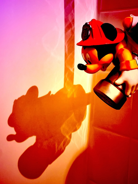
The colours and the watery reflections give create the "going into a fire" atmosphere, and the composition seems very balanced. However, if I had seen this in the challenge I doubt I would have voted it high, as I don't really "get it" without the explanation. |
|
 Photographer found comment helpful. Photographer found comment helpful. |
|
|
07/02/2006 11:00:25 PM |
|
Remember, y'all, he's a FIREMAN, flying into a FIRE. Natural colors will not exist in such a situation. That's why I did what I did. Minimal post would have been a complete waste of time. This was what I wanted it to be. Thanks so much for the comments, though, next time I've got to figure out how to make YOU see the reason. |
|
|
|
07/02/2006 08:12:30 AM |
Trading Post
I like the idea, but the colors are a bit over the top for me. I was out fo town and couldn't vote, but I would have scored it a 5 or 6. I would have leaned toward a higher score if the colors weren't so saturated (especially his hat, which has few details). |
|
| Photographer found comment helpful. |
|
|
06/30/2006 12:31:22 AM |
|
Trading Post - Reading your intentions on the perception of this shot after the fact helps make the processing make sense. I dont think i got it during the challenge. Pretty funky colors and the shadow really stands out. I am sure it is not what voters were looking for though. |
|
| Photographer found comment helpful. |
|
|
06/25/2006 10:34:26 PM |
hello again and welcome back,
yeah. it is overprocessed. lol. that was the major problem i had with this was that it had too much saturation creating an extremely odd coloration.
nice idea and it looks okay ifn you just had something other than a bathtub. lol. |
|
| Photographer found comment helpful. |
|
|
06/25/2006 09:18:42 AM |
[[trading post]]
I think the image is way overprocessed, the colors are fine, except on mickey there the colors are way off.
composition is good, the idea is good, but the rest is not so good... lighting and postprocess is not good, and the colors in mickey are really bad.
I think you might have scored higher with minimal processing. |
|
| Photographer found comment helpful. |
|
|
06/19/2006 10:26:47 PM |
Trading post...
Great job here! After being DQ'd for a filter I'm really leary of using them anymore. This was so creative. IMHO, I think this should have scored higher. And I don't think it looks processed. |
|
| Photographer found comment helpful. |
|
|
06/19/2006 09:32:30 PM |
Trading Post comment:
Heh! I like this one! I love that you used filters to get the colors - I'd never have known that. Very clever! It looks vibrant and rich, but not overly processed to me. I like how the figure and the shadow are both in the frame, but the shadow more fully developed in the "action" by being attached to the rope. Met the challenge well and would make a nice poster for a kid's room, I think! |
|
| Photographer found comment helpful. |
Comments Made During the Challenge  |
|
|
06/15/2006 09:09:02 AM |
|
I really like the cartoonish look to it. What filter in PS was that? It looks like a chrome and something else. |
|
| Photographer found comment helpful. |
|
|
06/15/2006 06:32:51 AM |
|
Awwwwwwwwwwww.........now this is just damn cute....wicked. |
|
| Photographer found comment helpful. |
|
|
06/14/2006 07:51:01 PM |
|
So cute... Nice colors and a cute idea :o) |
|
| Photographer found comment helpful. |
|
|
06/14/2006 08:03:45 AM |
|
This looks like a drawing, the colors are a little strange but I kind of like the idea. |
|
| Photographer found comment helpful. |
|
|
06/13/2006 09:42:23 PM |
|
| Photographer found comment helpful. |
|
|
06/12/2006 03:16:30 PM |
|
| Photographer found comment helpful. |
|
|
06/12/2006 12:29:18 AM |
|
I still like it. Wish you could have made it more orange instead of pink. :) |
|
| Photographer found comment helpful. |
Home -
Challenges -
Community -
League -
Photos -
Cameras -
Lenses -
Learn -
Help -
Terms of Use -
Privacy -
Top ^
DPChallenge, and website content and design, Copyright © 2001-2026 Challenging Technologies, LLC.
All digital photo copyrights belong to the photographers and may not be used without permission.
Current Server Time: 06/29/2026 06:19:29 AM EDT.