|
|
|
Showing 4961 - 4970 of ~9205 |
| Image |
Comment |
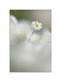
| 05/12/2007 09:13:18 PM | Solo Springby unicumComment: CRITIQUE CLUB CRITIQUE
by karmat
This is a lovely, peaceful feeling picture. It speaks of purity and happiness. I can easily imagine it making a stunning print.
Compositionally, I think the the picture's subject and general composition conflict with eachother. The subject, and all of the white/light colors, indicate that this is a very peaceful shot. However, it is placed within the upper right of the frame, close to the edge and near the corner with a lot of foreground space. This feels a bit off-balance. *I think* less foreground and more background, with the flower lower in the frame would make this shot feel much more balanced and stable.
Technically, I think you have done a super job. The focus, lighting, exposure, etc. are very well done. The shallow dof you have really adds to the dreamy feeling of the shot.
Just a note on the border -- some people love them, some hate them. I personally am ambivalent towards them unless the frame is the first thing I notice. In this shot, because it is so broad, I noticed the frame and then looked at the picture. When voting, I typically don't detract points for that, but it does take away from the overall effect, and in essence, gives the viewer a smaller picture to judge. Just a thought.
As bod said, this is a very elegant photograph.
Nicely done and best to you in future challenges. If I need to further explain or clarify myself, please feel free to let me know.
karma |
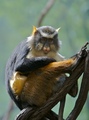
| 05/12/2007 08:56:25 PM | What Are You Lookin' At!by acoppolaComment: CRITIQUE CLUB CRITIQUE
by karmat
I like how the monkey is a large enough element in the frame that he is the obvious subject, but there is some background to give him some context. He does, however, have a branch coming out of his head. Depending on your philosophy of post-processing, that might be a good element to clone out.
Technically, the exposure, focus, lighting, etc. is all very well done.
Overall, you have a good photograph, and I think your score (especially in a free study with almost 600 entries) validates that. What kept this from being a top 25 or 50, though was the "wow" factor. It is a picture of a monkey looking at a photographer, and while the title gives it a bit of humor, there is nothing that makes this shot stand out enough to push it to the high 6 mark. I am fairly confident that if this had been in another challenge ("Zoo Animals," "Eye Contact,") it would have placed much higher.
Nice work and best to you in future challenges.
Karma |  Photographer found comment helpful. Photographer found comment helpful. |
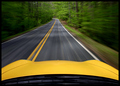
| 05/12/2007 08:35:05 PM | There Is No Substituteby arlanbartComment: CRITIQUE CLUB CRITIQUE
by karmat
Nice motion shot.
Compositionally, I really like how the yellow of the car is at the base of the picture. This helps to provide an 'base' of sorts for the eye to start on. Then, because the yellow line so very nearly matches, it is a natural progression up and through the frame. Very effective use of leading lines/vanishing point.
Technically, it is also a very sound picture. The focus in the distance really makes the motion blur all the more effective.
I would really like to see this shot in the fall with all the fall colors, too.
Saluda, eh? Are you from around there, or just passing through? There is a neat place under the Green River Bridge that has a cool railroad trestle that is interesting to photograph. And if you want more curves, head on up my way and take one of the roads to the Parkway.
Congrats on taking 11th in a free study. That is something to be proud of!
Karma | | Photographer found comment helpful. |
| 05/12/2007 02:55:26 PM | Boats of the Andaman Sea by orvaratliComment: CRITIQUE CLUB CRITIQUE
by karmat
Wow! What could I say to ad to this shot. The colors are beautiful, the lighting is awesome, the composition is wonderful. The *only* thing I would suggest to have a bit more room on the left side of the frame. But, that is terribly minor.
Awesome shot and very deserving of the ribbon. Congrats!!!
Karma | | Photographer found comment helpful. |
| 05/12/2007 02:50:02 PM | fruit flyby eyeslanderComment: CRITIQUE CLUB CRITIQUE
by karmat
Interesting.
you have a strong composition that is "anchored" nicely in the lower left of the frame and moves through the frame in an upward and outward "motion." It is also a nice graphic shape, without a lot of extraneous details to distract or detract.
Technically, it looks soft. Not out of focus, though some viewers may have thought that when passing through. The lighting is also uneven. Admittedly, sometimes uneven lighting can be used to produce nice dramatic effects, but in this case it looks like it was controlling you instead of you controlling it.
In a field of almost 600 pictures, a shot really needs to have something to reach out and grab the viewer and compel them to look longer than a second or two. You have a good humor factor, but there is nothing in the shot besides that to really jump out at the viewer.
Best to you in future challenges, and if I need to further clarify or explain myself, please feel free to contact me.
Karma | | Photographer found comment helpful. |
| 05/11/2007 08:10:23 PM | Poker parisien (submitted BEFORE the contest Triptych)by Rino63Comment: CRITIQUE CLUB CRITIQUE
by karmat
Awesome collection of images. I am truly surprised that it didn't score/place higher.
Each of the shots, on their own, are very strong. There are good colors and details present, and each one is interesting, in its own right. I think the arrangement of the ones you have chosen are a bit haphazard, though.
The flower in the bottom right works well. The trees and reflection in the upper left would be better placed in the lower left, with the tower picture on top. That way, the tower and moon is pointing toward the center of the shot rather than feeling like it was falling out.
Another tiny nitpick, the border around the outside of the images, and between the left two is thicker than the border down the middle. It doesn't sound like much, but it adds to the "not planned" feeling of the overall shot. I think cropping the people picture tighter would give you the few pixels you need to be wider apart.
I daresay that you could have used the tower alone in this study and done well. It has an interesting perspective and composition.
This would make an excellent postcard, I think.
If I need to further explain or clarify myself, please feel free to contact me.
karma | | Photographer found comment helpful. |
| 05/10/2007 11:12:38 PM | Birdwatchingby loveComment: CRITIQUE CLUB CRITIQUE
by karmat
Very effective shot.
Compositionally, I like how the head fills the frame, and I think that cropping it so tightly was very effective here. I find myself following its gaze out the frame, and wondering exactly what he (she) is seeing.
Technically, the focus on this is great. So many times, it seems, with animals, something will be blurry and it detracts from an otherwise great shot. You do not have this problem. The focus is awesome. Also, the bw is very nice, not a muted gray, but clear blacks and white, and the contrast level is very appealing to me. I am on my laptop, which is notoriously flat, so it the contrast looks good here, it may have been "too contrasty" for some of the voters. Also I like the textured background.
Overall, you have an awesome shot it. It seems to really capture the essence of the cat and its personality. To score over a 6 with a pet shot in a free study is commendable in itself.
Good work.
If I need to further clarify or explain, please feel free to contact me.
Karma | | Photographer found comment helpful. |
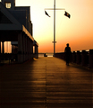
| 05/10/2007 10:31:46 PM | Sunlight Serenadeby EBJonesComment: CRITIQUE CLUB CRITIQUE
by karmat
Lovely, relaxing tones.
Compositionally, you have effectively used leading lines to direct the eyes upwards and through the frame. I also like the balance created between the building on the left and the flags on the right. The person helps to add a human element to the story and that adds to the interest of the story.
Technically, I like that there are still some details in the silhouette, and the orange provides a nice contrast. I honestly can't think of anything I would suggest to change in this -- it is that awesome a shot.
We had been toying with the idea of going to Charleston this summer. This shot has about made me definitely decide to do so. :)
If I need to clarify or further explain myself, please let me know.
Karma | | Photographer found comment helpful. |
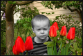
| 05/10/2007 10:13:49 PM | A Thorn Among The Flowersby smardazComment: CRITIQUE CLUB CRITIQUE
by karmat
Compositionally, I like the different elements in the shot. The tree and house in the background give it a good context and backdrop. The tulips make a creative frame and contrast for the little boy's face. I think a tighter crop on the left, so that there is no "space" between the edge of the tree and the edge of the shot, would give this a more complete feel. As it is, it feels unbalanced to me because the tulips are closer to the edge on the right, than on the left, or because of the difference from the camera, it feels that way. For that matter, cropping closer to the edge of the flowers on the right might be a useful trim as well.
Technically, you have good focus, and good contrast between the focused areas of the shot (the boy, most of the flowers) and the out of focus house and greenery. The colors are nice. The muted yellow/tan of the house is a great contrast with the green and red.
The selective desaturation kills this shot, I am afraid. While it can be an interesting and effective technique, it has to be done judiciously. I think what hurts this one the most is that the selective part is more muted grays than a true black and white. Also, it doesn't seem to have much purpose in being desat., other than it is something you can do, although it does make the shot a bit more humorous.
Something I think might look interesting for this shot is to do a "handpainted" technique. It's not something I've done a lot, but I think it would look interesting here. Choose two or three main colors -- yellow for the house, red for the flowers, and a color or so for the boys shirt. Then, make the entire shot a bw, then paint the house with just a touch of yellow, the flowers with just a touch of red, and his shirt with whatever color you choose. Then, the colors can be faded to show the textures, patterns, whatever, underneath the color.
OR you could desaturate the whole shot so that there is just a hint of color throughout.
The little boy's expression is priceless. Hope he wasn't too disgruntled.
If I need to further explain or clarify myself, please feel free to contact me.
Karma | | Photographer found comment helpful. |
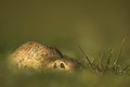
| 05/10/2007 09:37:13 PM | gopher playing possumby gazdiComment: CRITIQUE CLUB CRITIQUE
by karmat
He looks like he is ready to do battle!
Compositionally, the little critter is in an excellent point in the frame. There is a good use of negative space that helps to emphasize the subject, and it is a stable, balanced feeling shot. I also like the low perspective you have chosen to use. I really like that you captured the "eye contact."
Technically, *I* like the shallow depth of field and how the grass in the foreground is blurry. Upon first glance, though, it gives the impression of the whole picture being out of focus, and in a field of almost 600 entries, a shot has to have immediate appeal, which it may not have done for several.
Also, the green is a bit drab which gives the picture more of a "ho-hum" feeling rather than making it *pop.* Obviously, that is difficult to control, but maybe playing with brightness/contrast or saturation *might* give it a bit of color.
overall, I think it is a good shot, and it made me smile. Be careful, though, they can bite!
Karma | | Photographer found comment helpful. |
|
Showing 4961 - 4970 of ~9205 |
Home -
Challenges -
Community -
League -
Photos -
Cameras -
Lenses -
Learn -
Help -
Terms of Use -
Privacy -
Top ^
DPChallenge, and website content and design, Copyright © 2001-2026 Challenging Technologies, LLC.
All digital photo copyrights belong to the photographers and may not be used without permission.
Current Server Time: 05/12/2026 04:06:49 AM EDT.
|