|
|
|
Showing 4931 - 4940 of ~9205 |
| Image |
Comment |
| 05/16/2007 11:18:13 PM | 100m dashby MarkComment: CRITIQUE CLUB CRITIQUE
by karmat
Interesting take on the challenge.
Compositionally, this shot is okay. The cheetahs are in the lower half of the frame which makes it feel balanced, and the two visible ones are not centered but in the right hand running left, so there is room for them to go. The tail on the left is a bit distracting, but funny. What may have made it even more humorous is to chop part of the tail of the one to the far right. To me, then , it would look like the sides of the picture would 'match up' in a rather humorous juxtaposition.
Technically, the shot is a little soft and needs a touch of contrast or saturation, I think. Also, the trees in the background seem to be slightly tilted to the left, just a touch making it seem as if they are running down hill (perhaps they are).
As mentioned before, I find this a creative, interesting approach to the challenge. It is not a sport as we know it, but rather one that is being played by non-humans. Unfortunately, that may have hurt in some of the scores.
Nice work, and if I need to further explain or clarify myself, please feel free to contact me.
karma |  Photographer found comment helpful. Photographer found comment helpful. |
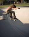
| 05/16/2007 11:13:00 PM | I Believe I Can Fly by cools98Comment: CRITIQUE CLUB CRITIQUE
by karmat
Wow! Nice shot. I'm not sure that I can tell you anything to improve this shot, it stands on its own fairly well.
I do think there are some elements that work together, though, to make this a good shot.
First, the focus is right on. The colors are rich and the details in the skater are clearly present. Also, having the skater in the top of the frame, adds to the feeling of "big air" that this shot portrays. And, subtlely, the slope of the half-pipe (is that the right term?) gives even more motion and action to the shot.
You have done a fine job, and this is an excellent shot.
Karma | | Photographer found comment helpful. |
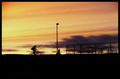
| 05/16/2007 11:08:30 PM | Sunset Cyclingby dizusComment: CRITIQUE CLUB CRITIQUE
by karmat
Welcome to the challenges! Topping 6 in your second entry is very good. I imagine I will be seeing more of your images towards the top in the near future.
Compositionally, this shot has some very strong elements. There is a nice balance between the sky and the foreground, and you haven't cut the horizon in half, which is nice. :) Also, there are three "elements" being silhouetted, the cyclist, the pole and the fence. This sets up a nice "triangle" which feels well-balanced. The fact that the pole is the highpoint and the cyclist and fence are similar heights also adds to the stable balanced feeling.
My only nit, compositionally, would be that there is too much space to the left of the rider. It think cropping it in just a touch closer would tidy the picture up some.
Technically, you have a very sound picture here. The focus, exposure, etc. all works together well to form a nice picture.
Overall, you have a nice picture that meets the challenge well. It is pleasant to look at.
Good work, and best to you in future challenges. If I can clarify or further explain myself, please feel free to contact me.
Karma | | Photographer found comment helpful. |
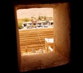
| 05/16/2007 11:02:06 PM | time machineby alyamiComment: CRITIQUE CLUB CRITIQUE
by karmat
Using the window as a frame is a very interesting and effective technique here, I think.
As a picture, I think that if the view out the window was better focused, it would have been better received. As it is, the "stuff" in the background is barely indistinguishable, especially to a voter going quickly. What hurts worse than the background being out of focus is that the window sill is also rather soft. As a result, the eye keeps searching for the focal point of the photograph, but since nothing is clearly defined as such, it doesn't hold the viewer's attention.
Also, outside the window seems a bit overexposed. Admittedly, this is one of the most difficult kinds of shots, at least for me, when one part is very bright, and the other is very dark. Given that, you have done well, but the overexposure adds to the fact that the information through the window isn't easily discernable.
As a challenge entry, *I* think your connection to the challenge is tenuous at best. You do, indeed, have a "cultural" subject, per se, but it doesn't "scream" event to me. Actually, it doesn't even whisper it. I may be missing something obvious, and if I am, please feel free to contact me and let me know. I suspect, though, if it is not that obvious to me, it may not be to others, either.
Again, using the window as a frame is very effective, and I like that it is tilted. That adds interest and variety, I think.
Karma |
| 05/16/2007 03:32:57 PM | By In a Blurby twmaxComment: CRITIQUE CLUB CRITIQUE
by karmat
Great motion capture.
Compositionally, I can't decide if I like having the tops of their heads and backs cropped out or not. On the plus side, it fills the frame better, and contributes to the sense of urgency or speed that the shot conveys. On the negative shot, it feels a bit accidental, because not much was cropped out.
Technically, I like that you have chosen to show the bicycles blurry. That helps to capture the motion and speed. I do think the back wall could be a bit more in focus, though. If it had been, this would have been an incredible shot.
Overall, good work in this challenge. You met the challenge well and had a good photograph.
If I need to further clarify or explain myself, please feel free to contact me.
Karma | | Photographer found comment helpful. |
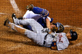
| 05/16/2007 02:46:53 PM | "Ouch!" screams the catcher. "P-lease drop the ball," struggled the runner.by harmsusmcComment: CRITIQUE CLUB CRITIQUE
by karmat
Ouch, that hurts.
Compositionally, this shot works. The two guys fill the frame and it is balanced, nicely.
Technically, I like the net there. It gives the sense of actually watching the game live. Of course, I can see how it could be distracting, but I'm not sure they would let you on the other side of it to shoot. :) The low aperture number seems to have made the focus just a teeny tiny bit off. Not enough for it to feel out of focus, but just enough for it to not feel exactly focused. Some of the "edge" that I'm seeing though, could be from compression to fit into the size for dpc.
Great active capture. I think that helped your shot stand out among several others.
Good work, and if I need to clarify or explain myself, please feel free to contact me.
Karma |
| 05/16/2007 02:42:05 PM | rock climberby andrijaComment: CRITIQUE CLUB CRITIQUE
by karmat
Great capture.
I like how the hand and top of the ridge are focused, yet the shallow dof eliminates other distracting features. However, his grimace is still "visible" so you can still "feel" the intensity of what he is doing.
Compositionally, the only thing I would suggest would be to have more space at the bottom and right of the frame, so that his hand is not sitting so close to the edge. Since it is the focused object, it becomes the primary focal point of the picture. It is so close to the edge though, that the eyes either go out of frame, or keep trying to focus on the out of focus face. You do have a good balance between the face and hand -- they counter each other nicely.
Technically, I think black and white works well for this shot. It helps create the tension of the climb, and eliminates colorful distractions. As mentioned, the shallow dof works well, too.
Overall, a nice shot.
If I need to further clarify or explain myself, please feel free to contact me.
Karma | | Photographer found comment helpful. |
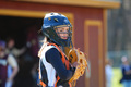
| 05/16/2007 02:37:53 PM | The Catcherby mgrover63Comment: CRITIQUE CLUB CRITIQUE
Very nice clarity and rich colors on this one.
The thing that I immediately notice is that she is standing in the middle of the frame. I think the single biggest thing you could do to improve this shot is to crop it so that she is on the left third. That would leave some background for context, but would help eliminate the static-ness that goes with a centered composition, typically.
Technically, I love the clarity in this. The detail are awesome, and I'm thinking you nailed the exposure on it. Some of the whites where the sun is hitting directly are a touch blownout, but not to the point of being distracting.
Overall, it is a good shot, and pleasing to look at. While I do think you met the challenge, I also think that if you could have captured her (obvious) intensity during some action of the game, you would have scored even higher. Good work on your first entry. I look forward to seeing more of your entries.
Karma | | Photographer found comment helpful. |
| 05/16/2007 11:47:51 AM | Foul Ballby VpphotoComment: CRITIQUE CLUB CRITIQUE
by karmat
Compositionally, I like how the ball is "anchored" in the lower left, but it is cropped much to close, I think. While I don't necessarily feel that the entire subject has to be in the frame, you have cropped just a bit out and that makes it look accidental. Also, the ball is almost on the mid-line, horizontally, so if it could have been dropped in the lower 1/3 of the frame, I also think it would have made it a slightly stronger image.
Technically, the shallow dof works very well here to isolate the subject and add interest to the shot. The background *seems* tilted, but it is difficult to tell because it is indistinguishable as to what it is I'm seeing. Also, a bit of saturation and contrast boost may really help this shot to *pop.*
Overall, I do think the shot conveys "sports" but it doesn't cover the 'action' part of it well. While this ball may have been on the very verge of being scooped up and thrown to the pitcher, there is nothing to indicate that. So, perhaps a little "action" would have helped. Also, when a shot is stationery, voters tend to feel that it should be almost perfect technically, they do seem a bit more forgiving with action shots.
If I need to further clarify or explain myself, please feel free to contact me.
karma |
| 05/16/2007 11:39:22 AM | Ascending Numeralsby bjjwannabe152Comment: CRITIQUE CLUB CRITIQUE
by karmat
Compositionally, I like the implied leading lines established by the players. I think the crop you have chosen is effective, though I wish there were a bit at the bottom so that the end of #1's glove wasn't cropped out.
Technically, the shot is sound. The busy background is a bit distracting, but it does give some context to the shot. The focus is good, and the colors contrast nicely.
Overall, I think it is a good shot, and I do think it meets the challenge. Granted, the players aren't moving, so the action isn't obvious, but having watched and played a lot of softball/baseball games, I can personally attest that this is what the "action" looks like. That being said, I do think you would have scored significantly higher if you had captured some of the "action" of the game.
Also, regarding the comment about seeing the player's faces. I have seen some very compelling/interesting sports shots where the face wasn't showing. However, in a shot like this, where it is between plays, it would have been interesting to see their faces, especially if they were intently concentrating or something like that.
If I need to further clarify or explain myself, please feel free to contact me.
karma |
|
Showing 4931 - 4940 of ~9205 |
Home -
Challenges -
Community -
League -
Photos -
Cameras -
Lenses -
Learn -
Help -
Terms of Use -
Privacy -
Top ^
DPChallenge, and website content and design, Copyright © 2001-2026 Challenging Technologies, LLC.
All digital photo copyrights belong to the photographers and may not be used without permission.
Current Server Time: 05/12/2026 05:14:29 AM EDT.
|