|
|
|
Showing 2971 - 2980 of ~9205 |
| Image |
Comment |
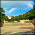
| 08/09/2007 11:06:55 PM | Day 40by kellyrc01Comment: Yippeeee for you! Enjoy the next two weeks. I know you glad to be getting finished. I really like the colors in this one. |  Photographer found comment helpful. Photographer found comment helpful. |
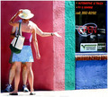
| 08/09/2007 09:13:26 PM | Meeting at the Cornerby riversongComment: CRITIQUE CLUB CRITIQUE
by karmat
Compositionally, I think the people on the left side of the frame and the emptiness of the right contrast nicely with eachother. The only mildly disconcerting part is that at first glance, it almost looks like a woman with four legs and arms. :/ This is interesting once you realize what you are looking at, but upon first glance it may have put some people off.
Technically, the lighting is a bit harsh, but it is understandable. It really makes the colors *pop* and emphasizes their brightness. Also, again, the colors are very nice, and really attract the viewer's attention to the shot.
Overall, I think it is an interesting shot.
If I need to further clarify or explain myself, please feel free to contact me.
Best to you in future challenges,
Karma | | Photographer found comment helpful. |
| 08/09/2007 09:07:48 PM | The long way homeby dpcollinsComment: CRITIQUE CLUB CRITIQUE
by karmat
Compositionally, I think the vertical crop works well. The fence and rails help to lead the viewer's eyes up and through the frame. the walker is also placed at a good spot in the frame.
Technically, I think the bw works very well here, and you have a good range of tones as well as good details both in the brighter areas and in the darker ones. The depth of field you have used works very well on this.
Overall, I think it is a good shot, but just didn't "connect" with the viewers the way some of the higher scoring ones did. Perhaps they didn't feel it was "street" enough, or maybe they've never experienced walking like this. :)
If I need to further clarify or explain myself, please feel free to contact me.
Best to you in future challenges.
karmat | | Photographer found comment helpful. |
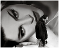
| 08/09/2007 08:57:24 PM | Beauty And... by hotpastaComment: CRITIQUE CLUB CRITIQUE
by karmat
Wow, not a lot I can say to improve on this one, so I guess I'll just say what I think went "right."
Compositionally, it is very well balanced. The large face of the women dominates the shot, but does not overwhelm the subject which contrasts in so many ways -- size, confidence, shape, sex, etc.
Technically, it is very well focused (which always helps) and the exposure is very good too. The bw works very well here and you have a good range in tones, as well.
Emotionally, I think it connected with a lot of the viewers simply because we can relate with the dejectedness that the guy shows (at some point in our lives).
Excellent shot and congrats on the ribbon.
karmat | | Photographer found comment helpful. |
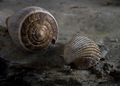
| 08/07/2007 04:50:29 PM | Still Sea Lifeby kevip6Comment: CRITIQUE CLUB CRITIQUE
by karmat
First of all, kudos for doing a sea shell shot (say that five times fast!) well. No matter what I try, I can't seem to get them to work.
Compositionally, I think it works well. The two shells contrast nicely in shape and size and their position works well to establish a triangular shape (almost) that gives stability to the shot, but also allows the eyes to "bounce" between the two without having to leave the frame.
Technically, the shallow dof works to isolate the shells from their background and to emphasize the existing focus, nicely. The colors are a bit redundant in that the shells are almost the same color as the soil on which they are sitting. Perhaps a lighter colored sand/dirt would have helped bring out the highlights of the shells. As a result, it does appear to be a bit flat, colorwise. The details are great, here.
Nice work, and honestly, I'm surprised the overall score wasn't higher. I suspect the subtlety of the colors worked against you and didn't "grab" the viewer enough to let them look at the shot long enough, so they may have missed some of the finer details.
Best to you in future challenges.
Karma | | Photographer found comment helpful. |
| 08/07/2007 04:30:52 PM | Pineconesby JLCComment: CRITIQUE CLUB CRITIQUE
by karmat
Overall, I like how you have filled the frame with the subject. It gives it a sense of busy-ness, but also showcases the uniqueness of each of the cones.
Compositionally, I like that the one prominent cone is in the upper left "third" of the shot. I think if it were in the bottom left or right, though, it would have a stronger sense of balance to it. Also, there is a very subtle line drawn between the browns and the lighter browns. You can use this to make your composition stronger by setting it on a diagonal, so that the "line" (even though it is not obvious), runs corner to corner instead of side to side.
Technically, the focus seems just a hair off. If you were not using a tripod to steady the camera (which would be my first suggestion), I would think lower the aperture number would give you the ability to shoot with a faster shutter speed, and if the slight blur is due to camera shake, that might be eliminated. It is a bit flat, so a slight touch of contrast (via curves, levels, brightness/contrast) may help that a little.
This was a tough challenge because I think with "still life" comes the notion that you have every thing under control and should be able to shoot until perfection. As a result, the voters were probably a bit picky.
Best to you in future challenges
karma | | Photographer found comment helpful. |
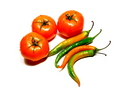
| 08/07/2007 04:23:04 PM | Hot and Sourby jaymodyComment: CRITIQUE CLUB CRITIQUE
by karmat
Overall, I like the attraction the colors of this have. It catches the eye in a pleasant way.
Compositionally, I think it could be a bit tighter. There is a lot of white around the edges, and while this is not necessarily a bad thing, it does give the picture a centered, static feeling. I think a crop of showing partial veggies would be effective, and would show more detail of them. It may also help you to eliminate some of the hotter spots. Use the shapes of the tomatoes to add stability to the shot, and use the curves of the peppers to lead the eye through the frame.
Technically, it is a bit bright, and the light is a bit harsh. One thing that I have found that is quick and easy is to put a tissue over the light to lightly diffuse it, or a papertowel if you need more. That way, you have the benefit of a lot of light, but it softens it up, or diffuses, it somewhat. The white background is very clean, but it does give the effect of being a touch overexposed.
Best to you in future challenges.
karma
|
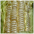
| 08/04/2007 11:42:25 PM | day 35 - corn!by rachelellenComment: Not bored. : ) Silver lame, heh? What did the groom wear?
You did good with the corn. Anything I try to grow does survive. | | Photographer found comment helpful. |
| 08/04/2007 11:40:13 PM | | | Photographer found comment helpful. |
| 08/04/2007 11:39:45 PM | | | Photographer found comment helpful. |
|
Showing 2971 - 2980 of ~9205 |
Home -
Challenges -
Community -
League -
Photos -
Cameras -
Lenses -
Learn -
Help -
Terms of Use -
Privacy -
Top ^
DPChallenge, and website content and design, Copyright © 2001-2026 Challenging Technologies, LLC.
All digital photo copyrights belong to the photographers and may not be used without permission.
Current Server Time: 07/23/2026 07:00:23 AM EDT.
|