CRITIQUE CLUB CRITIQUE
by karmat
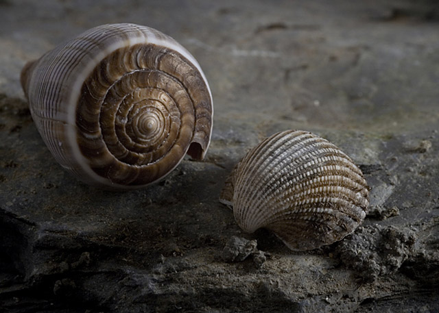
First of all, kudos for doing a sea shell shot (say that five times fast!) well. No matter what I try, I can't seem to get them to work.
Compositionally, I think it works well. The two shells contrast nicely in shape and size and their position works well to establish a triangular shape (almost) that gives stability to the shot, but also allows the eyes to "bounce" between the two without having to leave the frame.
Technically, the shallow dof works to isolate the shells from their background and to emphasize the existing focus, nicely. The colors are a bit redundant in that the shells are almost the same color as the soil on which they are sitting. Perhaps a lighter colored sand/dirt would have helped bring out the highlights of the shells. As a result, it does appear to be a bit flat, colorwise. The details are great, here.
Nice work, and honestly, I'm surprised the overall score wasn't higher. I suspect the subtlety of the colors worked against you and didn't "grab" the viewer enough to let them look at the shot long enough, so they may have missed some of the finer details.
Best to you in future challenges.
Karma |