|
|
|
Showing 1341 - 1350 of ~9205 |
| Image |
Comment |
| 05/08/2008 12:26:23 PM | |  Photographer found comment helpful. Photographer found comment helpful. |
| 05/08/2008 12:25:18 PM | | | Photographer found comment helpful. |
| 05/08/2008 12:24:35 PM | Early Bird Of Anarchyby gocComment: I really, really like the simplicity and minimalistic nature of this shot. It is quite "graphic" feeling and leaves the viewer feeling almost overwhelmed. | | Photographer found comment helpful. |
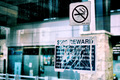
| 05/08/2008 12:12:14 PM | $500 rewardby CitadelComment: CRITIQUE CLUB CRITIQUE
by karmat
The irony here is great. If only there could have been someone standing there smoking, it would have really been awesome!
I like the composition of this. Because you didn't center it, the eye is drawn to the sign and are "comfortable" resting there. I also like the color tones and "style" of this shot. It is not "dpc friendly" but it does have a hip, modern, urban feeling to it.
As per your score, if it were in a "street signs" "urban life" or "irony" challenge, I suspect this would be a top scorer. Unfortunately, in a free study, the voters tend to go faster and have to be captured quickly (my opinion, of course). This does't grab you immediately, but it does hit you after a few seconds.
As far as "purpose," I think it is a pretty good commentary of society -- no matter how innocuous or "reasonable" a request is, someone, somewhere will find a way to rail against it. :)
Nice shot and best to you in future challenges.
karma | | Photographer found comment helpful. |
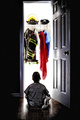
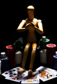
| 05/08/2008 11:56:14 AM | all-inby tcoliveiraComment: CRITIQUE CLUB CRITIQUE
by karmat
Compositionally, I think you have a fairly strong image here. The cards help to "anchor" the shot at the bottom, and the stacks of chips help to lead the eyes up to Woody (who kinda looks like he is praying). It does seem a bit tight on either side, but I think for the most part, it is okay.
Technically, the focus and colors are good. The lighting on the woody is effective, but it seems like there is too much on the cards. If you could have "shielded" them so that they weren't as bright as Woody, it might have made Woody stand out a bit more. As it is, because they are so bright, they compete for the viewer's attention, just a bit.
You have met the challenge well. I'm sure there were some "anti-Woody" voters out there, but you still had a reasonably good response to the picture.
Best to you in future challenges.
Karma |
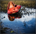
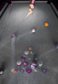
| 05/07/2008 04:54:35 PM | The Breakby StOlafPhotographerComment: CRITIQUE CLUB CRITIQUE
by karmat
Compositionally, this shot doesn't "follow the rules" I don't think, but that helps add to the chaos of the shot. Having the balls in the bottom of the shot really give it a nice balance, and the wide angle makes the hand look disporportionatly small -- which is good.
Technically, I like the trails that are visible -- it really adds to the feeling of motion in the shot. Having the table not be green helps the shot too, as I think a green table would really make it to overbearing and bold. That said, a touch more contrast might really give it a bit more depth and add to the "punch" a bit more.
Karma | | Photographer found comment helpful. |
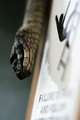
| 05/07/2008 04:49:07 PM | Snakes and Laddersby posthumousComment: CRITIQUE CLUB CRITIQUE
by karmat
ewwww, I HATE, DETEST, LOATHE, DESPISE, FEAR and think snakes are yucky. But, I'll look at your shot anyhow. :)
compositionally it is strong. It is well balanced and the blur leads the eyes straight to the snake. Also, I like the shallow dof, though perhaps if there were just a touch more focus on the snake, it wouldn't feel quite so out of focus.
The muted colors give this a sinister, evil feeling. And the little guy falling off of the ladder (I admit, I almost missed that little touch) is just classic!
Or maybe it is just because I hate snakes.
Karma | | Photographer found comment helpful. |
| 05/07/2008 04:42:51 PM | The winning handby dippydazComment: CRITIQUE CLUB CRITIQUE
by karmat
Compositionally, you have a very strong image -- it is well balanced and allows the eyes to "go" from the cards to the chips and back.
Technically, you exhibit great focus and exposure and the shallow dof works very, very well here.
Ordinarily, selective desaturation does not "work" for me, but it seems okay here. It doesn't jump out at you and scream "selective" but it does seem to make the red parts stand out nicely. I tried to imagine if it would be better in straight bw or color, but I think this probably works best.
The only nit I have, and it has nothing to do with the picture is the red border. Because red is so bold and screams for attention, my eyes are automatically drawn away from the picture to the border. Not sure if that is the effect you wanted or not.
Great shot and excellent interpretation of the challenge.
Karma | | Photographer found comment helpful. |
| 05/01/2008 12:15:20 PM | Putting the "Ad (and half a 'v')" in 'Advanced Editing'by poikiComment: CRITIQUE CLUB CRITIQUE
by karmat
Technically, this shot has good focus and colors. Unfortunately, it doesn't offer a lot to hold the viewer's attention. Frankly, many people probably just glanced at it, thought, "a shot of a monitor or TV" and went on. I think your score reflects this. The lack of a "subject" can also be a turnoff for many voters.
Welcome to DPC and best to you in future challenges.
|
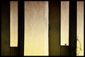
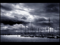
| 04/25/2008 04:52:43 PM | STORMFRONT LAYERSby hotpastaComment: CRITIQUE CLUB CRITIQUE
by karmat
Compositionally, I love this shot. It is "anchored" (no pun intended) strongly in the lower right hand side with the smattering of boats on the left providing a neat contrast and adding balance. It does *feel* tilted to the right to me, though I don't think it is. I suspect it is more of an illusion created by the boats and the clouds.
I really like the bw conversion and how you have captured a lot of detail without making it busy.
It has a very dark ominous feeling. You can almost feel the storm blowing in. . .
Great work | | Photographer found comment helpful. |
|
Showing 1341 - 1350 of ~9205 |
Home -
Challenges -
Community -
League -
Photos -
Cameras -
Lenses -
Learn -
Help -
Terms of Use -
Privacy -
Top ^
DPChallenge, and website content and design, Copyright © 2001-2026 Challenging Technologies, LLC.
All digital photo copyrights belong to the photographers and may not be used without permission.
Current Server Time: 06/23/2026 01:27:26 AM EDT.
|