|
|
|
Showing 1171 - 1180 of ~9205 |
| Image |
Comment |
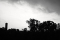
| 06/10/2008 03:28:21 PM | Here Comes The Nightby Kwilson10Comment: Would be much, much more effective if focus was sharper, I think. It is just off enough to make it a bit uncomfortable to look at. |
| 06/10/2008 03:27:50 PM | |  Photographer found comment helpful. Photographer found comment helpful. |
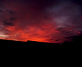
| 06/10/2008 03:23:42 PM | The Open Skyby gauravComment: Not a lot here to captivate me, or cause me to think this is a good photograph. If you want to go with something this "minimal," you could try to add interest by making it look funky in post processing. As it is, it could be the open sky, or it could be a patch of dryer lint on a window. | | Photographer found comment helpful. |
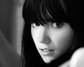
| 06/10/2008 03:11:19 PM | Shallow Field Deep Soulby ColeyComment: CRITIQUE CLUB CRITIQUE
by karmat
Compositionally, I really like the tight crop of this and the "unoccupied" space to the viewer's left. This crop really forces the viewer to focus on the eyes, which are full of expression -- it is almost a "I didn't do it, promise" look.
Technically, it is a very well done black and white, and the focus/exposure, etc. are also well done.
Overall, a very well done shot, as the commenters have aleady told you.
Karma | | Photographer found comment helpful. |
| 06/09/2008 09:55:35 PM | Little Sisterby panderbearComment: CRITIQUE CLUB CRITIQUE
by karmat
Compositionally, this is a very strong, "classical" arrangement, I think, and it works well. It is a well balanced shot, and it makes the viewer wonder what she is looking at and thinking about. The mountain/hill in the background is a bit distracting, so if the shot could have been made while facing a few degrees to the left, that may have helped. Judging from the light, though, that may not have been possible.
Technically, it has good exposure, focus, and the shallow dof helps to isolate the subject from the background.
For me, though, while it is a good shot, technically speaking, it seems to be missing something. She looks so lost and forlorn, but there isn't anything in the shot that explains why (that could be a good thing, I suppose). I think what *bugs* me, though, is the lack of "anything" in her hands. I'm not sure what or how, but not seeing her hands makes this feel incomplete to me, for some reason.
Overall, it is a very well done shot, and is technically good. It is just missing that "something" that makes it soar above the rest. Best to you in future challenges.
Karma
| | Photographer found comment helpful. |
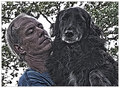
| 06/09/2008 08:05:32 PM | A Man and his Dogby Bear_MusicComment: The post processing of this kills it for me, sorry -- it is way too much, I think. The composition is good, and it would be interesting to me so see what it looked like "before." | | Photographer found comment helpful. |
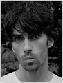
| 06/09/2008 05:18:39 PM | I'm a Model Idiotby F-StopBluesComment: CRITIQUE CLUB CRITIQUE
by karmat
Compositionally, I typically don't care for straight on portraits, but his expression makes up for it. That is funny.
Technically, the bw works well (especially if his lips were orange, though that might have been interesting as well). A touch brighter may have made it seem less "gray," and if the focus had been sharper, it would be a bit more compelling, I think.
Overall, I feel you met the challenge well, and think your score is a bit lower than I would have expected.
Best to you in future challenges.
Karma | | Photographer found comment helpful. |
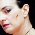
| 06/09/2008 05:14:22 PM | My beloved cyborgby Rino63Comment: CRITIQUE CLUB CRITIQUE
by karmat
Compositionally, I like how you have only shown half of her face. It kinda intuits that one eye is "human," but the other one, the one you can't see, my not be as quite "human." I also like that it is tilted.
Technically, it is exposed and focused well. Also, the colors are vibrant, but not too overwhelming.
Overall, you definitely met the challenge. AND, you had a good idea. I think, though, what might have hurt is that rather than looking "cyborgish" it looks like she has a spider on her face, or a really nasty mole with thread wrapped around it. While "this" may have been more "real," I think a bigger, more definitive element of some kind would have made it seem more artificial.
Best to you in future challenges.
Karma | | Photographer found comment helpful. |
| 06/09/2008 11:06:33 AM | | | Photographer found comment helpful. |
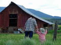
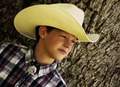
| 06/09/2008 11:05:25 AM | "Happy Trails, Cowboy!"by 777STANComment: This shot has a lot that is "right." The angle is great, and his expression really sets the mood of the shot. Also, the tree bark background gives it a nice outdoorsy context. The lack of focus is a bit bothersome. It looks like the shutter speed was a hair too slow, and there was some camera shake. | | Photographer found comment helpful. |
|
Showing 1171 - 1180 of ~9205 |
Home -
Challenges -
Community -
League -
Photos -
Cameras -
Lenses -
Learn -
Help -
Terms of Use -
Privacy -
Top ^
DPChallenge, and website content and design, Copyright © 2001-2026 Challenging Technologies, LLC.
All digital photo copyrights belong to the photographers and may not be used without permission.
Current Server Time: 06/22/2026 02:52:58 AM EDT.
|