CRITIQUE CLUB CRITIQUE
by karmat
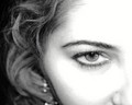
Compositionally, I like how you have only shown half of her face. It kinda intuits that one eye is "human," but the other one, the one you can't see, my not be as quite "human." I also like that it is tilted.
Technically, it is exposed and focused well. Also, the colors are vibrant, but not too overwhelming.
Overall, you definitely met the challenge. AND, you had a good idea. I think, though, what might have hurt is that rather than looking "cyborgish" it looks like she has a spider on her face, or a really nasty mole with thread wrapped around it. While "this" may have been more "real," I think a bigger, more definitive element of some kind would have made it seem more artificial.
Best to you in future challenges.
Karma |