|
|
|
Showing 131 - 140 of ~1021 |
| Image |
Comment |
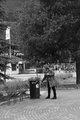
| 06/08/2011 03:09:53 AM | She follows instructionsby mundilitliComment: Hi Arnmundur, welcome to the Critique Zone!
Firstly, I have to say that unlike the other commenters, I like this shot. It is something of a social commentary and I like the sense of solitude there. I definitely think that it was a shot worth taking but with 20/20 hindsight, I might have done it differently.
Technically: I think that the settings are fine, although an ISO of 500 seems a little high? I have also read that most DSLRs perform better at the 'standard' ISOs (100, 200, 400 etc) than the in between settings. The long DoF works really well here - this shot doesn't want a blurred background. It does need to be sharper though, there's no way around that.
PP: It's a minimal editing challenge, so tricky but this definitely needs some sharpening. For a minimal editing challenge, shooting in JPEG has to be the way forward to gain your camera's built in sharpening too. The black and white conversion is also a bit flat - again difficult to do anything about in this challenge, but to avoid editing, a filter (possibly blue for this shot?) might have added some depth to the contrasts.
Artistically: I can see the use of the rule of thirds, but only vertically. I would be tempted to place her less centrally on the horizontal as well. Also, the geometric pattern of the brickwork is quite interesting in a black and white shot - more so than the tree I think, so perhaps include more of that?
Overall, I think that the lack of sharpness and the DPC tendency to race through voting leave this shot a little under-rated. It is interesting and I encourage you to continue to develop this style.
Happy hunting!
Frank. |  Photographer found comment helpful. Photographer found comment helpful. |
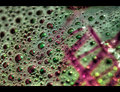
| 03/03/2011 09:21:06 AM | Latticeby leonedavisComment: Hi Lee, welcome to the Critique Zone!
What can I say? Hmmm. It's a fun shot - definitely fits with the challenge in being a macro, lots of colour and interest.
Technically, there isn't a lot to say - you have complete control of the DOF here, and putting it across the shot at the perfect diagonal is really pleasing. It's nice and sharp where it should be, and very blurred where it should be.
Artistically, this is a puzzle macro - how can it be measured artistically?! It's a lot of fun, but lacks a little 'wow'. The border is nicely done and frames it well, but push come to shove I suspect that the voters just decided that it is only a shot of some bubbles - bright, colourful and very well executed but it didn't grab them.
I suspect that if this were an abstract macro challenge, you could have added a full point to the score. This is the kind of shot you could sell to a smart restaurant or coffee bar more successfully than the DPC voter! Ultimately, as long you like it, it's a success.
Happy hunting,
Frank. | | Photographer found comment helpful. |
| 02/14/2011 07:55:42 AM | A Little Birdie Told Me......by battymaddieComment: Hi Madelyn - welcome to the Critique Zone!
I'm afraid that I'm not sure that the bird made that much difference to the voters. With the bird, you have an interesting focal point (and title), without the bird, you have a pretty sunset. I think that your concept was excellent, but I'm not sure it really worked in practice.
Technically: This has a really high shutter speed - metering off the sun, I'm guessing. So you know that everything else is going to be a silhouette. Given that the silhouettes are then your subject they need to be really sharp and they're not - the water is bang on in the middle but that doesn't help.
PP: You have boosted the hell out of the saturation and contrast, which makes the final output very red, and a little 'blocky'. I suspect that a slightly more delicate touch (perhaps trying to preserve some blue in the sky for balance?) would have been more pleasing, but not seeing the original I'm guessing! The vignette doesn't really add here - it needs to be stronger if you really want to see it.
Artistically: Personally, I think that the bird could make this shot, but he is pretty small against everything else. Personally I would have either zoomed or cropped this to about 75% of it's current size, losing most of the bottom inch to make the focus more about the lone shelter with the bird, against a beautiful sea and sunset. That would also help with the sharpness / focus issue as bigger objects are easier to ensure sharpness for.
Overall, this shot comes across more as a tourist snap than something taken by a photographe with your skills (I checked the portfolio!) and not to mention, equipment! But... with just a slightly different perspective and a lighter PP touch, I think it could be stunning.
Hope that helps
Frank. | | Photographer found comment helpful. |
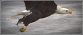
| 02/14/2011 07:33:08 AM | Lunch To Goby TommyMoe21Comment: Hi Tom - welcome to the Critique Zone!
Having looked at your portfolio, and having checked out the other comments, I doubt that I am going to tell you anything new, but here goes...
Technically: There is little to say - from what I can see of this shot it is pretty much nailed, and looking at the figures, you were working that lens/camera to get the shot anyway. Perhaps if you were working at 200mm, you could have dropped the aperture and gone faster? I don't know - these shots happen so damn fast anyway, it's just that 1/400 seems a tiny touch slow for an eagle in flight!
PP: Perhaps a little extra sharpen after re-size? Other than that, the vignette really works here.
Artistically: IMHO, this is where the points went. Pulled back, with the wings and a little more space to move, this shot is definitely a high six if not a seven. It's just too cramped, and the loss of the wings denies the bird his identity. It's also very centred - either a tighter, or a looser, crop would have worked better for me.
As I said, little new but I hope that helps in some small way!
Frank.
|
| 11/02/2010 05:42:24 PM | 10by sidpixelComment: This is lovely - the light, the structure, the detail. Fantastic. I was thinking that it is a shame you couldn't get it into a challenge, but then I don't think it would be appreciated anyway. | | Photographer found comment helpful. |
| 10/26/2010 08:48:09 AM | A Boys Lifeby aurorabComment: Hi Shannon, welcome to the Critique Zone!
My initial take on this shot was that it is very cute, colourful and with plenty of interesting detail - and yet it only scored about an 'average' score. So why was that?
Technical: I'm guessing that light was a problem for you here - the slightly high ISO and the aperture still didn't really give you a particularly bright shot. With a stationary subject and an IS lens, I would drop the shutter to maybe 1/40 with those settings - or even 1/20 and make the aperture smaller (those kit lenses really aren't at their best wide open). It looks as if there is quite a bit of light, but you are taking it in a shadowed area - perhaps just move your 'set' into the light a bit more? Where you are, the natural light has given your model a really odd shadow just above the knee, which almost looks like an editing error.
Artistically: This is completely subjective, but... I don't think this is a time to break the rule of thirds, and I would pop the model a little further right to stop him being in the centre. There is also a lot going on in the background - I would think that the toys in the foreground would be enough, with just trees / bushes behind rather than the table (?) - this would also give it more contrast. On the other hand, the detail of the laces, the plaster etc on your model is excellent and makes the shot. It's all about balance!
PP: You mention upping the contrast - I don't know how you did this, but ideally I would use levels, or even better, curves. As it stands, the lack of direct light leaves the whole shot just a little gloomy and levels / curves can help with that.
In summary, it's a really cute shot, but the difference between good shots and great shots around here is all about getting the lighting right. I hope that helps!
Frank. |
| 10/22/2010 04:32:26 AM | Self-Portrait...by 777STANComment: Hi Stan, welcome to the Critique Zone!
I'm afraid I have to be honest here, my first take on this shot is that it looks like a snap of a friend at a BBQ, so what went wrong?
Technically: The shot is just not that sharp. I can see some sharpening has been done to rescue it, but (having tried similar myself) it never really works. I would suggest closing the aperture down - the kit lenses are never that great wide open. Boost your ISO to 200 or 400 and close your aperture to f6.3 or f7.1, make sure that the focus is bang on where you want it (the face, not the trousers!) and good to go. The lighting is more 'flash' than 'fill flash' too - the darkness behind your subject makes true 'fill flash' unnecessary.
Artistically: You have carefully used the rule of thirds, but the slightly dull background doesn't add any interest - it's dark and fairly homogenous. I would either go in much tighter, or shoot against a more interesting background. The point of view is also a problem here - this is the same point of view that we would see in normal life, and as such we don't tend to be grabbed by it - try getting low and shooting up, or shooting from above for a more unusual perspective.
PP: You don't mention saturating, but these colours (particularly the blue) are way over-saturated. I find de-sat can be useful on these occasions. Also be very wary of the over-sharpening. Some things just can't be recovered.
It is clear from your portfolio that you are way better than this shot, which is perhaps really just an exercise in lighting, so I don't want to get you down! Just head out and get back shooting! Happy hunting,
Frank. | | Photographer found comment helpful. |
| 10/22/2010 04:21:22 AM | Smile by DigiFotoBuddyComment: Hi Shailesh, welcome to the critique zone! It's always hard to critique a ribbon winner so this might be quite short!
My initial take is that this is a very bright, cheerful image of an excellent model. As another commenter said, it does look like a professional portrait shot - but with soul.
Technically, there is nothing I can really say about this. The focus and DOF control are bang on, as one would expect from your work. There is the raging question about 'fill flash' but I am sure you are sick of that one and since the voters have spoken, who am I to disagree!
Artistically, the composition is simple and appealing. Kudos to your son for pulling off such a great expression - excitement and fun, with just a touch of uncertainty/shyness lingering in the eyes. I'm not sure about the use of such an extreme angle of tilt, but definitely some tilt does give it interest.
All in all, a cracking shot and recognised as such by the voters. | | Photographer found comment helpful. |
| 10/22/2010 04:14:11 AM | Brittanyby yakatmeComment: Hi Robert, welcome to the critique zone!
My initial take on this shot is that it has a really warm, rich feel - like a proper chesterfield sofa. The soft reds and browns work really well with the rumpled fur to give an impression of comfort and tactile pleasures.
Technically: Your focus, and control of the DOF is unsurprisingly superb - the OOF cushion on the right hand side works nicely to isolate Brittany's expression. The only area where I would take some issue is lighting, partly because I would have liked just a little more detail in the left eye, and partly because I am not convinced that this is 'fill flash' rather than just 'flash'. That seems pretty contentious at the moment!
Artistically: This is completely subjective, but I find the fairly central position of the face a little odd. I can't see what the space to the right is adding - a little is good for the isolation effect, but there is a lot there. That's all though, as I said before the 'feel' of the photo, the colours and textures, are just great.
All in all, a really classic study of Brittany - I'm sure she would be pleased!
Happy hunting.
Frank. | | Photographer found comment helpful. |
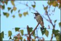
| 10/21/2010 11:55:27 AM | Phil, the Flash, Takes a Breakby zencowComment: Hi Chris - here we are again!
This will probably be a much shorter critique, since there really isn't much to say that hasn't already been said. It is a pleasant shot - but unremarkable. You said that it came from trialling a technique, and that is pretty much what it looks like. That said, from where I'm sitting you have nailed the fill flash thing.
Technically: It's all good - the focus, the DOF and especially the light. You have managed to get a nicely exposed background while capturing all of the hummingbird detail courtesy of the flash.
Artistically: I think the biggest issue is that tiny subject in that fairly open frame. A busier and more interesting background could bolster a composition like this - setting the subject in its environment, but there just isn't enough there to do this. Another minor point (which I got from a pro wildlife photographer's book) is about the angle of shot. Here you are looking up at the bird, which is the angle most people also have so it doesn't really grab them as being different. It may not be possible, but a horizontal or downward angle might add interest. Equally, apparently we should try and shoot land animals horizontal or upwards... got to be worth a try!
In summary, it is technically spot on and you definitely achieved what you were going for, so I guess now the mission is to park that little bit closer!! Happy hunting.
Frank. | | Photographer found comment helpful. |
|
Showing 131 - 140 of ~1021 |
Home -
Challenges -
Community -
League -
Photos -
Cameras -
Lenses -
Learn -
Help -
Terms of Use -
Privacy -
Top ^
DPChallenge, and website content and design, Copyright © 2001-2026 Challenging Technologies, LLC.
All digital photo copyrights belong to the photographers and may not be used without permission.
Current Server Time: 05/25/2026 11:18:02 AM EDT.
|